

Google is rolling out an update to Google Play that first made an appearance a couple of weeks back, but seems to be hitting more devices this week. The update is noteworthy because it dramatically changes the “My apps & games” section into a new “Manage apps & device” area where everything looks and functions differently.
In this new “Manage apps & device” area, you’ll find only two pages for “Overview” and “Manage.” Before this update, you had Updates, Installed, Library, Share, and Beta, all of which made quite a bit of sense from a management perspective. Now, though, you are going to have to get used to a setup that involves new taps, filtering, etc. to get old tasks done in a new way.
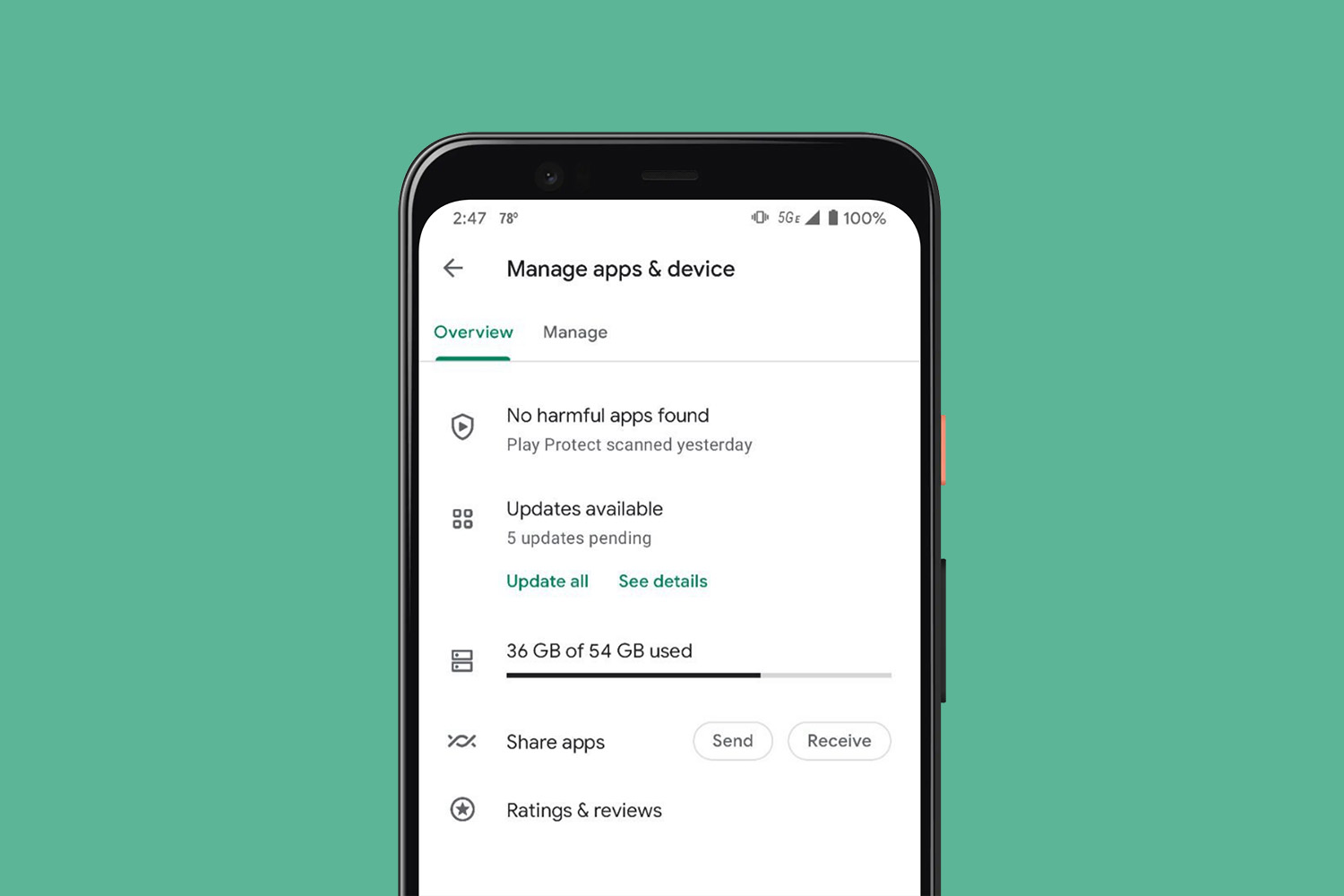
The “Overview” page shows your Play Protect status, if you have updates available (including how many, with buttons to update or see details), how much storage you are using, a shortcut for sharing apps, and another for dealing with your ratings and reviews.
So instead of heading into the Updates page of old, where you had a list of apps with updates available at the top of a recently updated list, you now can see how many updates you have pending, but will then need to tap one of two buttons to get to the update page to make that happen.
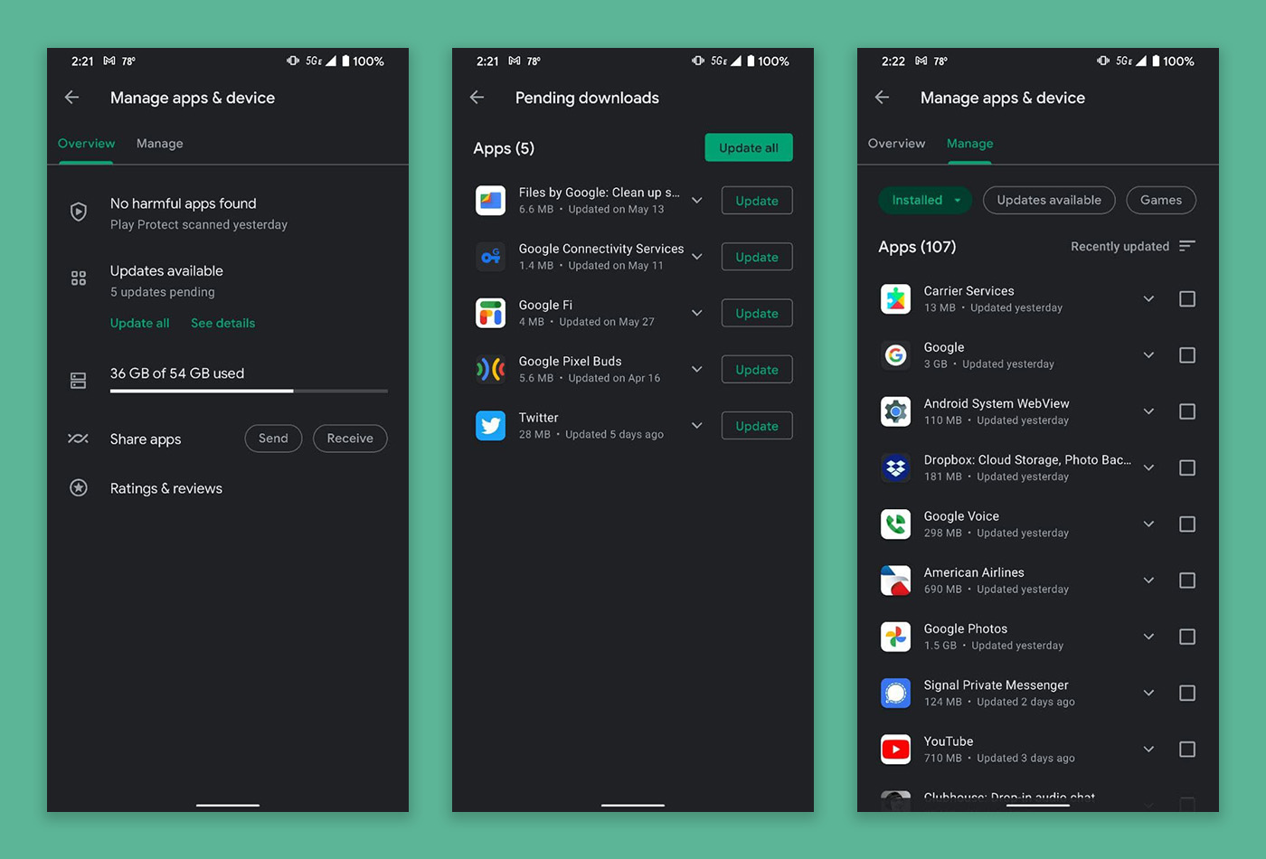
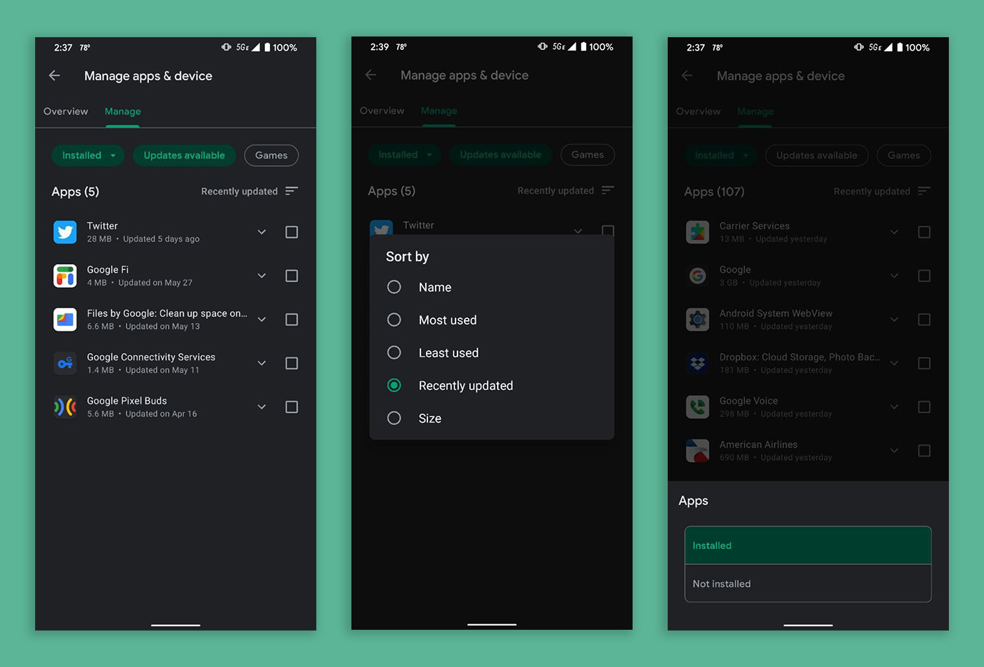
Where things get really weird is in the “Manage” page. From here, you can filter by Installed or Not Installed, by those with updates available, or if they are games. You can even sort from there in a number of ways, by size or name or most/leased used.
Need to find your beta apps, like you used to be able to do in a separate panel? The friend of the site who sent these screenshots says they have looked and looked and looked and still cannot find anything resembling that old beta section. I’m not sure how important or used it was, but it was a way to keep up with your various beta experiences in one place.
Neither Tim or I are seeing the update, but I already saw at least one reddit thread complaining about it earlier today. I’m running the same Google Play build of 25.6.14-21 as is seen above without the changes.
This isn’t the first big change to Google Play in recent months. You are still probably trying to get used to the end of the hamburger menu and the account switcher now being your main menu. I know I’m still struggling with it. They did start testing that back in January, so if you aren’t seeing the change above, it could be a while before we all get it. That’s how Google rolls.
Seeing the new manage apps area? Thoughts?
This latest update is not handy at all. Any newcomer may get lost in the new settings page of the Google Play Store.
I hate the change, it was simple and quick prior to this and it even seemed to put the stuff I cared about updating up top and anything updated recently would show down below. This on the other hand, had me scrolling through stuff to figure it out and even then to find out what I wanted to update.
Imagine my mum calling me about it too as she agreed it was simpler and quicker b4.
Holy cripes on toast. This is unbelievably cumbersome and significantly worse than the previous UI. Why has Google done nothing but make things worse with each update?
sundar too bizzy counting his billions to care that his underlings are asleep at the wheel.
I’ve had this for a week and it doesn’t function easily. Meaning that it is not the way to use, streamlined version it once was. I’ve noticed most of what Google implements lately doesn’t really offer anything new, instead they offer the same functionality, but using different labels and descriptions. It’s a case of if it ain’t broke, don’t fix it.
Gotta love Google’s approach to things the last several years: If it ain’t broke, give us time to break it.
The change doesn’t look promising. This isn’t MS Excel, stop making it like one. Just keep it simple (which it already is) don’t agree with it? Just take a look at iOS app store.
I’ve had this on my 21 Ultra for several weeks. I prefer the previous UI.
Google going the way of Microsoft, making settings and apps less intuitive and more complicated just to say that they updated the experience.
I got this on my Moto E4 Plus about a month ago. Meh.
I’ve had it for almost a month and don’t like it. The most frustrating thing for people with many apps, especially those with apps that update frequently, is that there’s no update all button that I’ve seen yet.
I’ve had the new interface on my phone for several weeks, coinciding with joining the Android 12 beta. The old interface is temporarily there, go in to app info for the Play store, clear data, and you get the old sensible interface that shows beta apps as the last tab. However, after a short while, after the deleted app data gets rebuilt, the awful new interface appears again. Deleting app data also means your Settings are gone, so apps will try to auto update over mobile data, and anything else you previously prevented. There’s also no way to sort apps by most recently used with the new interface, even though there are a bunch of different ways to sort the application list. Overall, it’s a big step backward in terms of usability
I noticed this on my wife’s phone over the weekend. I was very confused.
Same. Wife has it on her Pixel 3a running Android 11 (no beta anything for her). Meanwhile I have Android 12 Beta on my Pixel 4a with beta everything possible, and I have the old interface. For once I’m glad because the new UI is strange and less friendly.
Once you get used to it it’s not all that bad
I’ve had this for a couple weeks without realizing it wasn’t something that had hit everyone’s phones already. I hated it at first, but I agree now that I’m used to it I like it just fine. Not really any better or worse than the previous way for me, but of course everyone has their preferences.
Just dreadful.
I had this for most of the day. Just went back and it appears to have reverted.
mine is still there. It took me forever to figure out how to update my damn apps.
Exact same boat.
I hate it
it is horrible
I have multiple devices who keep flip flopping. Not for this update, but one day my apps and games appears under my picture (need to click on my profile in the top right) and other days you click on the hamburger menu in the top left. I’ve been noticing this for months on my Pixel 5 as well as my Android based GROM Audio VLine VL2 module (which is running 8.1).
I wish mine reverted. I sent feedback right away. It’s an abomination.
I like it!