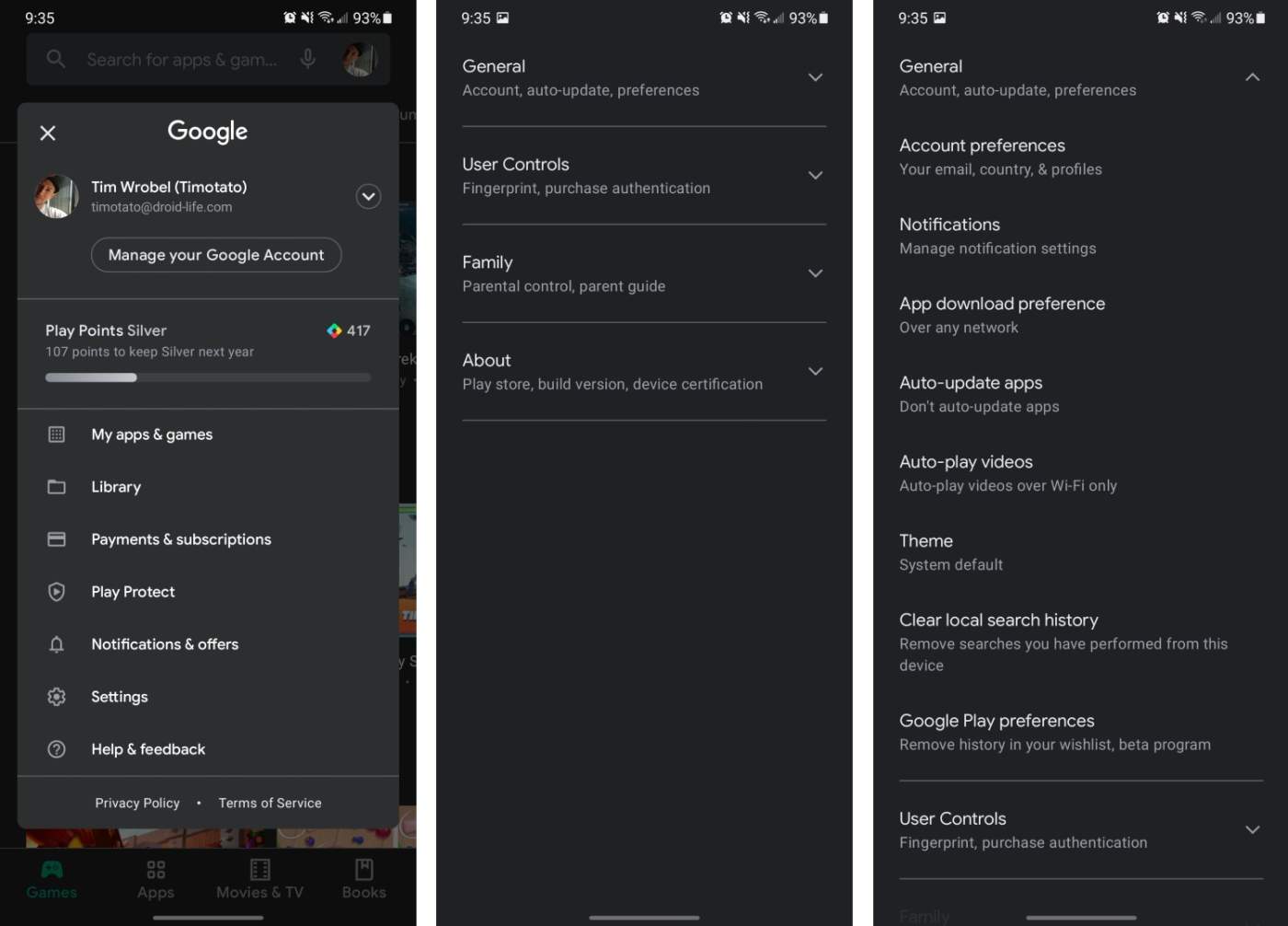
I opened up Google Play this morning and was greeted by a UI I’m not familiar with. It’s build version 23.7.11-21 (same build as others, but with this server side change), and honestly, I’m pretty torn about it. The previous build I was on still had the dedicated hamburger menu on the left side, which allowed users to pull the menu out and access your apps and games, settings, and all of that. This new UI moves everything to the profile photo in the top right.
You can check out a video quickly detailing the new UI, but besides the hamburger removal, we haven’t spotted anything new. Once on this UI, you simply tap on the profile photo, then you’ll have access to your apps and games list, Google Play’s settings, an overview of your Play Points status, your library, payments & subscriptions, notifications, and everything else.
Anyone see this updated UI this morning? Notice anything else that’s new?
New Google Play UI
