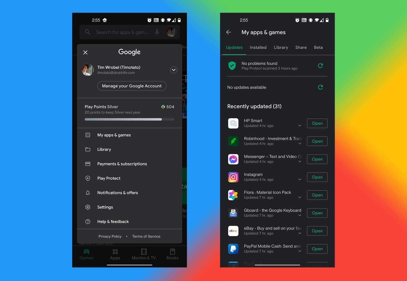
This is just a quick post to let Google know I don’t like the new layout of Google Play. If you saw the news from this morning, it appears that everyone is receiving the UI that I magically received back in late January. Welcome to the club, stinkers.
The main thing the UI change does is strip the hamburger menu from the left side and place all of the contents in a new menu that’s accessed by hitting your profile photo in the top right. This is the part I don’t like. If we were being smart about this, I’d recognize that one of the primary reasons I go into Google Play is to access my list of apps and games. I do this because that’s where I go to download app updates. Why did Google not create a dedicated button on the bottom of the UI to quickly access my library of stuff? Instead, the bottom bar is the various sections of Google Play — Games, Apps, Movies & TV, and Books.
In my perfect world, I’d have apps and games under the same tab, then movies, books, and either “Library” or “My Apps” or something along those lines. With the change cemented, we now have to reach to the top of our tall phones and access My Apps & Games from there. I know, I probably sound ridiculous, but I’m just not a fan of this new layout. Heck, I was even fine with the old hamburger menu. You could at least swipe down the side of your phone and drag the menu out. It was kinda cool. That’s all gone now.
Maybe some of you have had the new UI for the day. What are you thinking so far? Do you mind it? Am I crazy?