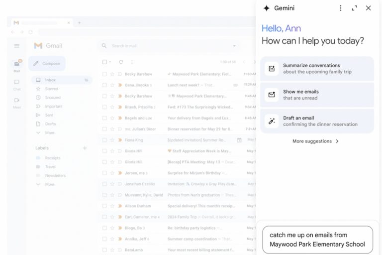
As Google continues to update its core apps with its Material You styling, it’s still working on those that were updated early on that still have planned tweaks to be made. Gmail is one of those examples, as it was one of the first to pick up its new design back in early September. Today, Google appears to be rolling out subtle-yet-lovely changes that it teased over a month ago that mostly benefit those who use the Chat or Meet tabs.
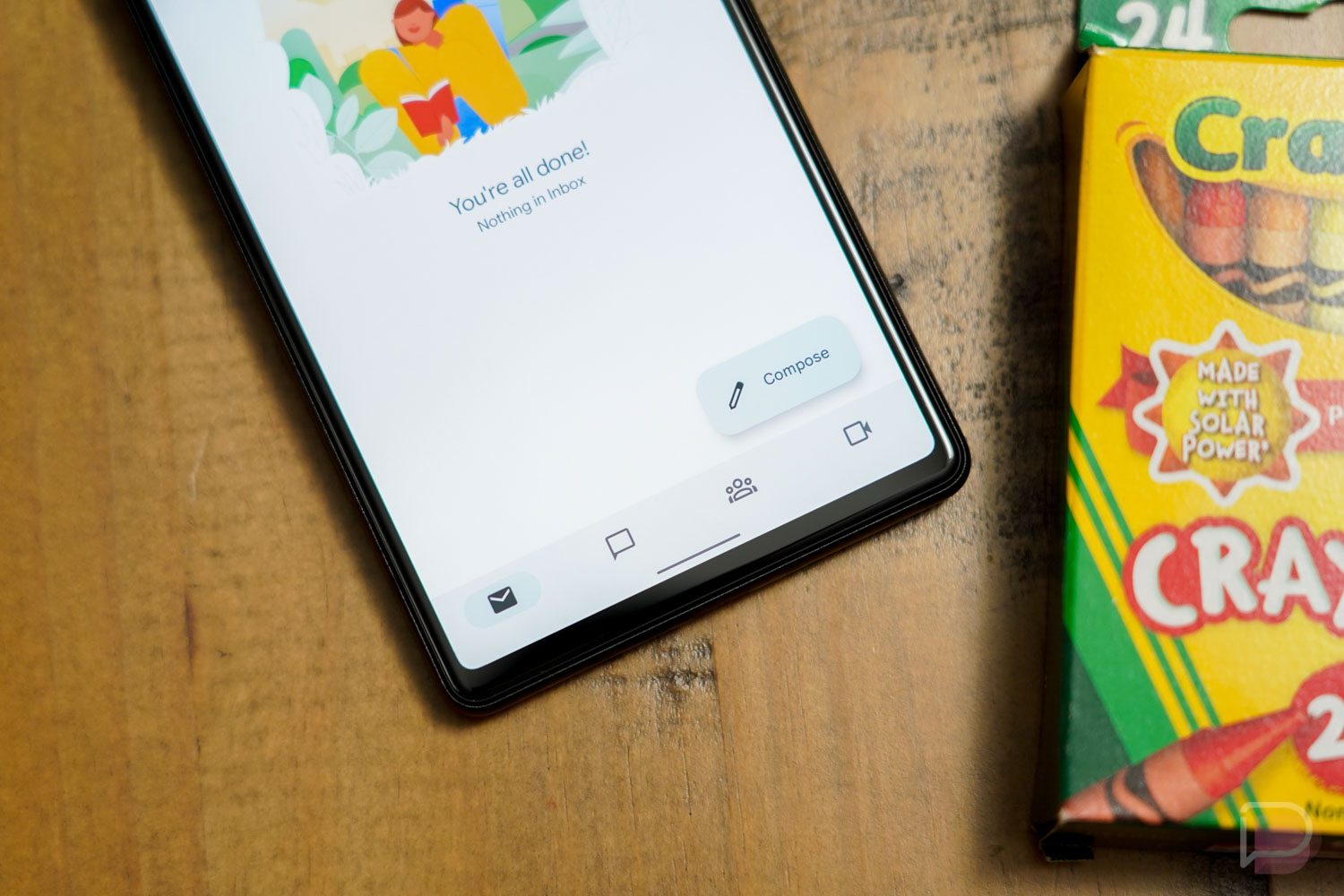
The Gmail app on my Pixel 6, which is still on version 2021.10.03.404390235 and did not receive an update today, is now showing a further shrunken bottom navigation bar that lacks labels for Mail, Chat, Spaces, and Meet. It takes up a lot less space than the bar Gmail has had for months with the labels under each tab. It now matches up to the iOS version of Gmail.
Google first showed off this version when it previewed a bunch of Material You app updates through its Workspace blog, but we had yet to see them push out the change. This is (obviously) some sort of a server-side rollout since my Pixel 6 Pro on the same Gmail version doesn’t have this new look. Tim’s phones don’t either.
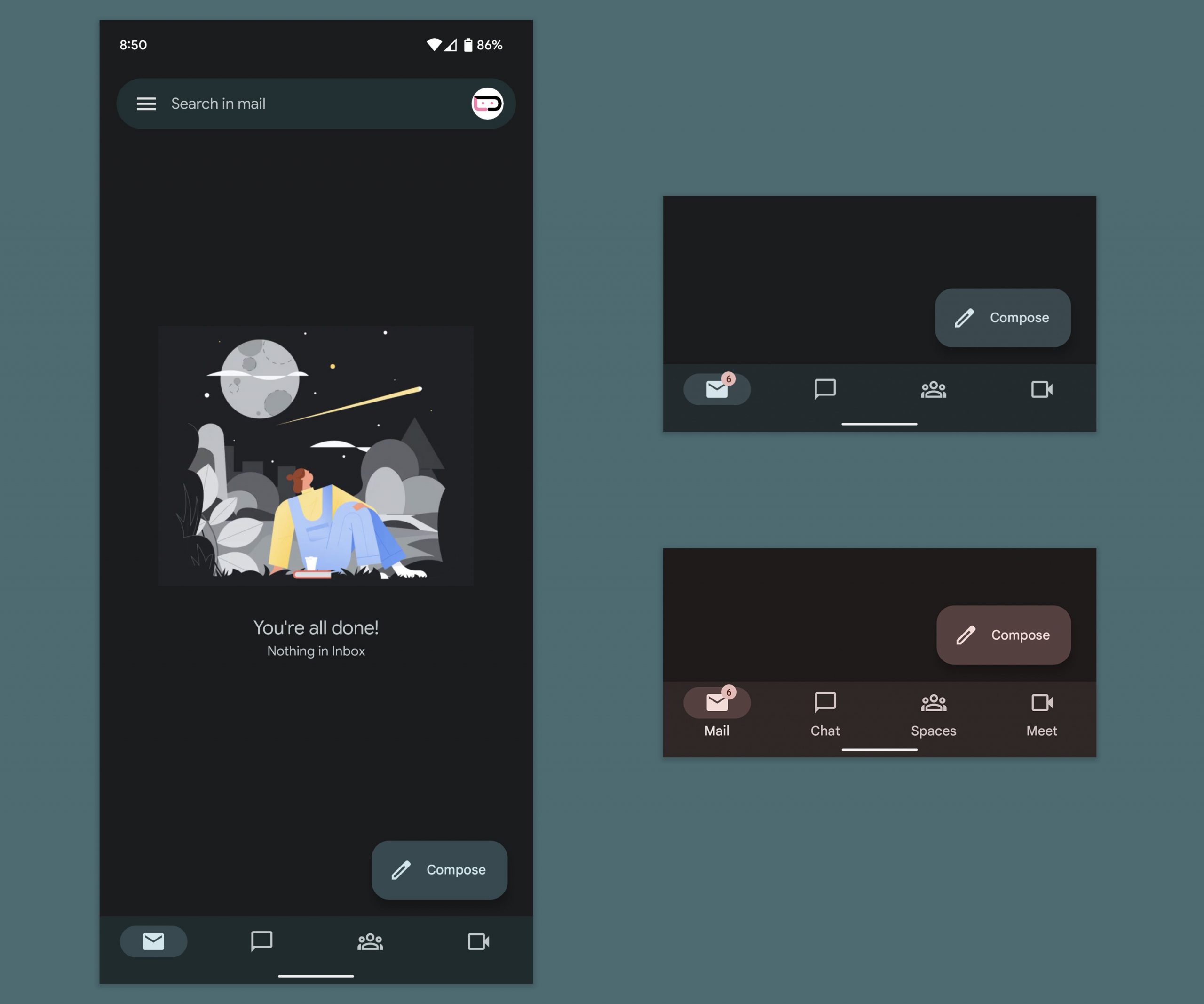
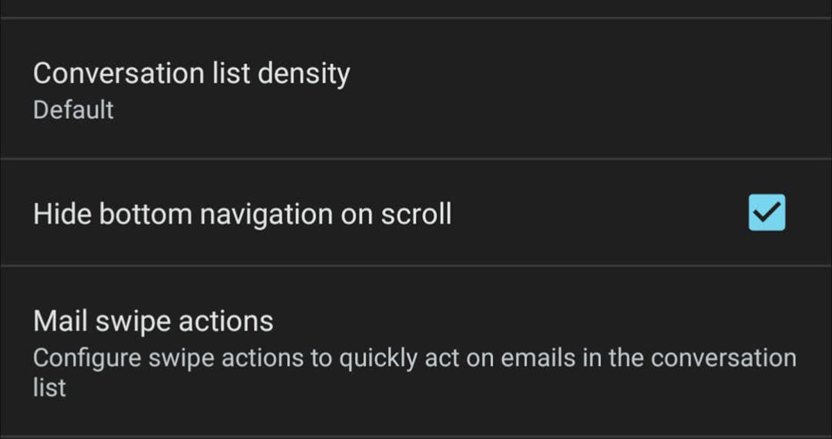
While that smaller navigation bar is greatly appreciated, my Gmail is also showing a “Hide bottom navigation on scroll” option to the settings area. As you can probably understand from its name, checking the box for this option does indeed hide the bottom bar as you scroll. Again, this is really only important or useful if you keep the Chat and Meet tabs on, otherwise there isn’t a bottom nav bar.
This feature isn’t showing on both phones of mine with the same Gmail version, it’s only showing on the phone that has the new navigation bar. To check to see if your phone has this option, open Gmail, then the Settings>General settings and the option will sit below the “Conversation list density” and “Mail swipe actions.”
Google has mentioned this “hide” option on a support page, but it looks like an option that was added without much publicity in August or so. Anyways, cool!
Gmail is fun.


Gmail is NOT fun. I loved it when all options were under the hamburger menu. But then they added a button on the upper right corner to switch accounts. Then we had a big bad button on the lower right to compose new messages. Then the bottom of the screen popped up with more options. For someone trying to use Gmail with one hand, these changes have been most unwelcome, and the app functions entirely different from the way the web version does.
Just give me the freaking HTML signature!!!
I still have the hamburger menu on my Pixel 6 Pro.
I recall reading somewhere that Material You (MD3) guidelines suggest having a text description on the bottom bar. I guess they’re just guidelines and not rules. But now we begin the slow descent until none of the Google apps match each other anymore… ????
Let me know when they made it look like Inbox.
Wish you could drop the home screen icon labels on the pixel launcher.