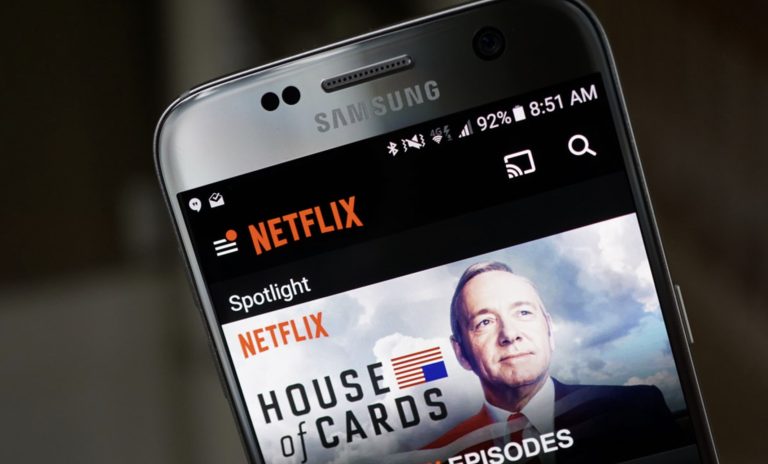
We received the above screenies this morning and from the looks of it, Netflix is testing out a new user interface (similar to the tablet version) for Android phones. I downloaded Netflix onto my device to check, but I still have the old UI. The tipster mentioned that after his app was turned into this without receiving an update from Google Play, that it later turned back into the regular phone UI which consists of more greys and yellowish colors.
Again, this new look somewhat reminds us of the Android tablet layout where you have instant access to recently watched shows and the same color scheme of the dark grays and highly saturated images. I love using Netflix on the Nexus 7, so if my phone’s app starts running smoother and looks prettier, maybe I can start using it more too.
Anyone else see this on their Netflix app last night?
Cheers Jesse and Clifford!