

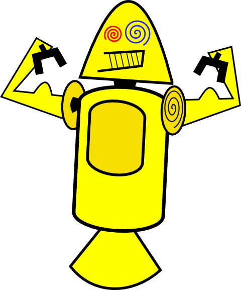
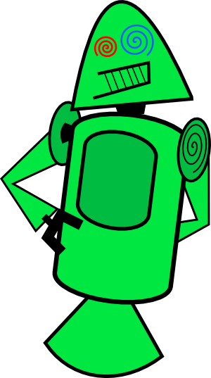
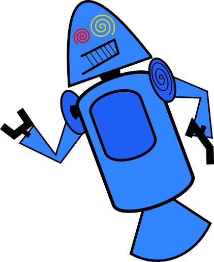
Last night on Google+, Android engineer Dan Morrill shared the four colorful little robotic creatures that I have included in this post, along with their backstory. The short form of the story goes like this – these were the original, yet unofficial Android mascots which were at some point dubbed “Dandroids.” While their internal history leaves them some fame, their lives were brief.
Dan walked through the entire tale, talking about the days leading up to the public launch of Android, needing some sort of funny graphic to include with a presentation, and settling after a couple of hours of Inkscape work on these four characters.
As you all know now, Bugdroid is the official mascot, but there was a brief moment in the life of Android where Mr. Yellow Muscles and his three pals were on the short list.
Care to share your favorite?
Via: +Dan Morrill | Android Community

Although not similar, the “dandroids” reminded me of the science probes from a video I found a while back by someone named “billyblob” – http://billyblob.com/cartoons/ – specifically, his piece called “We Are Science Probes” (http://billyblob.com/cartoons/we-are-science-probes.html).
they look pretty fruty 😛
“Oh Jesus no!” I screamed, “Oh God yes” it chortled.
Jetson’s on crack. o_O
not a good idea
Wow, I’m glad they didn’t use these… there even more terrifying that the droid ad’s.
Danger Will Rogers!! Danger!!
I like the green. It looks like he’s scratching his ass.
Stoned robots don’t make me want to buy phones (but maybe a bag of Cool Ranch Doritos).
Looks like one of Rosies long lost relatives from The Jetsons … am I showing my age? =)
Raped my eyes have been…
This just reminds me of how far Android has come since it was originally released. It makes me truly proud to be one of the founding members of Team Android.
lol thats pretty funny dude.
http://www.GotmyAnon.tk
Just me or did they just steal the dreamcast logo for the left eye?
swirls have been around long before dreamcast…
These four guys and Bugdroid can kiss my shiny metal ass.
Read the source; these were never even being considered. I hate to say it, but Droid Life’s gotten a bit sloppy lately with their reporting.
Probably took that from android community’s article.
That’s a gross misrepresentation of the facts and the post. Here’s the complete, relevant portion, for anyone truly interested but too lazy to click the link:
“See, we were prepping for an internal developer launch (meaning, we were going to ask Googlers to start fooling with the APIs and give us early feedback), and I had no eye candy for the slides we were putting together. Hence these guys.
They had a brief flurry of minor popularity amongst the team — enough to pick up the nickname “Dandroids”, anyway. But then +Irina Blok (as I recall) presented her work: the bugdroid we all know and love. Funny how the professional work is of vastly higher quality than the amateur, isn’t it? 😉 Even so, these guys have the distinction of being the first proposed mascots for Android (that I’m aware of, at least.)”
These were obviously made to simply fill space for a quick meeting and were never even close to in the running for anything official. Ever. The guy behind them even calls them amateur work and readily admits to their poor quality. This article makes it seem as though they were actual contenders for the Android mascot, or even were the Android mascot for a while instead of being what they are: amateur placeholders for an insider meeting.
Meet George Jetson
So did they take the design from Atari Lynx’s Gauntlet Android character? This cant be a coincidence.
Wow, epic fail
Oh god….cant’ believe they were going to use these! They’re terrible!
Who looked at this and said, “This looks perfect.”?
So glad we ended up with cute little Andy!
Good ole Andy is irreplaceable, and will go down in the history books as the greatest mobile OS mascot in the history of everything.
All that blasted Apple has is a half-eaten apple. What kind of mascot is that? A half-eaten apple? Really?! That’s ALL they could come up with? Blah!
I miss the rainbow Apple.
Sure, it screamed 70s, but it was and still unusual for a logo to be multiple colors.
Ew. Just ew.
They kind of look like happy dildos.
thats exactly why i thought too lol
You two should get together, you obviously have similar interests 😉
I didn’t picture that until you mentioned it. Thanks a lot perv.
hahah
A dandy?
Reminds me of the command module of the Apollo missions.
those might be the worst robot drawings ever.
OMG I want to punch Dandroid in the face SO BAD. Burn Dandroid! Burn!
?fugly?
Nothing phallic about those. Nope, nothing.
Holy crap! Did they commision Joseph Barbera to draw these or what. These are fugly and makes me think of The Jetsons
Its uglier than the Cid that CM uses. So glad they got rid of him in the default CM10 boot logo.
Wow. These are horrible.
These are so bad that i just blue myself
I see what you did there. Well played.
I am so bloody glad these weird-looking Android bots were not chosen to be the official Android mascot. So bloody glad.
Just weird, strange looking creatures of habitat.
These things look like Andy after meth abuse…
They look some like the cleaning robot from the Jetson…..Thank God they didn’t choose one of these….yikes…
Business attire Bugdroid does not approve.
I got trolled for saying this on Phandroid: The current bugdroid is ugly, and simple. These are ugly too, but in my opinion, Android should be represented by a strong mascot, such as a transformer.
Wait, you want an overly complex image to be a brand symbol of Android? Simple logos work best, as they’re instantly recognizable. Take a look at some of the most successful brands in the world, their logos are very simple.
You do have a good point there. I just wish they updated it a little. Gave it some dimension.
haven’t u heard? Simplistic is in.
It sure as hell beats a lopsided oval. 😉
As a designer, these took maybe 3 minutes to make.
Heh, dodged a bullet there, didn’t we?
I didn’t. That stupid yellow thing is now my snapshot of the D-L website in Chrome.
MAKE IT GO AWAY!
I can haz phone OS
They all look retarded. To say the least. I hope to never see them again.
Thought the Jetsons was over with a long time ago…
Exactly what I thought when I first saw them, The Jetsons.
These look like what Steve Jobs’ nightmares must of been like and why he wanted to crush Android so badly.
and settling after a couple of hours of Inkscape work on these four characters.… http://www.MoneyHotspot2013one.qr.net/j4gy/ExclusivegiFDM=fwK7ggA3-bU
Yeah, they did the right thing going with Bugdroid.
Someone was a little drunk…
Its not refined at all. It looks like a 5 year old drew these. Not the best when you are trying to make a respectable OS.
I disapprove of these. I’m sorry
Wholeheartedly agreed!
Weird how you change your icon and i have no idea who you are anymore haha.
Hahaha. Right? I changed my twitter image awhile ago, and the image finally took effect on Disqus. Strange.
All better? lol
hey, you’re back!
Apparently the design team was on vacation when they came up with this idea Yikes!!
That’s what it says in the post.