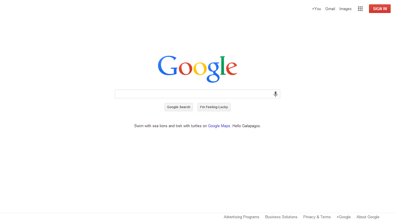
A couple of readers noticed this morning that the Google homepage has updated with a much more minimal UI, including a new flat logo. Gone are the shadows on the logo, and the black bar with links to additional Google services – in is a flat, color-tweaked logo and Chrome-style app button situated in the top right corner that gives shortcuts to other Google apps.
It should be noted that this Google homepage style has been an experiment for a few months, but this appears to be a rollout to non-experimental users.
Here is a comparison of the new and old logos:
![]()
![]()
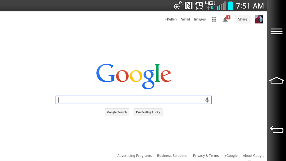
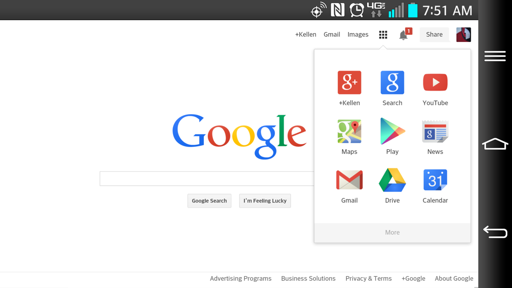
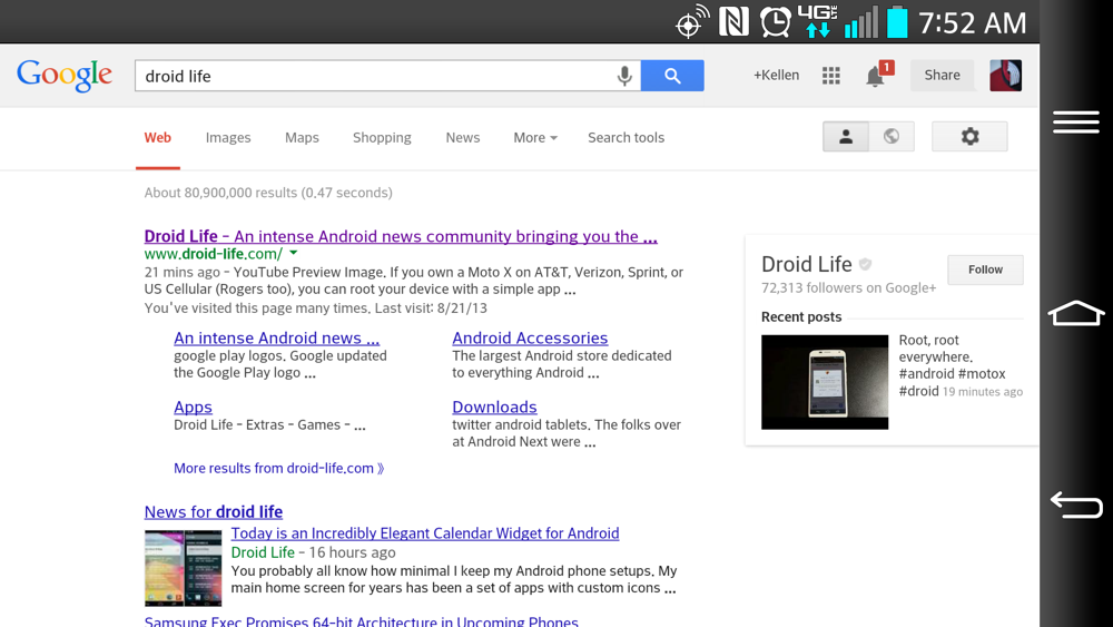
And here are some screenshots showing how the new app button will work throughout services. As you can tell, I’m only able to see the new UI through my phone’s browser and not in a desktop browser.
Anyone else seeing the new look this morning?
Cheers Damian and Aaron!