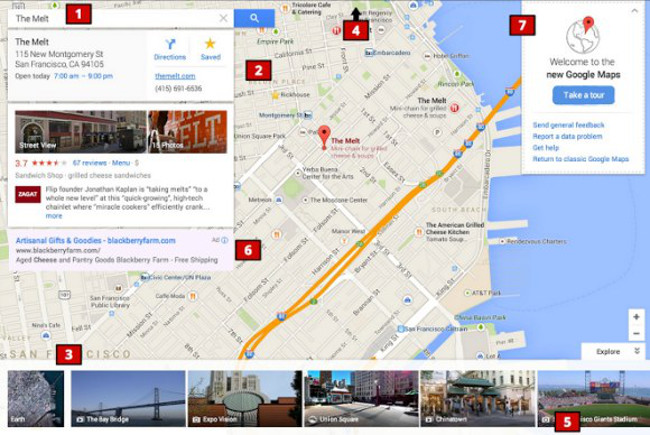
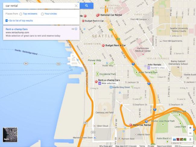
According to the folks at Google Operating System, Google Maps (the browser version) is about to get a major overhaul. The two images we have included in this post are reportedly screenshots of what the new interface will look like. As you can see, it’s a more full-screened experience, without the traditional sidebar for directions and search results. Results return on-screen and can even be tied to Google+ Circle recommendations (think friends’ restaurant recommendations). The color scheme has also been updated to match the style of the iOS Gmail app.
When first seeing this look, my mind – as it always does – ran to, “When is the mobile overhaul coming?!” But in reality, this is sort of how the mobile version of Maps works already, at least on bigger screens. You already get a full-screen experience because there is less screen real estate to work with in general on mobile devices. With that said, the look does come off as a bit more Google Now-ish, something we have seen from a number of Google apps over the last year. So in that sense, there is a chance that the mobile version is updated to at least match this look.
This new version of Google Maps isn’t live yet, but with Google I/O happening next week in San Francisco, don’t be surprised if it’s here before long.
Even though I use mobile devices constantly throughout the day, I find myself using the web version of Google Maps quite often and am definitely excited to see a UI overhaul. Anyone else?


I work in SEO sales and have to use Google Maps directly. How will this affect me? {{-_-}}
GOOD, because I’d always close the side-bar 90% of the time I’m in Maps
Bad, bad, bad ..
This is truly form over function. On a desktop 24″ monitor, I don’t need the extra 3 inches on the left to show SLIGHTLY more map, when it can be used, usefully, as an input area.
This makes no sense to me for a browser update. It makes sense for mobile maps.
I’m a big fan of overhauls to products I use on a daily basis. I’m with you
“The color scheme has also been updated to match the style of the iOS Gmail app.”
Screw everything about Google catering to iOS users.
I use it everyday for work so I welcome a nice change!
Hope there’s a latitude layer instead of having to go to a separate latitude site
All I want from Google right now is to keep iGoogle going past November….errrrr
They’re going to replace it with Google Now in Chrome. I much rather have Now.
This is going to be a chrome packaged app come Google I/O.
This is how it is on the Nexus 7, figured it was only a matter of time before they converted over.
I hope there’s an option to view fullscreen!
it will be fullscreen
It looks very clean and Holo – It’s a great update!
Yolo.
You Only Love Oreos?
Oranges, but Oreos will work.
Whoever downvoted this clearly doesn’t r/androidcirclejerk. But then again, if they did, they’d be on Android Police.
To get a sense for it, tryout Google Maps Engine: https://mapsengine.google.com/
Okay. It looks awesome.
TY
I like the concept, but unfortunately the colors and style make it look a lot more like Crapple Maps.
Except the part where it works.
Well obviously. They’re universes apart.
i like it a lot
This is excellent. I always wind up collapsing the side bar anyway.