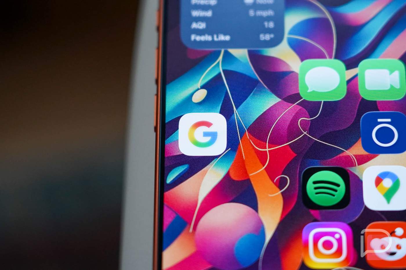
Back in May, when we first noticed that Google Search had received a fancy new gradient “G” logo, we imagined it wouldn’t be long before that same gradient moved elsewhere throughout the company. Today, Google says that this new “G” logo or icon is indeed making its way company-wide.
The announcement from Google today about the logo change was short and they touched on it still representing their 4 colors only now in this gradient style. It somehow “visually reflects [their] evolution in the AI era,” and I’m just going to take their word for it. Gradients and AI are not two things I typically associate with each other, unless it’s someone asking for AI to make them an AI wallpaper with gradient style, you know, like all of the bad AI slop filling your favorite wallpaper app.
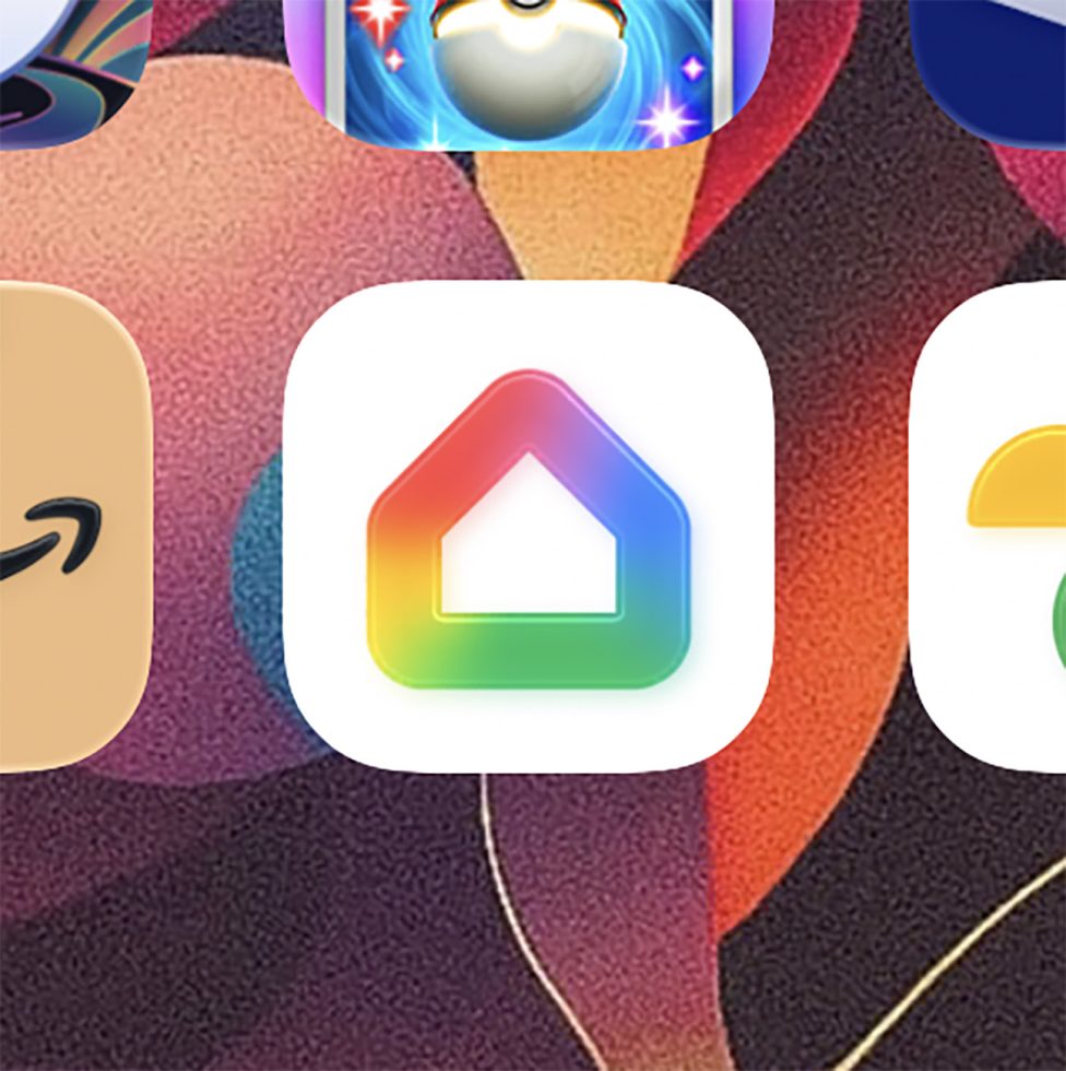
But beyond AI and gradient talk, be aware that this gradient style will end up on almost every Google app on your device before long. Over the weekend, the Google Home app on iOS switched to this style, yet still managed to be different. Sure, it has that gradient and it also is very bubbly. Maybe that’s an iOS style guideline. Just know that more gradients are coming! I’m guessing Google Maps or Photos are next. Or will it be Gmail?
