Snapseed, Google’s own photo editing application that introduced tons of people to the world of overdoing HDR effects, received a massive update this morning, bringing new effects, an overhauled user interface, and a shiny, flat icon.
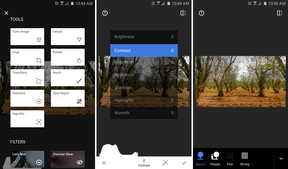
While the basic use of the app has gone unchanged, such as the dragging of your finger to scroll through effects and sliders, icons and navigation throughout the app has been changed. When you open the app, you are asked to select a photo for editing. From here, there is a huge list of edits you can make to a photo, such as applying an Auto Awesome-like effect, where the app will choose the best edits for any given photo, or you can scroll through the contrast, saturation, shadows, and ambiance all by yourself.
As for HDR Scape, don’t worry, it is still alive and well. Other effects include a new perspective adjustment tool, which almost delivers a 3D-esque feel to your photos. In addition, there is Lens Blur, Tonal Contrast, Glamour Glow, and Noir.
Our favorite part of the new app, though? The icon, of course.
To try out the new Snapseed, head on over to Google Play to see if it is available for you. If you would rather not wait, you can download and sideload the APK from right here.