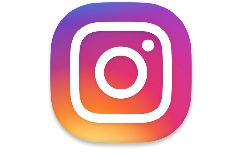
Instagram’s non-flat, retro camera icon that seems about six years beyond its prime, has been replaced this morning by a new app icon and a refreshed design. That’s right, we have a new Instagram icon!
The new icon is an updated take on the original icon, only in rainbow gradient form. Honestly, it’s pretty bad! But hey, I’m no designer and I think (Maybe. Hopefully. Please do me right.) I’ll be able to live with whatever most icon designs interpret this as through their own creations. (Stock?) Rainbow gradient, folks, rainbow gradient.
As for the app refresh, the UI elements are now mostly black and white, likely as a way to put the focus on your colorful photos. We saw this UI in testing on a handful of devices over the past couple of weeks, but it’s now official as the Instagram layout. There are also smaller buttons along the bottom of the app for navigating, again, to get you fully immersed in the app and photos. The location of UI elements all remain the same, though.
Thoughts?
UPDATE: The update is now live and can be grabbed from Google Play or sideloaded here.
