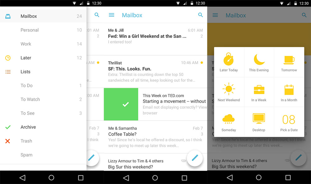
Mailbox, the Dropbox-owned email application that consumed the better part of the last year of my life, got its “Material Design” update this morning as v2.0.1.
The update introduces a lot of white. Well, the app was already plenty white, but it seems whiter than ever. It also has a floating action button for creating new emails, a slideout navigation drawer that looks like a floating layer when pulled, and overall, seems lighter, softer, and cleaner than ever. Search has been relocated as a shortcut at the top right corner of your inbox (instead of being buried in the nav drawer), the Snoozed/Inbox/Archived button tabs at the top of the app are also now gone, and signatures can now be displayed as you type an email.
For those new to Mailbox, think of it like Google’s Inbox, except that it was a real thing long before Google’s Inbox ever thought of existing. The app forces you to approach your email inbox like a task list, with the ultimate goal being to get to “inbox zero.” You swipe emails to the right to archive or delete, and swipe left to snooze them for a bit or add them to lists. There are ways to automatically move emails to lists, plus it will host all of your email accounts under one unified inbox if you want.
This is by all means one of the best applications around. In fact, it’s one of the first 15 apps I install on every new Android device. I’m currently testing Google’s Inbox now that it has Google Apps support, but the temptation to run back to Mailbox is there.
Play Link | Download Link (apk)