Prior to Google releasing Android 12 Developer Preview 1, we saw what were believed to be an early look at the new theme and UI changes for the next version of Android. Those first images were then followed by reporting that suggested we could see even more changes involving the notification area, lock screen, and system.
Now that this first Android 12 build is here, evidence to back all of those early reports up is surfacing. The folks at XDA were able to enable some of the changes to the lock screen and notifications area, all of which Google is still developing and hasn’t openly added to this first preview.
In this first set of screenshots you’ll get to see a work-in-progress lock screen setup that could eventually bring even more customizations to users.
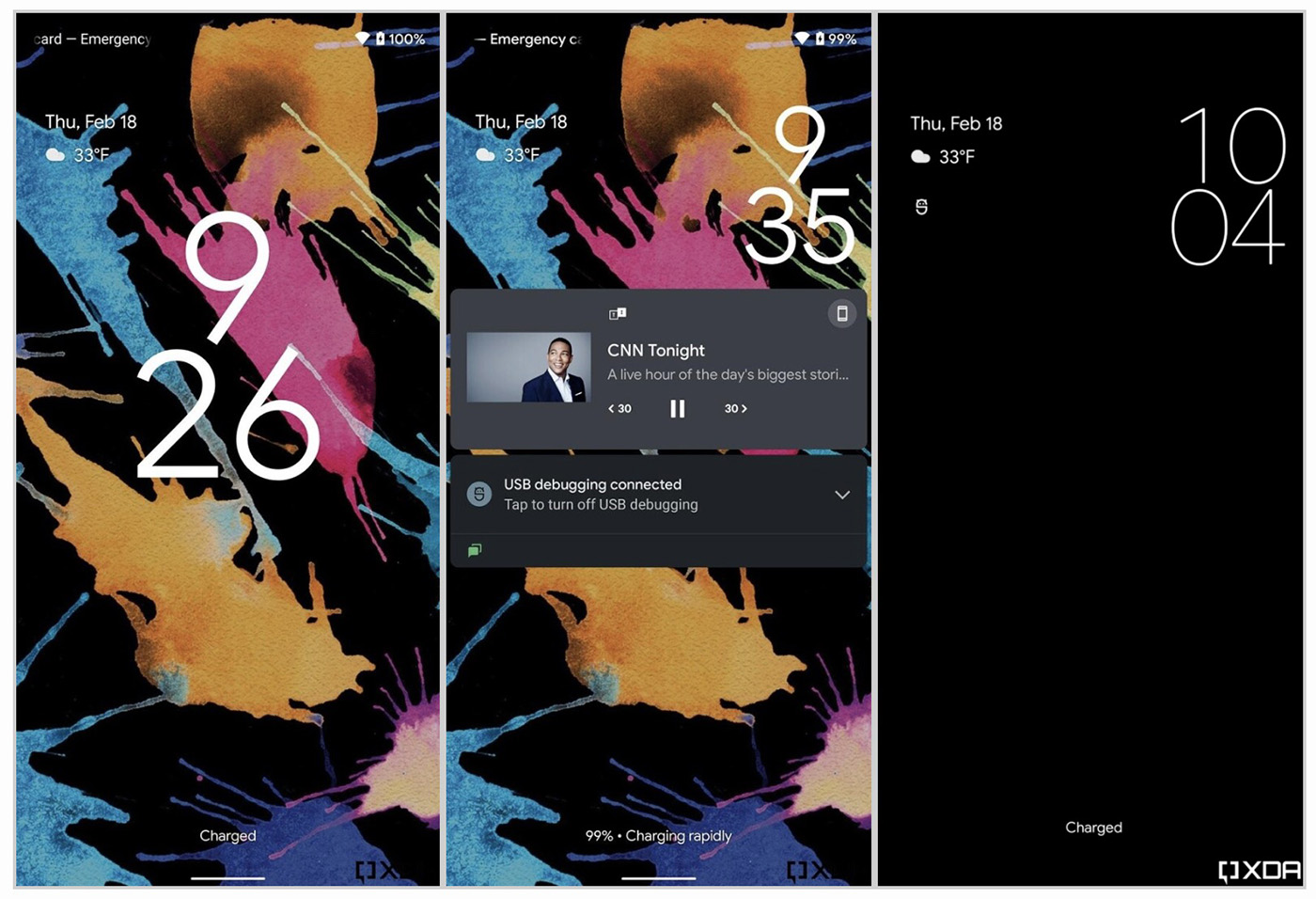
You can see here that Google is experimenting with a new layout that puts the clock with a stacked format and a huge size when no notifications are present, while the weather and date have moved to the top left. Once a notification comes in or you play media, the clock then shrinks and shifts to the top right to make way for centered content.
It’s an interesting idea that brings the lock screen alive, plus there could be more clock options down the road for you to choose from if this stacked clock isn’t your thing.
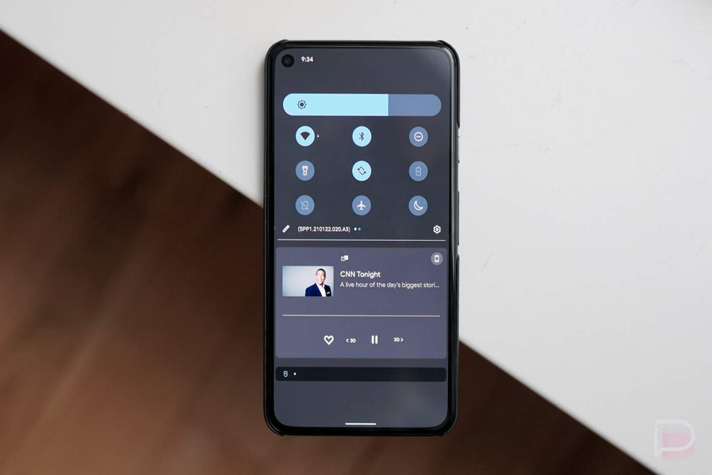
The next reveal we have is of the notification area. As you can see here we still have both light and dark themes, although everything is very blue instead of dark or black at this early stage. We showed you the change to the dark theme in a write-up yesterday, but this looks even less dark.
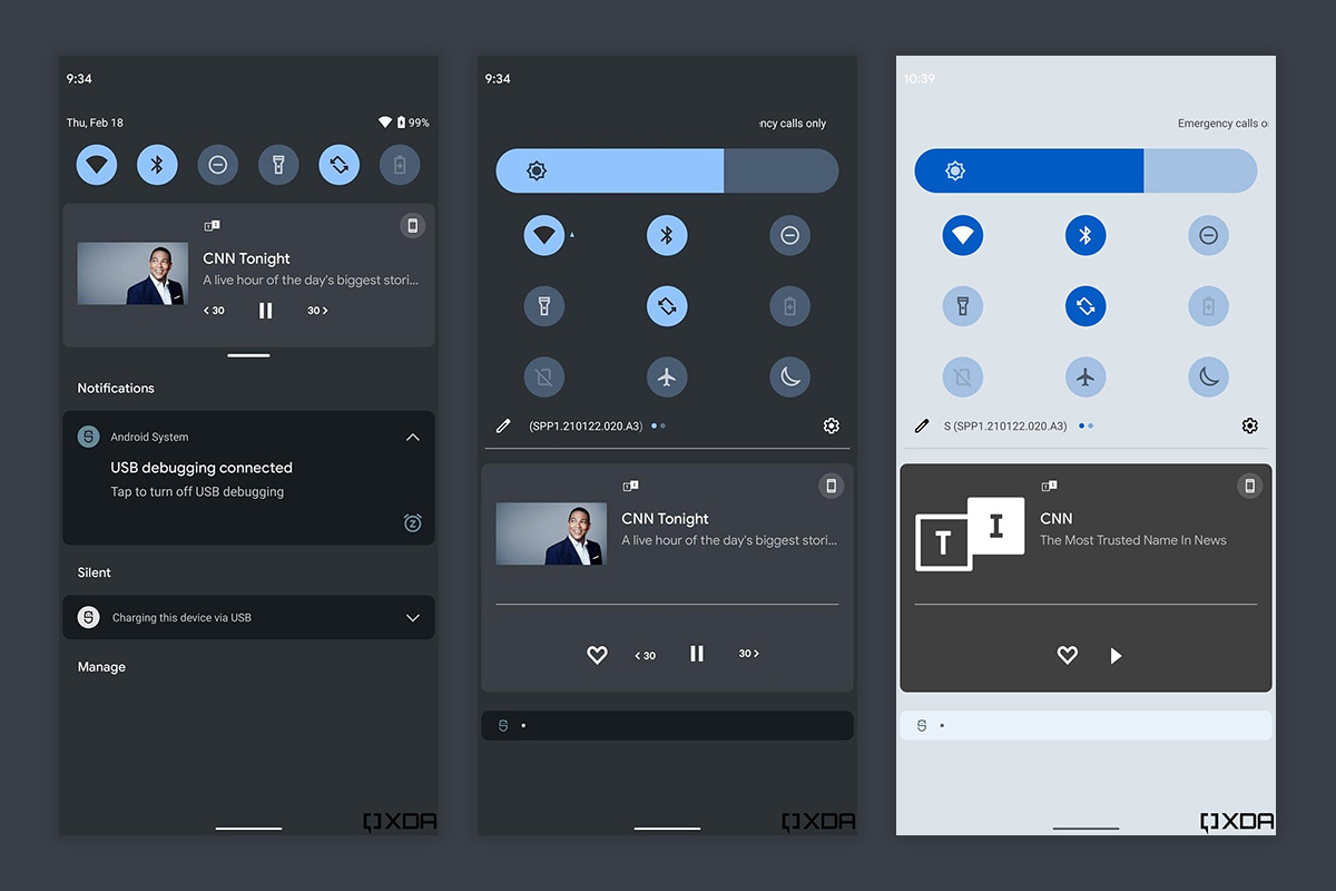
This isn’t dramatically changed from the current Android 12 notification panel, but there are a couple of tweaks to point out. First, instead of being fully transparent in-between notification sections, this has a frosted look that we believe will eventually tint towards a color pulled from your wallpaper, once the wallpaper-based system theme goes live. The other thing to note is the thick-as-hell brightness bar.
And that’s mostly it for now because Google has hidden most of this stuff and it requires a bit of background magic to enable it. It’s also very much broken and still being worked on, so it’s not exactly something we should all try to use today. So far, I think it all looks very clean, though, and I’m excited to see where Google takes this.
// XDA


Hello iPhone is that you??
Ugly as hell! Just make everything black in dark mode instead of trying to mix these random dark colors and get away from that ugly blueish green. You shouldn’t say anything about this and Samsung in the same sentence, that’s a insult to Samsung.
The greyish blue background is horrendous, just leave it simply black.
My only Complaint is that brightness slider i comically big hopefully the tone is down a bit
Did they get rid of that terrible wallpaper zoom they added in Android 11? Nothing like making or choosing a wallpaper just the right size to fit your screen, leaving room for dock icons and the notification bar or making sure a particular element lines up perfectly with your notch/holepunch if you have one, only to have the OS zoom it in by ~10% and render all your careful planning moot.
UGH …. wth are they thinking with Not leaving it true black. That color is terrible if that is the new Dark Mode look.
On a different not anyone running it that knows if there is the option for 2 or 3 button navigation in place of all this gesture garbage.
They are thinking of making it have less eye strain. A black background with white text is horrible on your eyes.
that is all well and good if it bothers ppl, but they should at least leave the option for true black like they had in the past. No reason to just get rid of it & make it a new look.
Personally I just prefer the true black as it doesn’t bother me, but i also dont spend near the amount of time on my devices like so many ppl do. Fact is just the small screens themselves put strain on ppls eye and I avoid doing things on my device at all cost if possible & would rather just do what I need from a computer
i dont think you understand the issues with using real black. Not only is it a huge issue for eyestrain but also for legibility. Theres a bunch of design usability studies on this if you’re curious. As a product designer I’ve been tempted to do #000 backgrounds but really its not as successful as you think.
but hey, maybe there will be an option or workaround for you
Never ever had a problem reading the contrast between pure black (#ff000000) and white text at all? I do a transparent substratum theme and there is no problem reading that contrast.
Can we see before & after? I haven’t been on android in a bit and curious how it compares to current Material Design.
Ugh, I hope they have a totally back option too, like it took so long to get dark mode, but OLED screens do benefit from total black vs. grey. Also, it’s annoying that the labels under toggles don’t show up in the fully expanded pulldown now…
Going back to the ICS colors I see. Instead of changing the UI why not just enable settings to allow users to create their own unique setups?
This, instead of a one size fits all why not allow users to change it as they see fit??
Of course it would show CNN and Don Lemon ????
That’s “D Lemon” to us schmoes 😉
Got to be “woke” to satisfy that crowd of small but loud people.
I was rocking a very similar grey and blue theme back during the ICS days. Or was it Jellybean? LOL
Ugly all the way around.
Looks good to me.. except for the lock screens don’t know what’s going on there.