At some point in the next few weeks, Google is expected to open up the Android 12 Developer Preview program before several beta builds lead us into a stable release of Android’s next version over the summer. Assuming, of course, that their schedule for this year’s release matches that of previous years.
We haven’t seen much of anything leak for Android 12 to date, outside of back-end changes or minor tweaks that could be included. Tonight, our knowledge of the look of Android 12 may have increased dramatically if the screenshots we’re sharing here are the real deal. This could be a first look at Android 12.
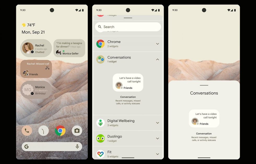
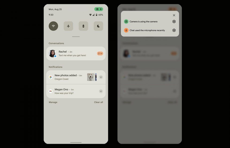
First spotted by XDA, the screenshots here are supposedly mock-ups of Android 12 pulled from a document that Google put together to highlight changes that their partners should be aware of. The screenshots show off a new home screen and icon color palette, a new widget picker with new widget shapes, a more minimal and spread out notification shade, and a new privacy panel with dedicated recently accessed permissions notification.
The first shot we have here shows off that new home screen and the widget picker, as well as several widget mock-ups. I don’t know that it’s a dramatic change, but the actual widget picker looks much improved and the shapes of smaller 2×1 widgets look nice, if not a little iOS-like. Seeing the colors all together like this has me wondering if Google has something cooked up that will allow your icons and widgets to pull from wallpapers in order to give you a really custom, immersive look.
Next up we have that notification shade, where you can see several changes. First, the quick settings shortcuts have been reduced from 6 down to 4, which certainly sucks. Second, we have a notification shade that has ditched its transparent background in favor of a faded light shade that makes the gaps in-between sections much less drastic. It reminds me a lot of a skin you might see from several of the Chinese Android phone makers that heavily skin Android.
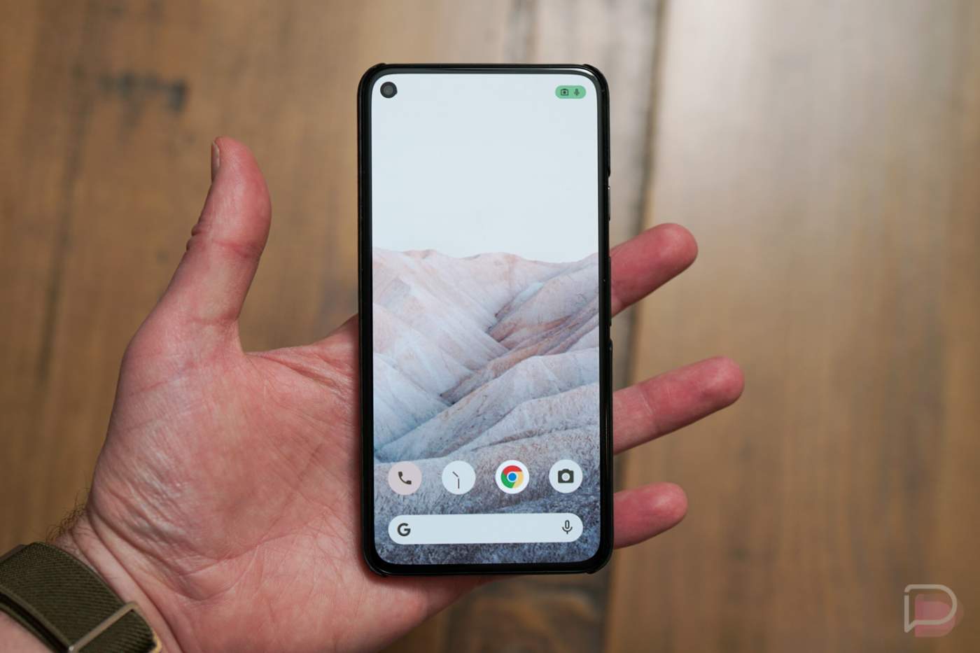
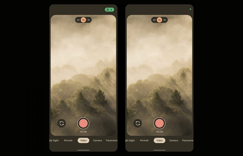
The other thing to note here is that green icon that is showing both camera and microphone in the top right corner. It sure looks like a privacy area that will highlight apps that have recently used those two permissions. You would be notified of that usage and then allowed to quickly change those settings if you’d rather those apps not do that.
To give you another example, in this screenshot I would once again point you to that top right icon, where Google is showing what that privacy notification would look like in an app when those permissions are in use. According to XDA, this may be a required change for all manufacturers to use with Android 12 and the color needs to be consistent across the ecosystem.
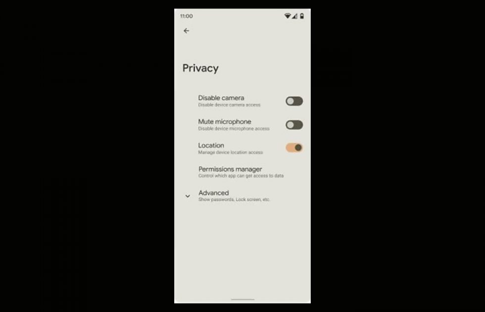
Finally, Google may be working on a new privacy page within settings that lets you easily and fully disable the camera and mute the microphone on your device with a simple toggle.
There is quite a bit to take in here from these screenshots. I think the first takeaway I have is that Google might look to Android 12 for pretty big UI adjustments following Android 11, but that there will be a further focus put on privacy. I’m cool with both of those things.
Your thoughts?
