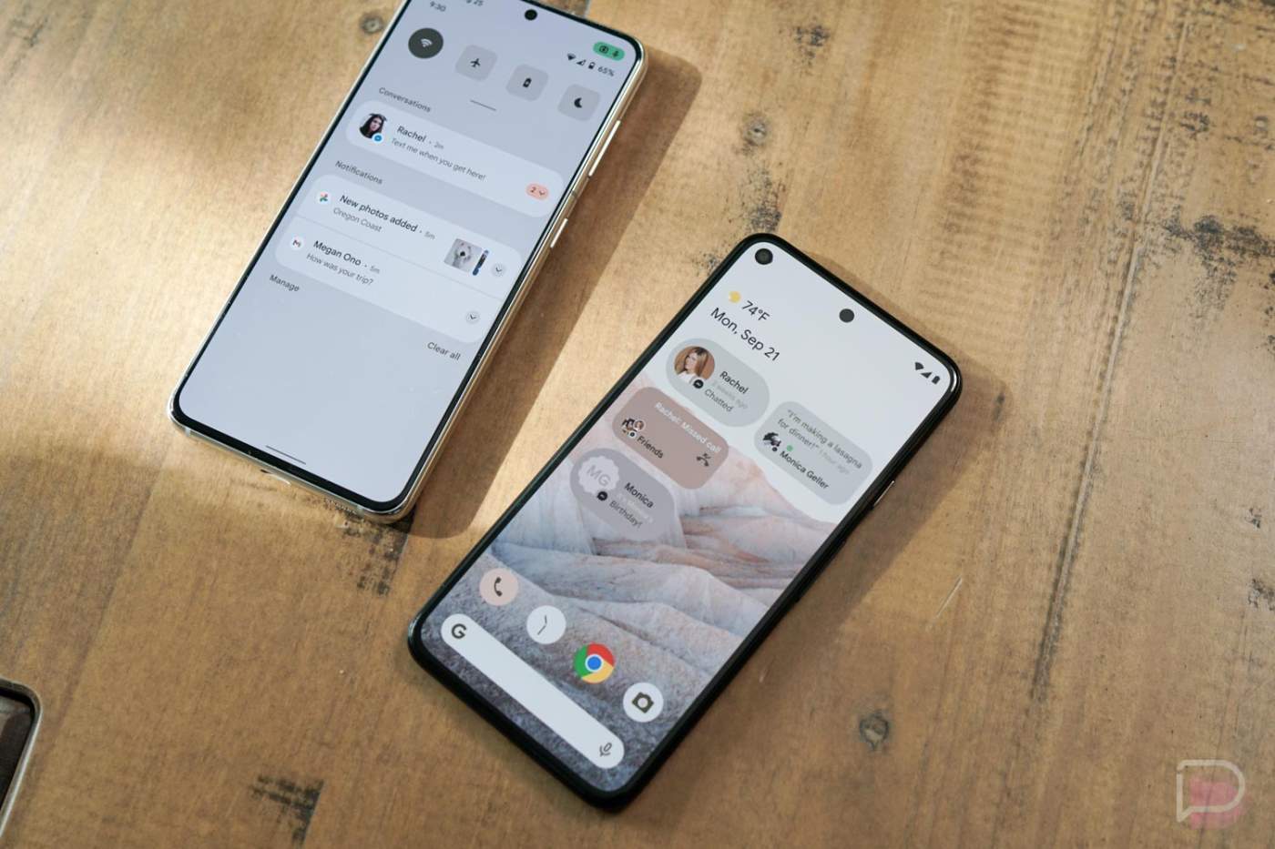
I should be used to the schedule by now and have already been preparing myself for the first build of Android 12 to arrive over the next few weeks. After all, Android 11’s first preview showed up in mid-February of last year and brought with it several changes that made their way into stable. But here I am, still a bit blown away by last night’s potential leak of the next version of Android.
Several of you have weighed-in on last night’s supposed Android 12 UI and feature reveal already. I think it’s safe to say that you are torn on whether or not you think the changes look good.
I can tell you that I’m all for Android continuing to mature, even if that means adopting several UI elements from Samsung and Apple’s skins. Android needs better widgets and we may get that. Android needs even better privacy controls and we may get those. The notification area from Android 11 needs fixing and this tries to do that. Having a system-level color profile that potentially adopts to your wallpaper is pretty freakin’ cool, assuming that’s what we’re seeing.
Overall, I like what I see (outside of the drop in quick settings shortcuts). If this is indeed Android 12, it looks like Google is taking what they created in Android 11 and making it much less patchy and more polished.
Click here if poll not loading
