Opening Google Play today might blind you and that’s because the all-white new visual refresh is here, officially. We told you last week that this was finally re-rolling out for the 4th time and today Google acknowledged it.
Why the big visual refresh? Google wanted to align the Play store with the newest Material design language you’ve seen in other apps, so that’s why we’ve gone full-white here. It will likely eventually lead to a dark theme too, we’re just not there today.
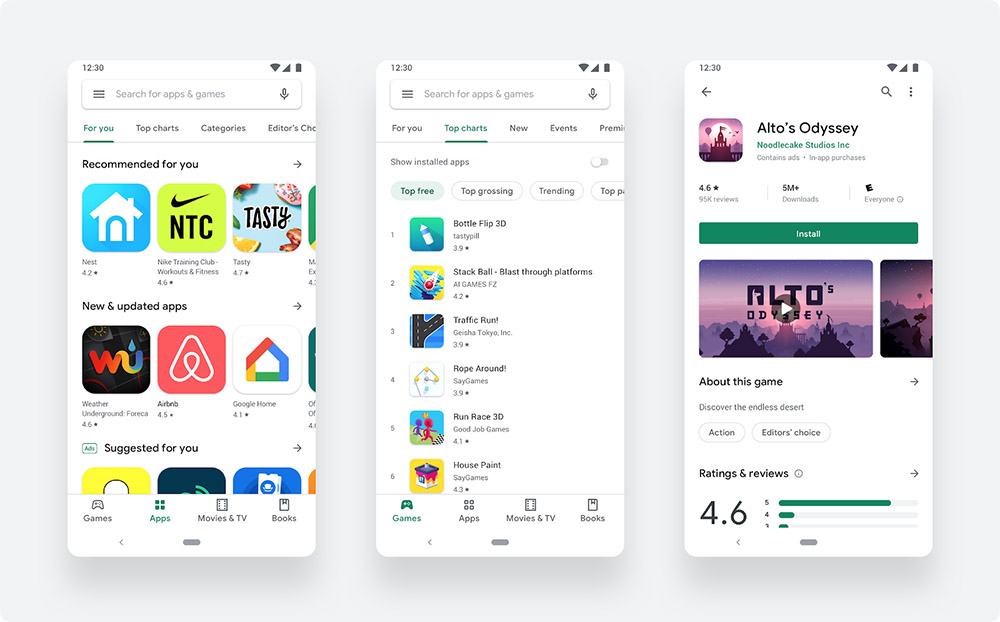
So what’s new besides the new coat of bleach? Umm, we have a bottom navigation bar for easier browsing, “distinct destinations” for games and apps, richer app information on app/game listings, more prominent call-to-action buttons, and a new icon shape. All jokes aside, it’s actually a pretty clean new UI, I just wish it wasn’t so bright.
To check for it, open Google Play. If you aren’t seeing it, feel free to try and clear cache on it.