Yesterday, the images we have included in this post were sent to 9to5Google as a potential first look at Android 4.4 “Kit Kat.” Are they real or are they fake? That’s the big question on the tech media’s mind right now. The images show a familiar wallpaper, newly redesigned flat icons, and new UIs for both the dialer and messaging application. So are they the real deal? I don’t think anyone really knows. They could be a brilliant troll job or they could be an early enough look at Kit Kat that shows all sorts of inconsistencies for Google to tidy up before launch.
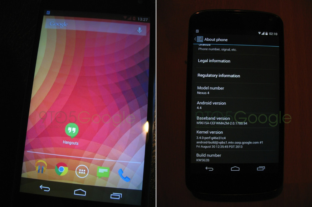
If we first take a look at the home screen picture (top left), you’ll see a wallpaper that is by no means new, but that doesn’t necessarily mean we should discount it. We have seen Google stick with Nexus wallpapers for extended periods of time, only adding on a couple of new ones from release to release. So by this person showing an old wallpaper, we can’t necessarily say if these are fake or not.
![]()
This screen also shows newly redesigned flat icons that lack the shadowing of the current Google icon set. With Google’s recent rebranding to a flattened “Google” logo, this move actually makes some sense if they want to remain consistent across the company. I also checked around at a variety of icon packs in the wild, and couldn’t come up with one that matches this look. The closest is Holo, but the Music, Chrome, Dialer, Messaging, and Hangouts icons are all slightly different and not exact matches.
![]()
The third part to this first screen is where things get a bit wonky. You’ll notice that the notification icons for WiFi, signal strength, and battery are all red. Now, there is a rumor circulating which suggests that Google will make notification bar colors customizable, but we’re not understanding why only those three icons would change and not the clock or random “K” debug icon. Unless of course that isn’t a debug icon? Tough to tell.
If we look at the “About screen” image, you’ll see a listing of Android 4.4, a 3.4 kernel built on August 30, and a build number for Android of KWS62B. Does that all look legit? Since I won’t claim to be a kernel guru, it could very well be, but it’s also information that could easily be faked. I’ve seen some suggest the kernel should be newer since this is Android 4.4, but that’s up for you to decide. Moving on.
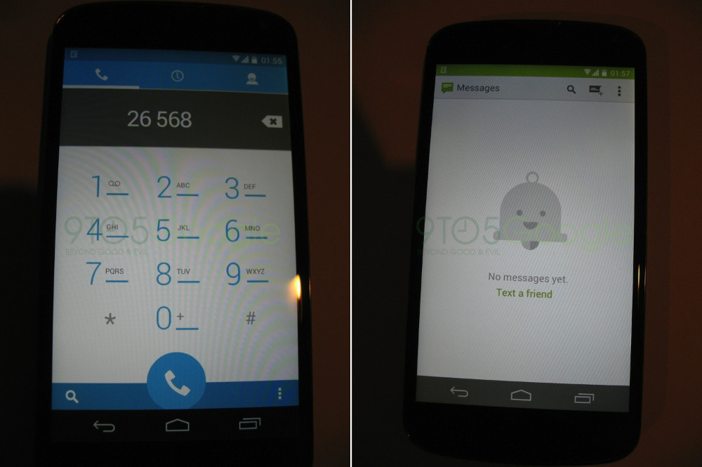
In these two images, we’re looking at what could potentially be a brand new Dialer UI along with a revamped Messaging app. If we start with the Dialer, I’ll just say this – it looks beautiful. Please be real. You have the three tabs up top for dialer, history, and contacts, just like you do with the current stock Android Dialer. Obviously, the color scheme has changed with more blue and white, and far less black. In fact, it matches up nicely with the current People app, which carries a similar style. The search, dial, and action overflow menus are placed exactly as they are now.
The only odd piece here is the notification area once again. All of the icons are back to a white color scheme, but the notification bar is now semi-transparent so that you can see partial blue shining through from the Dialer app. That’s a cool effect and all, but why wasn’t the notification bar transparent on the home screen as well, or in the revamped Messaging app sitting next to it? Or maybe it’s not transparent and it’s simply a dark blue to match the blue from the app? Impossible to tell from this photo.
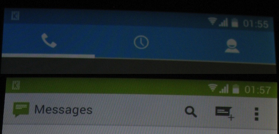
And speaking of the Messaging app, this could also potentially be its new UI. The icon in the middle is of Mr. Jingles, who became famous on Google+ as the notification icon. Since we are seeing Google make a massive push for G+ and to create some sort of cross-platform messaging system with Hangouts and G+ Messenger and Google Voice, this isn’t at all surprising to see Mr. Jingles here. With that said, why aren’t we eliminating the messaging app and just going with Hangouts at this point? Maybe Hangouts isn’t ready to be a stand-alone messaging service just yet? Or maybe it never will be? The app does look great, though, since the stock Android Messaging app has been horrendous for years and in dire need of a makeover.
The only other question here again, as I just mentioned, is the notification bar. In the Dialer image, we may have a transparent notification bar which shows the blue shining through, yet in this app, the notification bar has simply changed to a solid green to match the color scheme of the messaging app. Hello, inconsistency? Oh, the bottom navigation bar also looks transparent (at least to me) in the messaging app, but not anywhere else.
In the end, I just don’t know what to think. I really like what I’m seeing, that’s for sure – it’s just impossible to tell if any of this is real or not. Google has never been the king of consistency in anything they do, so to see inconsistent UI issues from one app to the next is not surprising at all. We also have seen decent UI changes whenever Google decides to rename a new version of Android. The changes from Froyo to Gingerbread to Ice Cream Sandwich were all intense, with the jump from ICS to Jelly Bean more of a polishing. If Kit Kat looks like these images, this would fall more in line with a polishing.
Then again, in terms of looking at this as a leak, why were these pictures taken at such random times? For example, one photo was taken at 13:37 (1:30PM), but then we have two taken minutes apart at 01:55 and 01:57, with the last taken at 02:10. If this leak came from the same person, why not take them all at the same time? Was this a late night troll PhotoShopping-mock-up party that took hours to complete or am I looking too deep into that?
You guys tell me. Do you like what you see? Is it all fake?
These images were also sent to Android Police who believe they are fake.
Via: 9to5Google
Cheers David, Kidtronic, thedonxr, and Justin!