A week ago, Motorola opened up a contest that asked designers to reveal their vision of the Moto 360. The prize? A Moto 360, of course. The contest itself didn’t grab our attention initially because Motorola included a potential price for the soon-to-be-released smartwatch of $249. But now that a week has passed since Motorola attempted to shut that price down, we can focus on all of the beautiful designs that have come through the contest, and boy, are there some great ones.
The entries are flooding in by the day, with the entry period closing on June 10. Since there are bound to be at least another 12 gems designed between today and the end of the contest, we may do this again. For now, we have put together a list of our top 12. If this doesn’t get you excited for the potential of the Moto 360, then I don’t know what will. Should Motorola allow third party skins or clock faces like this to be installed on their watch, then this could end up being the best piece of technology in the last few years.
Here is our list.
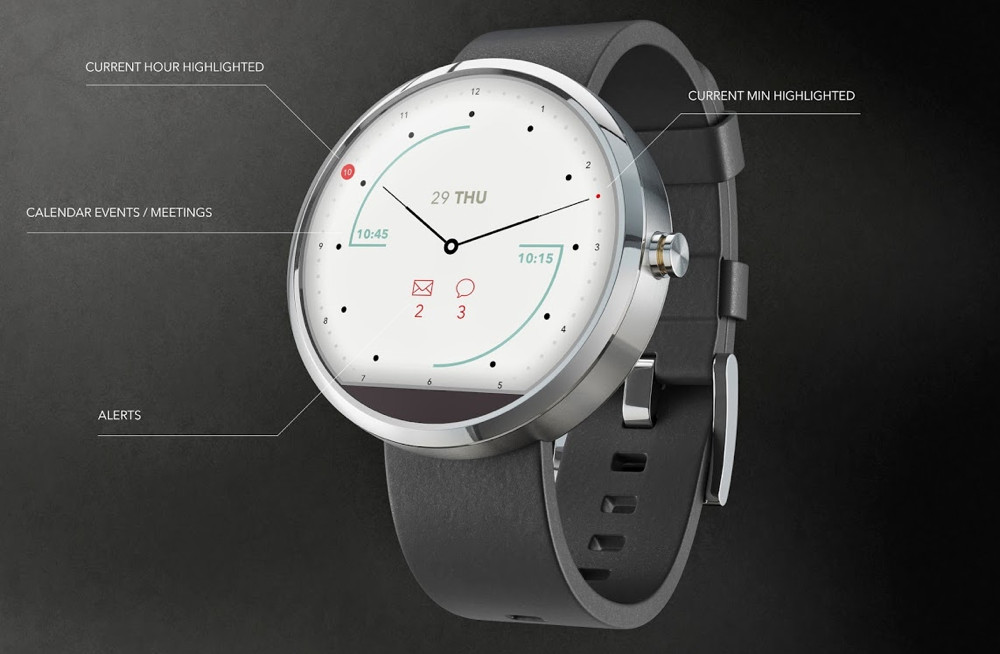
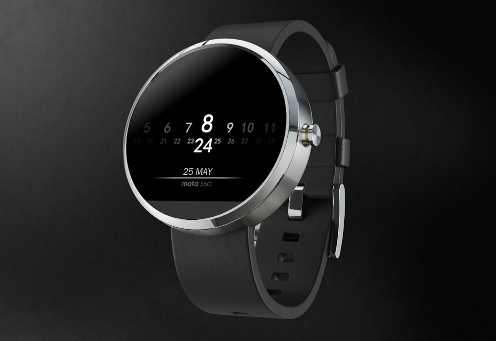
It’s clean, classic, yet still shows calendar events and notification counts for things like email and messages.
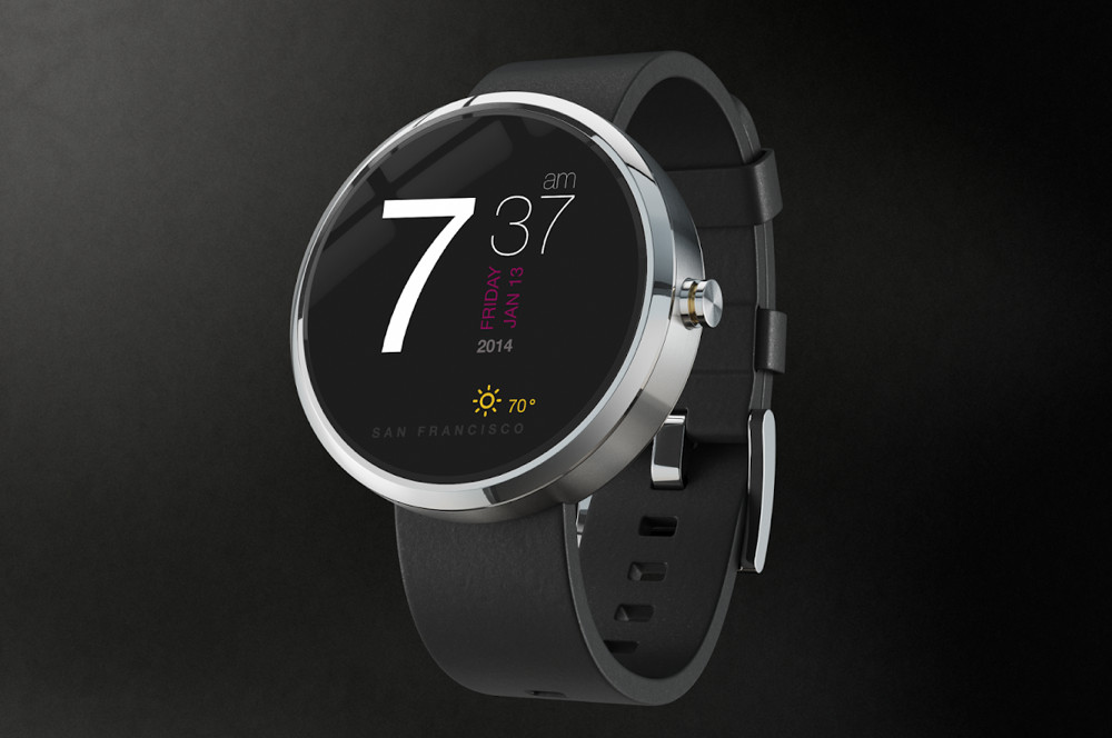
It may not have notifications or app shortcuts, but this digital clock face brings you the time in an easy-to-read format, which is important with a clock. It then adds in calendar, weather, and location without overdoing it.
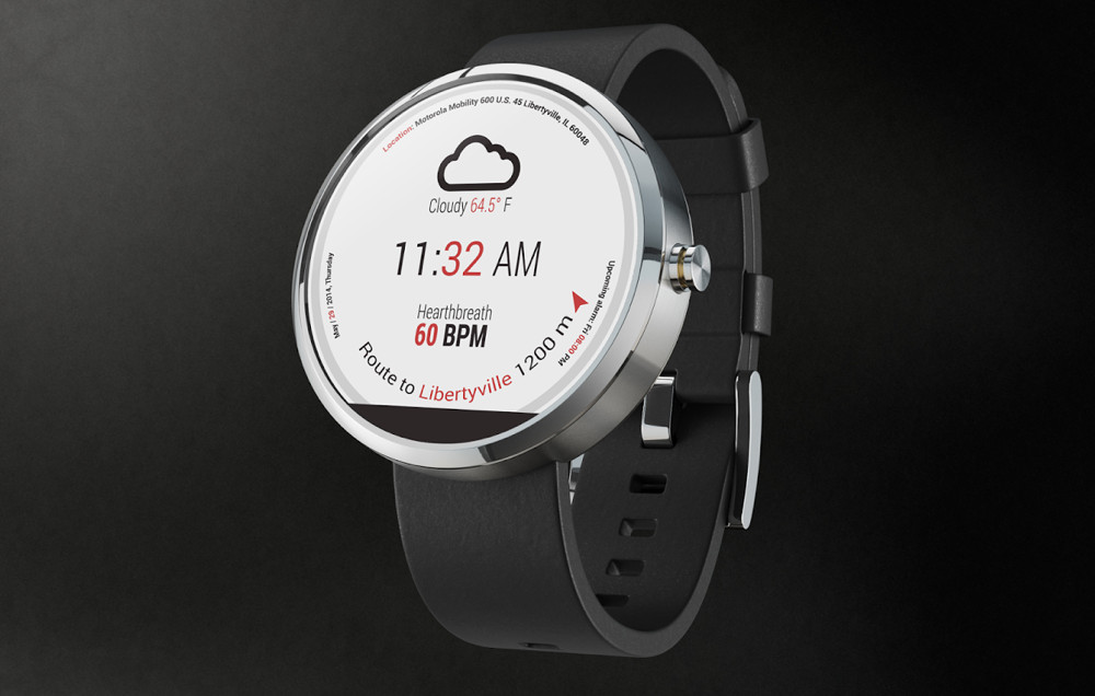
There is a lot going on here, yet the concept manages to keep the important items, like time and current weather at the forefront. You also get navigation info, heart rate, future alarms, the date, and current location as added bonuses.
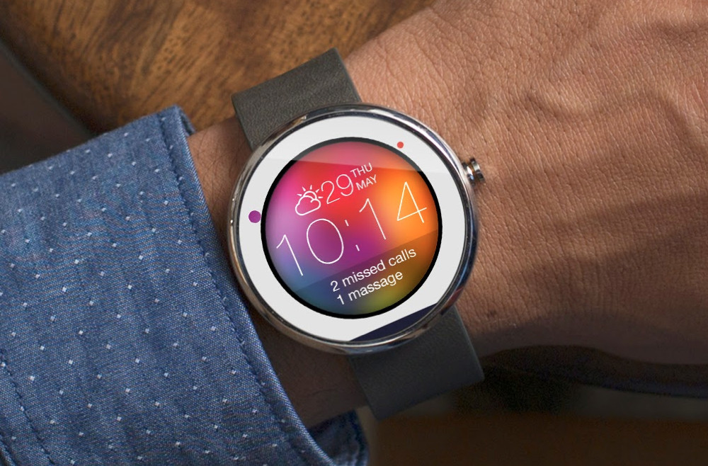
Simple time, current weather and date, plus a small area dedicated to missed messages. It comes off a little Galaxy Gear-ish, but a font change would probably change that.
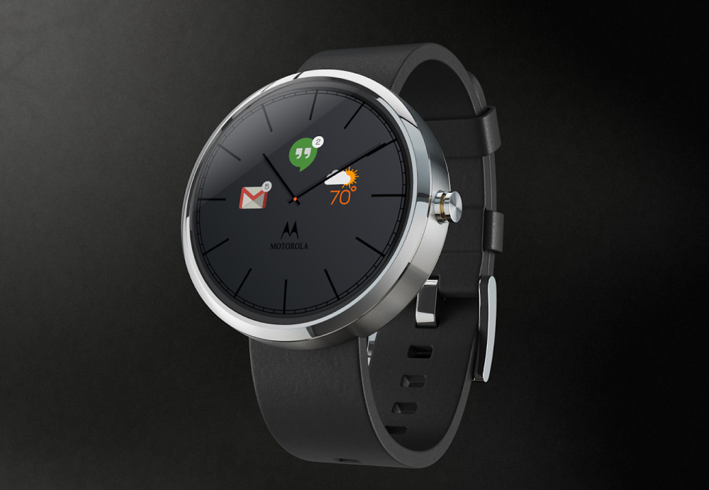
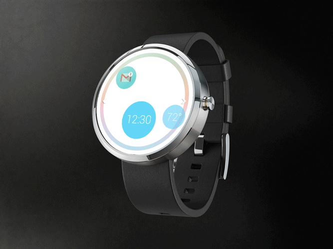
It’s a classic watch styling, but then it becomes tech-forward with colorful icons to weather, Gmail, and Hangouts. I do wish the clock hands were white or grey, to make them easier to read, but I like the contrasting styles together.
By showing love for Muzei Live Wallpaper, you can see how this clock could change depending on your wallpaper mood. The possibilities really become endless. Couple that with a clean watch font that shows time and date, along with simple and minimal icons at the bottom for frequently used apps, and you have a winner.
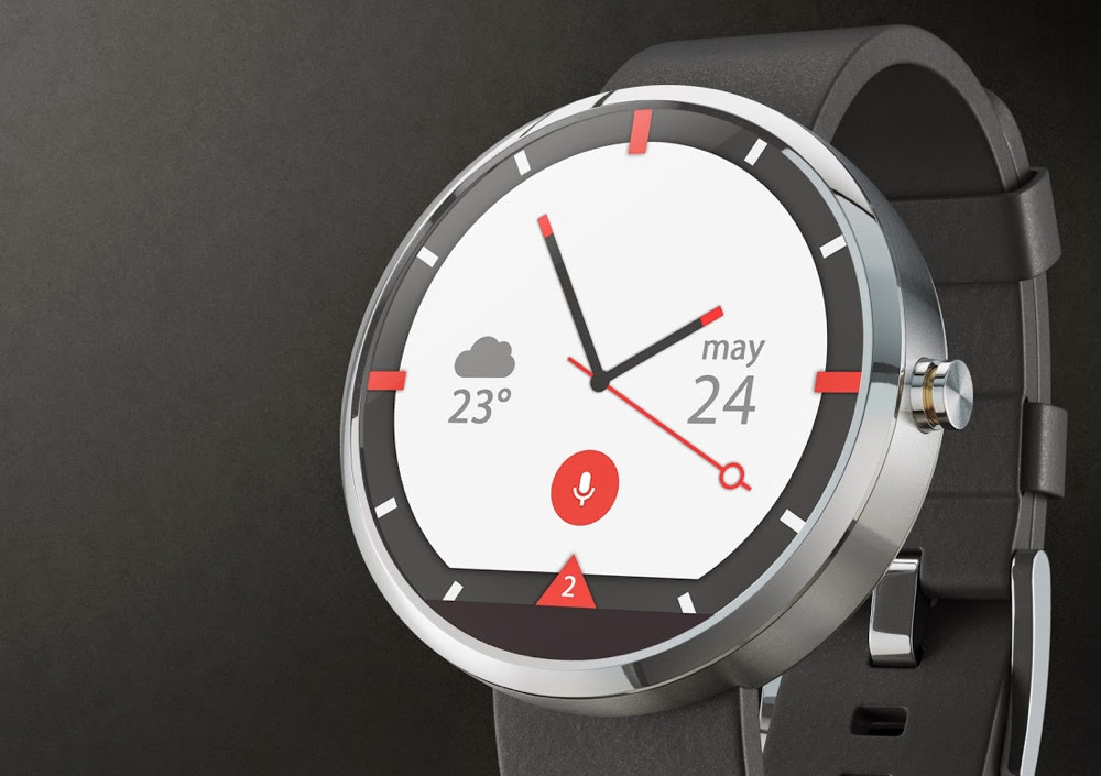
I really like the Google Now-esque look here, plus you get a familiar clock face with weather and date.
For those who want their clock face to just show time and date, here is a concept that could animate as the time changes. Minimal and beautiful.
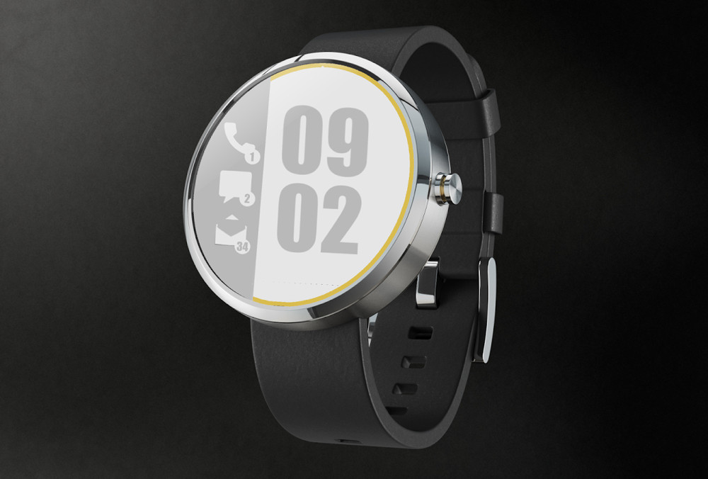
A big, bold time on the right, with shortcuts on the left. It doesn’t have some of the complexity of others, but do you want your watch to be complex?
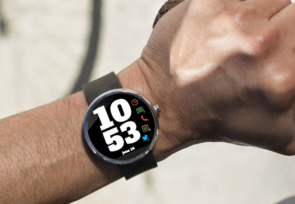
Similar to the last design concept, the focus here is on the time, but with shortcuts to your most used apps. This is a watch first, by the way.
It’s cartoonish, yet fun. I don’t know what else to say, other than it would be fun to use for a couple of days.
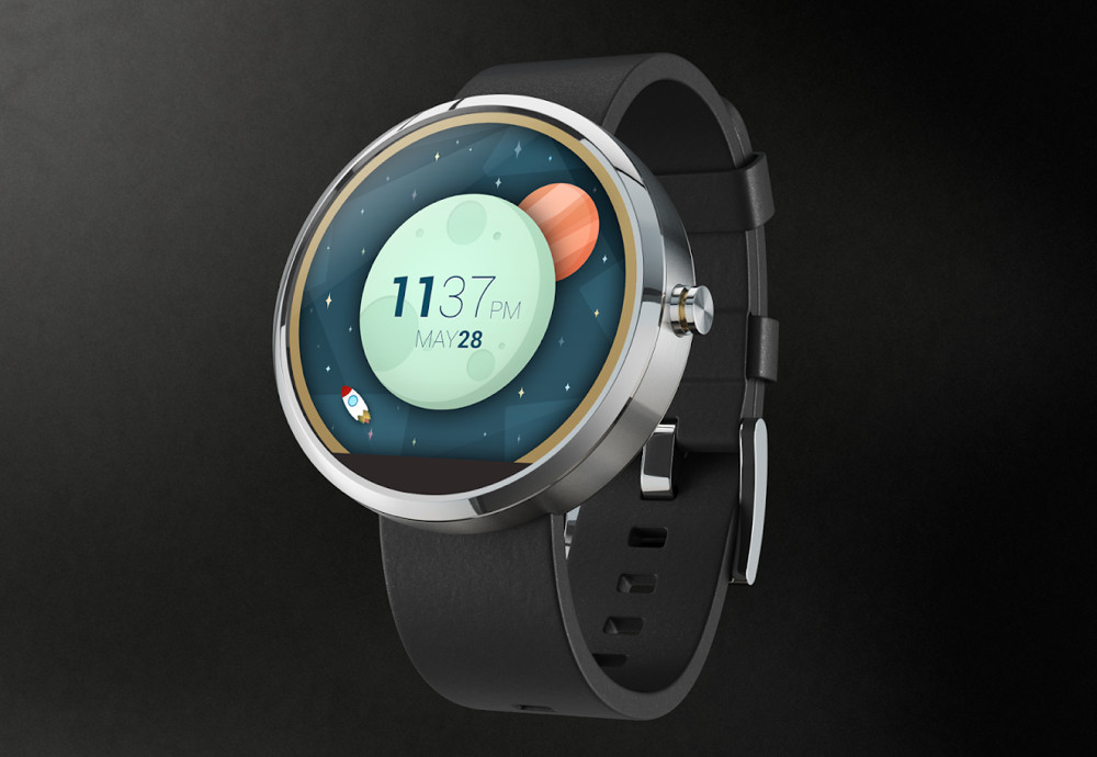
Because pretty animation.
To see all of the other amazing designs, cruise through this Moto 360 community on Google+. Let us know if you find others that are equally as awesome.
Collapse Show Comments81 Comments