Google TV has an Apps Only mode – I basically learned that today. Apologies for not sharing this earlier, as many of you may find it more appealing to use regularly than the bloated, content recommendation machine that is Google TV’s current experience. And I learned all about Apps Only because it is apparently getting an update that refreshes its look. Huh.
Apps Only, for those like me that had not yet acknowledged this setting, is an option within Google TV that lets you hide all of the recommendation and library stuff and just shows you a scrolling list of your apps. When explained that simply, it sounds glorious. However, it takes away search and also then forces you to scroll forever horizontally to find the apps you need. It’s so basic that it’s not actually very good.
In this new update, Google appears to be at least changing up the UI some to get rid of the never-ending side scroll fest. Once updated to Android TV Home v6.0.16, some users are seeing an apps page with bigger buttons and a vertical arrangement. It looks miles better than the old version you may have used.
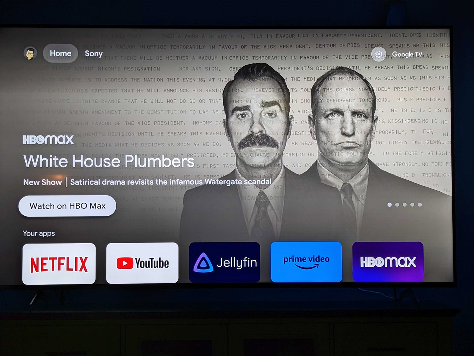
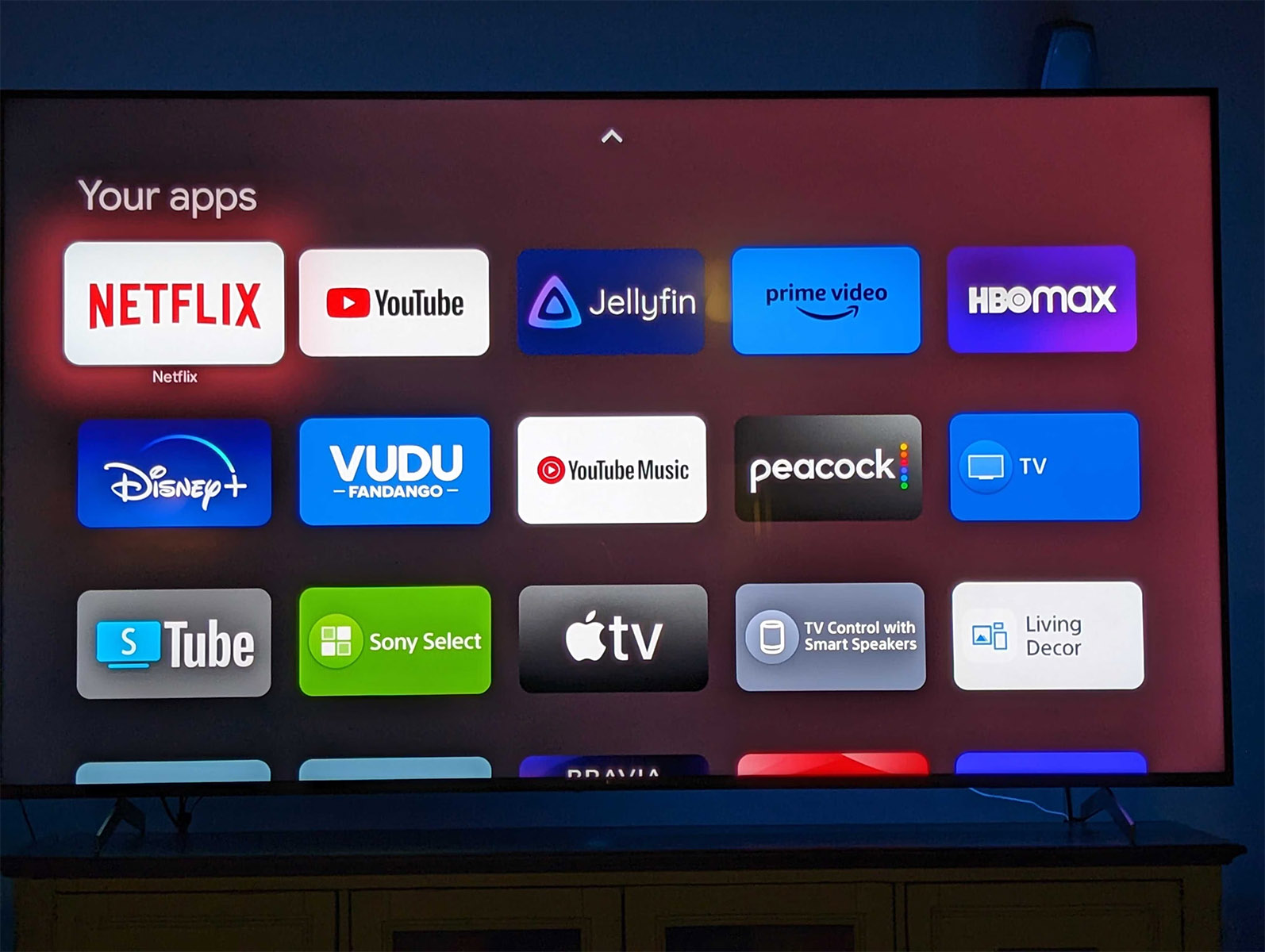
The example above is from someone with a Sony TV that received the update already. I’d imagine you can sideload the update to try and get it sooner from your favorite APK site if that’s your thing.
Unfortunately, the rest of the mode still looks too bare bones for my liking. Google at least needs to give us a library tab and search to make this more appealing. Then again, this isn’t really how they want you using Google TV, is it?


I made a switch to an appletv 4k just because I liked the simple UI better. I miss using my shield sometimes, but the experience for tv has been smoother, outside of Emby, which apparently excels in Android – though they claim to be working catching up.
I use about 8 or so apps, this sounds ideal for my use-case.
I use 2. Youtube and Plex. lol
Why do all these companies seem so averse to just letting us edit the layout so we can put the things like our library or apps where we want them? I don’t mind the recommendations, I just want to see my library first instead of in a completely different tab.
Because one of the primary true purposes of these devices is to try to sell you content and subscriptions, not to simply let you view your library.
It’s antithetical to that purpose to hide the library, though. I add things to my watchlist all the time when I don’t have time to watch them, and if my library were more visible I’d be more likely to sign up for the services hosting those options, or outright buy/rent them.
As of now they just go from recommendation to watchlist to lost forever in the ether of ADHD.
May as well just get a remote with the streaming services as buttons on it
that’s terrible as I don’t use any streaming services. I just want a remote that has customizable buttons only. I use plex and youtube. That’s it.
Download button mapper and you can have it change the netflix button to automatically launch plex 🙂
I already have it. It has problems
I used this when I setup a Chromecast for my parents. It’s great for older folks that get confused with too much content on the screen. There are some things that need improvement but it’s great.
It should consumer fraud to sell a hardware product without third-party ads or marketing in it and then add advertising to the product later.
They get away with it because you agree to it when you connect it to the internet and setup the services, its in the ToS.
While that’s true, you typically can’t use the device unless you agree to all of that. You’re forced into a non-option the moment you decided you wanted to buy it.