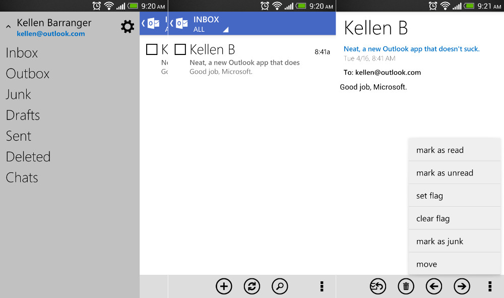
Back in November, Microsoft released an official Outlook.com app for Android that was, to put it simply, a terrible design. It brought back painful memories of Gingerbread with tabs, a dark theme, and nothing that reminded us of Microsoft’s other beautifully designed apps. No one used it – we all laughed at it. But today, a new update has been released that brings the app into line with apps like Xbox Smartglass. It also matches the design you’ll see in most of Microsoft’s current Windows products, which is a design language we have always been fans of.
There aren’t many new features, but Microsoft did add in conversation threading, filters for unread and flagged mail, and the ability to mark messages as junk. So if you are an Outlook.com user, go pick up the new goodness.
Play Link
Via: Outlook Blog


Is this version of Outlook.com strictly an email app, or is there a calendar function I’m not seeing? I’ve put in on my Nexus 7, but all I see is email. I’d like to be able to access the Outlook 2007 calendar from my desktop on my N7. Is this possible at all on a Google device?
Unfortunately you can not pinch shrink to fit screen as you can with the Hotmail app.
The next build is supposed to allow booting straight to desktop mode, just FWIW.
Do have to agree with you.
Windows 8 looks great. I don’t know if you have ever used it, but I love it. I know plenty of people that where turned off at first but after actually using it love the look and feel. Windows Blue, or 8.1 seems to be another step forward when it will be released. If you don’t like it, go use Chrome or Apple, plenty of options out there.
I actually use it every day on my home computer and my work computer. I do PC repair for a living and I know from all (no exaggeration) of my customers that a lot of people are not happy with it. I get calls almost every day about people wanting to downgrade.
The stock email app (ICS+) works great with Hotmail using the “Exchange” method. Not sure why more people don’t use that.
That’s what I’ve always used for my hotmail account, the stock email app you can assign any email too, works perfectly.
Icon does not show number of unread messages either. It still shows 0 (at least when using my Hotmail account).
Oh dear. This is actually an O for Outlook, it is not meant to be a number.
Aye yi yi, this needs work.
The sender’s name is way too big and there’s no way to adjust the font size, and it seems sluggish to open the actual email.
Is there a tablet UI for this?
Anyone know if it will support 2 Hotmail addresses?
Parents are “sharing” Asus Transformer Pad and will be using it for overseas travel. Using the STOCK email app, the system would only allow one of their hotmail accounts but not both. Would be nice to stop using stock email app, load this for them,use with 2 different accounts. Anyone? thanks!
why spend all the phone resources on this app when the mobile browser version looks as good?
Kellen, did you know you gave away your last name?
push emails its great hopefully google realize it and bring back Active Sync
Looks like the official hotmail app had an update and when I updated it the app it prompted me to download the outlook app anyways lol
No thanks, I’d rather not have any Metro crap on my phone.
Good for you.
I’d just be happy to get an email client that displays more than about 20 messages. All the ones so far only seem to load 20, then won’t load anything else below that.
Does it use IMAP or POP? Probably IMAP I assume/hope.
use active sync so push emails from outlook and hotmail at least
Sure they are – in the next iteration they’re letting you boot straight to desktop mode and bringing back the start button. Those are the biggest complaints I’ve heard about, and they’re fixing them.
This is what they always do. They try to come out with crap, and they have to let their users tell them how to do things right. That’s not how a software company should do things.
“great design guideline”
you must be joking
Okay, “great design guidelines.” But if you don’t think they’re good, then that’s your opinion, doesn’t make it a joke.
Completely agree with you.
What design? Seriously, this is the most lackluster app I have seen. While it isn’t ugly, there is nothing to it. A blue bar, some text here and there and then WHITE WHITE WHITE.
This app does follow the guidelines of bleak, boring apps.
It’s freaking hideous. Even the font is hideous, and looks unfinished.
Is anyone else having issues with the Play Store not loading on a desktop? I can get to it on my phone, but not from any computer, even using various browswers???
Works fine here
No widget? I guess I’ll keep using the native “Email” app.