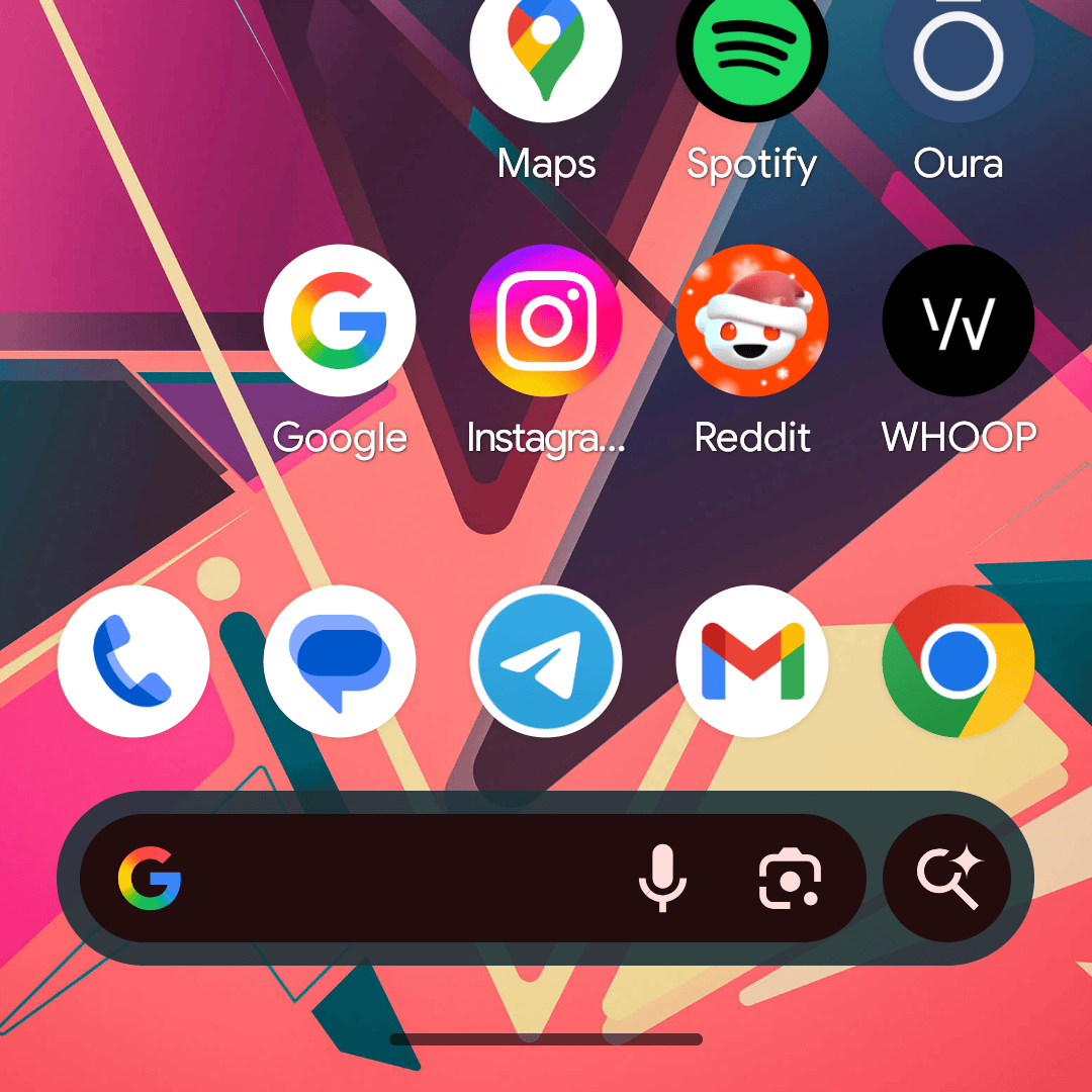
In the world of meaningless posts, I have a good one for you today – the Google App icon on your phone now has a bigger “G” logo.
Yeah, I know, this is uhhhh, a waste of your time, but it’s 2026 and that is where we are at. If you update your Google App, you’ll notice that the Google logo has spread itself closer to the edge of the icon. It looks, well, bigger. The gradient is the same, the shape and “G” are also the same only now…bigger.
What a post. Oh, I made this GIF for you to see the change.
Google Play Link: Google App
Collapse Show Comments4 Comments