Earlier in the week, a friend and I were talking about how we were suddenly both seeing the new Google Maps colors that were announced back in October. Neither of us had much of a reaction, only noting that there was a change and things looked different. I then shared a screenshot of the old color scheme still on my iPhone compared to the new color scheme showing on my Pixel 8 Pro as an acknowledgement that we weren’t crazy or seeing things. Again, neither of us reacted negatively or positively and then moved on.
Now that the colors have begun to fully spread throughout the week to all Google Maps users, it appears as if the reactions from others were much stronger than ours. People, at least in the Google Maps subreddit, are doing everything they can to try and get the old color scheme back. People are voting on which color scheme they like the most and generally taking every opportunity they can, throughout multiple threads, to trash on the new look. It’s wild.
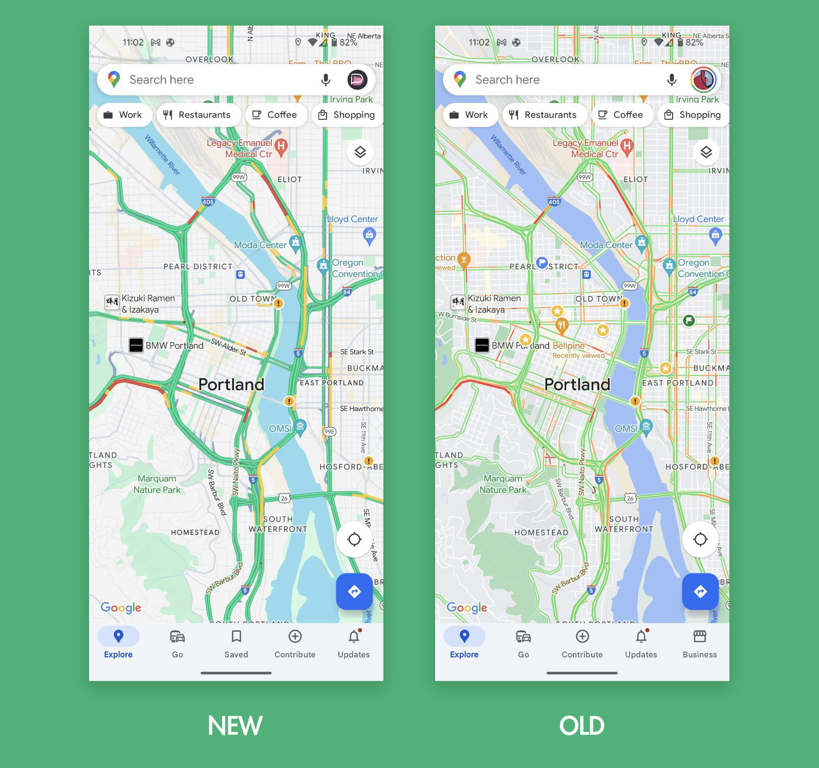
For those who haven’t noticed yet, the new colors were announced last month and are very much different from the old. Streets without the traffic layer are now a blueish grey vs. the old yellow and/or white. Bodies of water have a lighter shade of blue, while the traffic green is now punchier. The traffic layer also appears to be a bit thicker than before. There should be more details throughout the map as well.
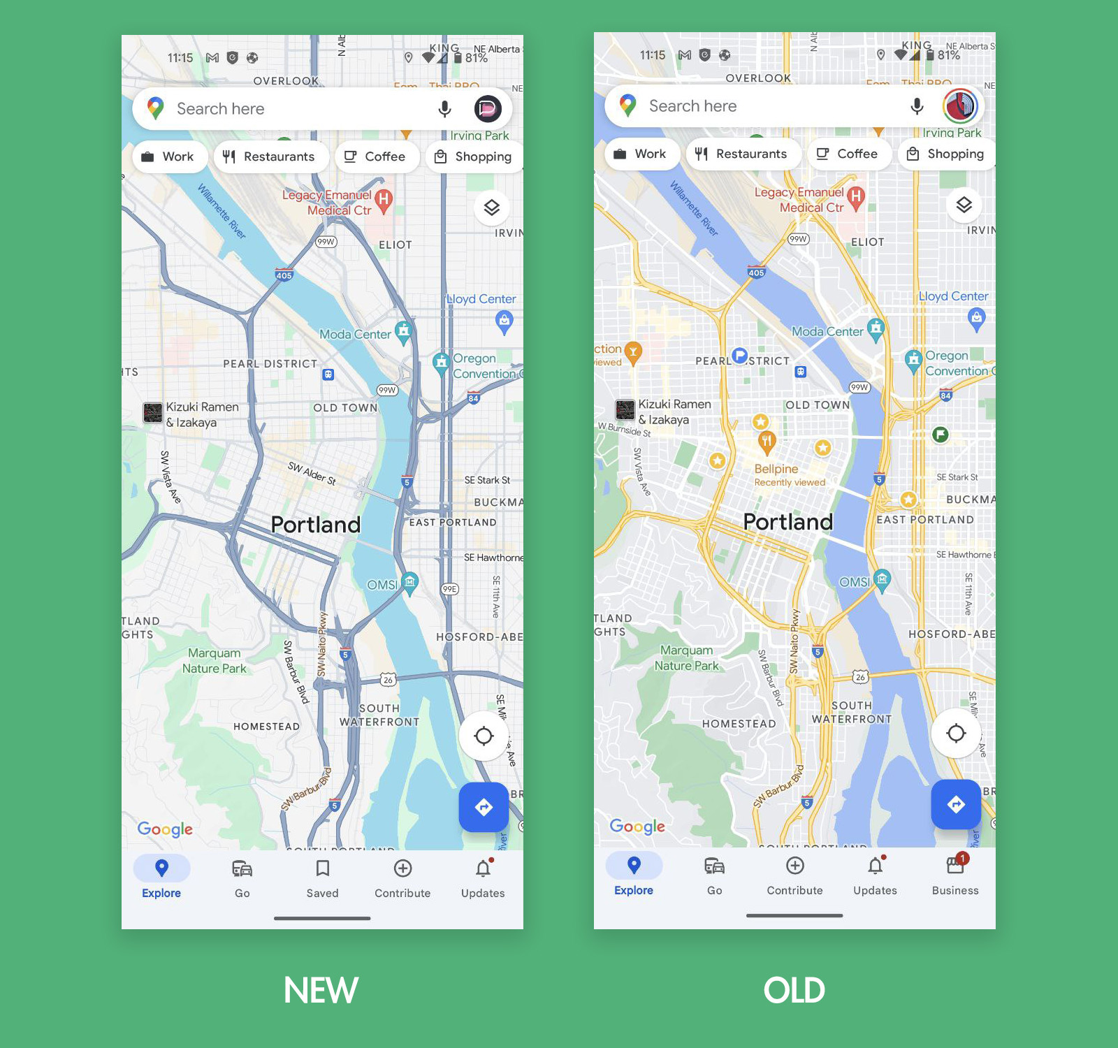
Above is an example of the new Google Maps colors without the traffic layer applied, while the traffic layer is activated below to show the difference. It’s a somewhat big visual change, but is it that big? Again, to the reddit crew, it is very big, bad, and makes them very mad.
Many of the responses I’d love to share, because they are so overly-dramatic, but they are also not quite safe for work. There are plenty of “I absolutely hate it” types of responses, several more that compare the changes to doggies going #2, and one guy even called it the Squidward color scheme. That’s actually pretty good. Others have chimed in about the new Google Maps looking too much like Microsoft Maps (I didn’t know that was a thing), with one non-fan suggesting they now “feel like a dumb Apple Maps user.”
The new Google Maps color scheme is widely rolling out on mobile and the web and on Android and iOS. If you have the Android version of 11.106.0501 or the iOS version with 6.92.0, prepare yourselves for changes.
Feel free to chime in through the comments if your feelings are big here.