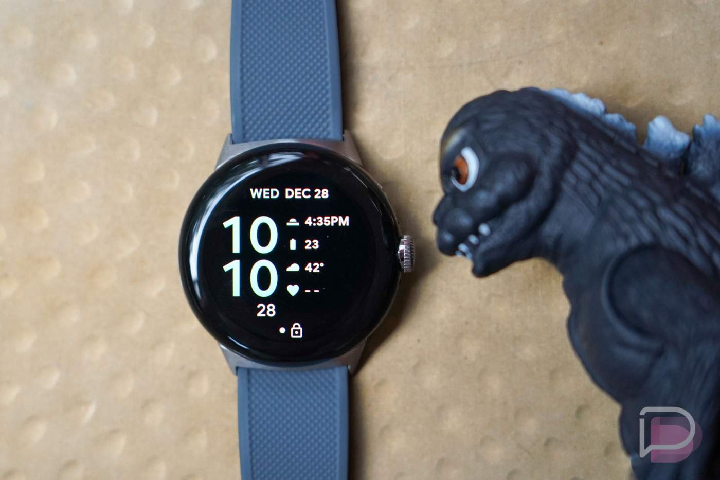
The Android Developers team at Google released new design rules for Wear OS app developers this week, set to take effect on August 31, 2023. That should be plenty of time for developers to ensure their apps aren’t breaking any rules, as Google is looking to really tighten up the look of the platform.
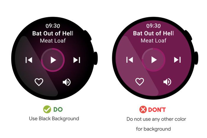
The new design rules aren’t anything too crazy. For example, Google wants all developers to use black backgrounds in their apps and never use colors for backgrounds. Considering we expect Google to release Material You’s Dynamic Colors feature for Wear OS, this particular requirement makes perfect sense. A black background will allow for a palette’s colors to really be the centerpiece of a watch’s aesthetic even within apps.
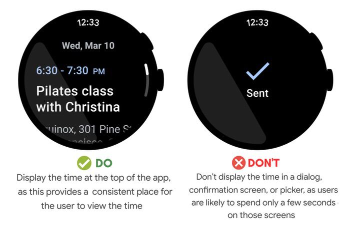
There are also smaller, little changes that one may not even notice but Google wants to clean up. As the example shows below. there’s no need for the time to be shown on a pop-up dialog page, as the user will only be on that page for a brief second. However, regardless of the app a user may be in, Google wants the time shown at the 12 o’clock position for constant viewing. It makes sense to me, having the watch function as a watch.
If you’re a Wear OS developer, firstly, thank you for your work. You are appreciated. Second, I recommend reading the whole blog that Google posted and ensure your app meets all the requirements.
Again, we’ll see all of these new requirements go into effect later this year.
