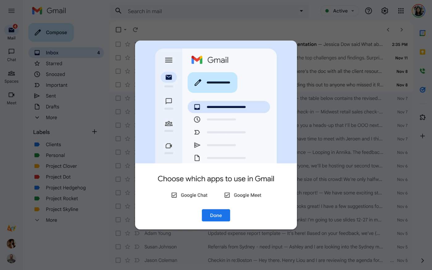
Gmail on desktop picked up a big refresh earlier in the year when Google changed the layout some to better integrate Chat, Meet, and Spaces. The new layout made it easy for users to quickly switch between each app from the same page, without having to open new tabs to carry on conversations, answer an email, and then jump into a meeting.
As that rollout has hit most users, Google has now announced that they are adding a Material You refresh as well. In a blog post to Workspace users who want to opt-out of the new integrated view of Gmail, Google shared images of the Material You look, with blue accents everywhere, rounded rectangle shapes, and more colors.
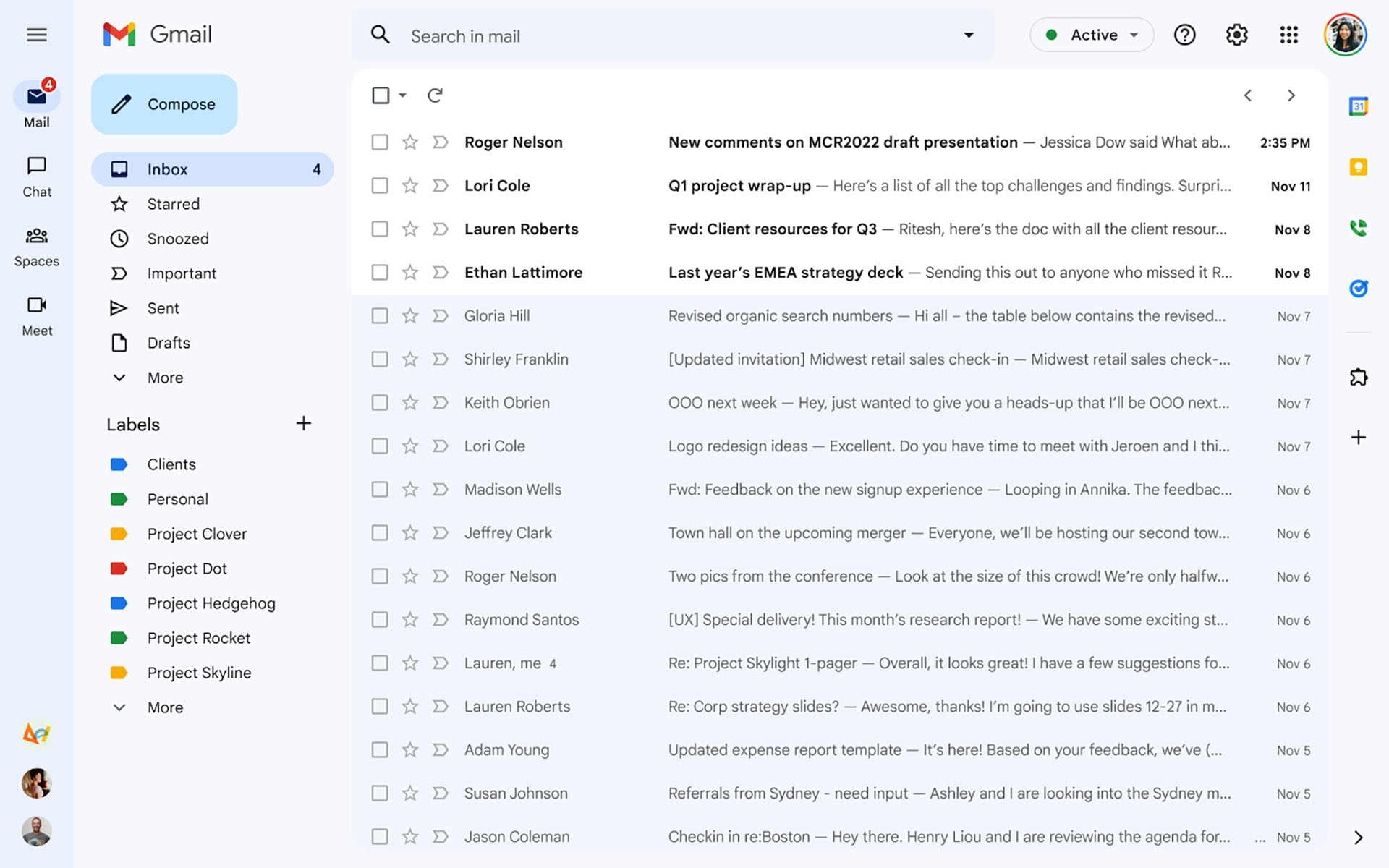
Below, you can see that not much is actually changing. In fact, the blue color is likely to become the “Default” theme, while the Compose button is turning more rectangle vs. oblong shape we have now. That matches up to most Material You apps and their buttons. Google appears to be doing away with its shadow too. After that change, you’ll notice colored labels and not much else.
Google says to expect rollout of this new Material You to arrive starting June 28. This is a staged rollout, so don’t be alarmed if you don’t see it right away.