Is it just me or is the YouTube app on Android TV totally whack? The menu on the left is oddly organized, like, why are my subscriptions all of the way near the bottom? Also, when you tap on a recommended video from the Android TV home screen, it just opens YouTube and doesn’t go straight to that recommended video. I don’t know, maybe it’s just me that can’t stand YouTube on my Android TV device.
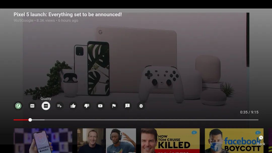
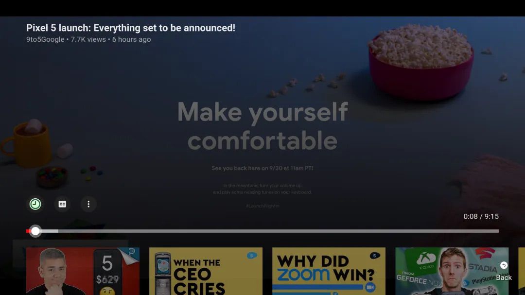
Regardless, there’s an update on the way, specifically aimed at changing up the video player UI. Following this server-side change, video titles are made smaller, icons for thumbs up and the like are made more clear, plus there appears to be a nice little channel button along with them.
I think this app needs a lot more work than just a video player UI, but hey, it’s a start.
Android TV and Fire TV users should expect to see this UI hit their device soon enough. Y’all know how Google is when it comes to server side changes. Could be tomorrow, could next month. You’ll get it when you get it.
// 9to5Google