I know that most people are in agreement that Wear OS is trash and the watch options aren’t great, but I’m foolishly still holding out hope that it will one day be good. Because of that foolishness, here is a bit of news: Google Play on Wear OS is now slightly better.
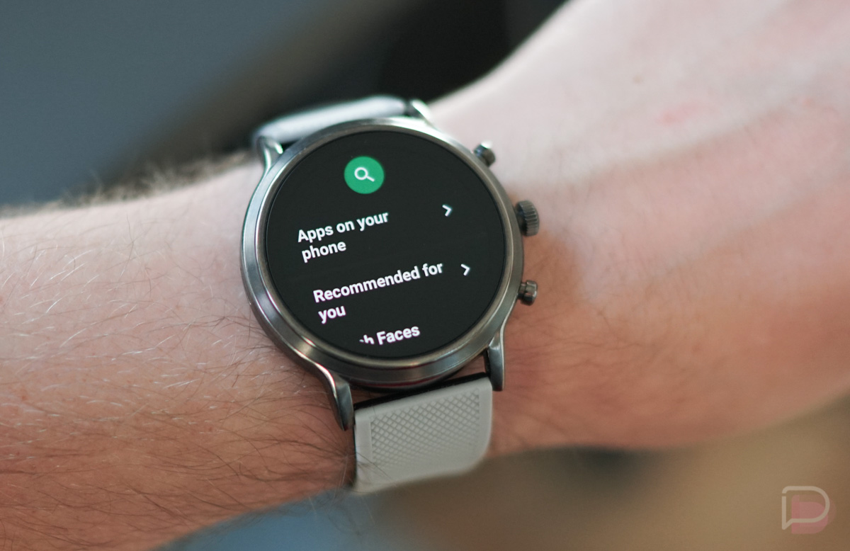
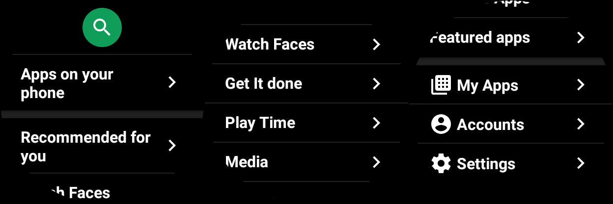
In the screenshots below, Wear OS users will see the difference, where you now have your My Apps, Accounts, and Settings sections at the bottom of the main page, rather than within a hidden pulldown menu. There is an “Apps on your phone” section at the top too, just under the search button.
For those not familiar, Google Play really did have a hidden pulldown menu with icons that meant almost nothing to anyone unless you learned what they meant by tapping on them. It was bad. They were bad icons. It was a bad design. Now that all of those options are buried at the bottom of the main screen, things are better.
It’s sad out here on Wear OS, OK? Enjoy your day.