The Android UI team took the time this week to publish a post on its rationale behind implementing the new gesture navigation system inside of Android Q. These gestures are something we’ve discussed a few times already, mostly because we aren’t huge fans of how it works.
In the post, the team goes over the data it collected to come up with the gestures, goes over the pros and cons, but maybe unknowingly, kinda proves that the 3-button setup is liked by users, is pretty quick to complete tasks, and is also quick at getting people in and out of their recent applications.
Let’s go over the gesture pros and cons that the UI team lists out.
Gesture Pros
- Gestures can be a faster, more natural and ergonomic way to navigate your phone
- Gestures are more intentional than software buttons that you might trigger just by grabbing your phone
- Gestures enable a more immersive experience for apps by minimizing how much the system draws over app content, i.e. HOME/BACK buttons and the bar they sit on – especially as hardware trends towards bigger screens and smaller bezels
Gesture Cons
- Gestures don’t work for every user
- Gestures are harder to learn and can take some adjustment
- Gestures can interfere with an app’s navigation pattern
While the pros are great examples of why gestures can be awesome, one of the cons sticks out to us, especially since fragmentation used to be word thrown around a lot in the Android world. In its post, Google says, “Most of all, we realized that there was a larger issue of fragmentation when different Android phones had different gestures, especially for Android developers.”
This is very accurate. Before Google introduced this standardized gesture layout, it was a gesture free-for-all among Android OEMs. However, Google says that it has been working with companies like Samsung, OnePlus, Motorola, LG, and many others to standardize gesture navigation going forward. This should help for a more uniform gesture navigation experience across Android devices. Furthermore, to ensure a consistent experience for users and developers, the Android Q gestures will be the default gesture navigation for new Android Q devices and beyond.
3-Button vs. Q Gestures
The next part of Google’s post is data. This is Google after all and no decision it makes is without numbers to back it up. Interestingly, though, the charts Google publishes show ranges of productivity for different navigation methods. There is the 3-button layout, Android Q gestures, as well as 3 bottom zones and single draggable button. Let’s allow the charts to speak for themselves.
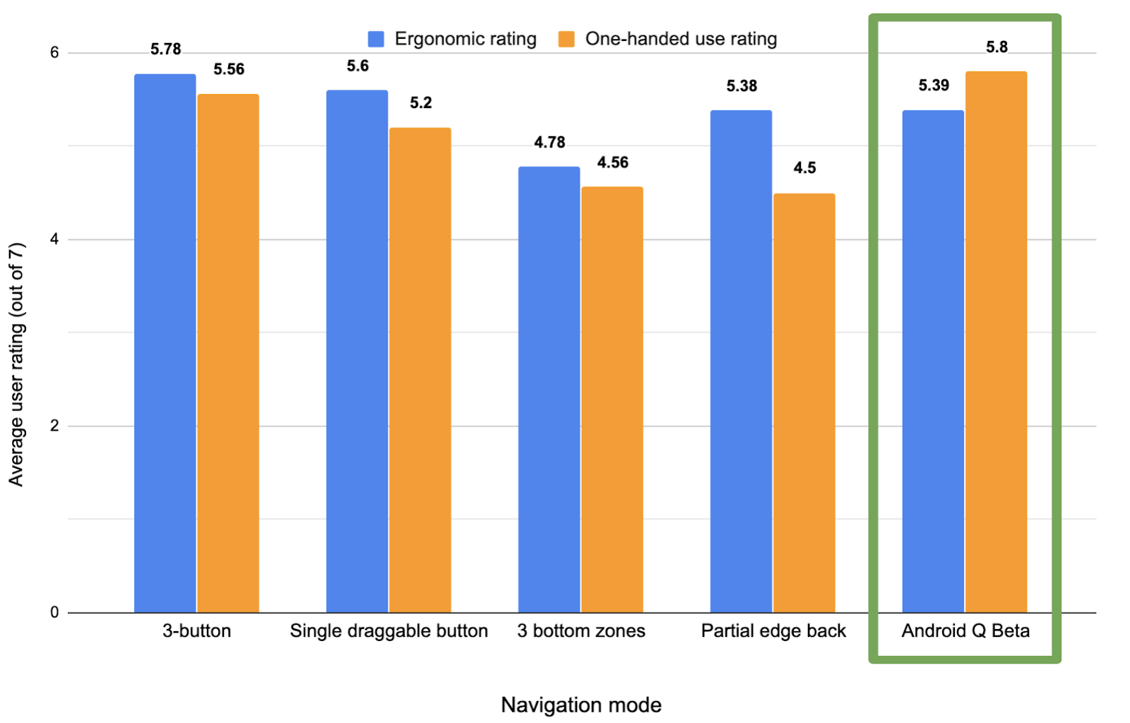
Comparison of user ratings for ergonomics and one-handed use across different navigation modes (higher is better)
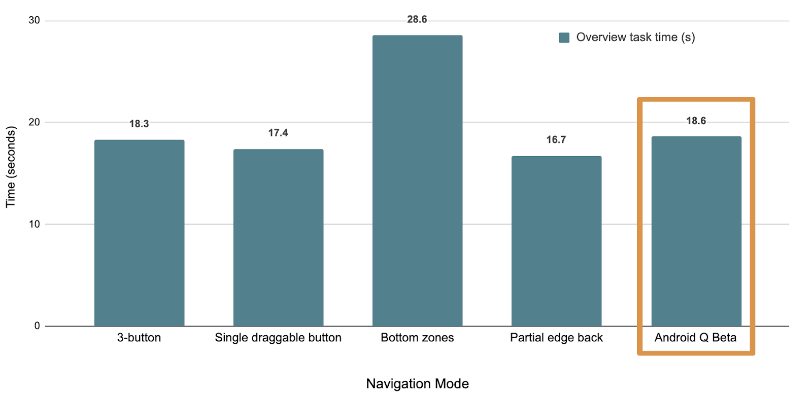
Comparison of average time required to complete Overview/Recents-based tasks across various navigation modes (lower is better)
These charts speak clearly. In terms of user rating, the 3-button setup ranks high in ergonomics and one-handed use. When comparing the average time required to complete recent-based tasks, the 3-button option is slightly faster. However, Google defends not really caring about that stat by saying, “users go to [Overview, Recent apps] less than half as often as the Home screen.
Another stat Google pushed really shocked me, so much so that you can expect a poll about it at some point. According to Google, only ~3-7% of users swipe to open a navigation drawer inside select Google apps. The rest of users push on the actual hamburger menu to invoke the drawer.
For example, we found that ~3-7% of users (depending on the Google app) swipe to open the App Navigation Drawer – the rest of our users push the hamburger menu to invoke the drawer. This drawer swipe gesture is now overloaded with back and some users will need to adapt to using the hamburger menu. This was a tough choice but given the prolific use of back we optimized for what worked best there.
Because it’s never a goal to change out behavior on users, we tried several ways to enable users to distinguish the drawer gesture from the Back gesture. However, all these paths led to users pulling in the drawer when they were trying to go Back and having less confidence that Back would work.
Not only am I flabbergasted at the number of people who haven’t been simply swiping out from the side of their phone to access that navigation menu, but considering every Google app featured that side drawer, we knew it was only a matter of time for Google’s decision to implement a side swipe for Back gesture to clash with the UI decisions it made previously. Thankfully, Google has been acting quickly to redesign a large amount of its apps to include a bottom bar button navigation style UI.
At the end of the day, Google will offer a choice between navigation styles to its Android users. If you like the gestures, you can use them. If you prefer the 3-button setup, it shall remain there.
In Google’s words, “In qualitative studies, we found that after an initial break-in period of 1-3 days, users became fluent and could consistently distinguish between these two gestures. The majority of users did not want to switch back to 3 button nav (even though that remains an option).”