Google is rolling out a visual makeover to Google Assistant today, one that should cater to both visual and touch fans.
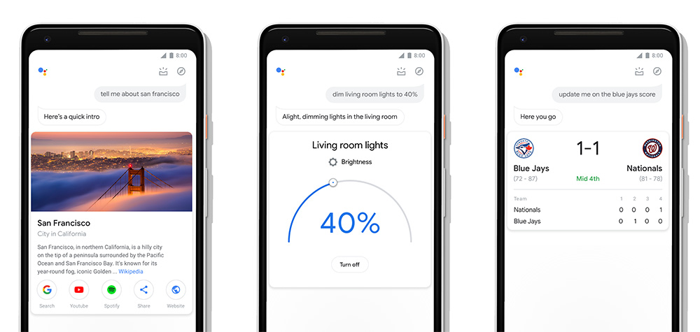
Google says that this new design “combines the best of text and talk,” with bigger visuals in the Assistant, new controls and sliders for managing your smart home or speakers, a more interactive messaging interface, and an easy way to get an overview of your day, sort of like what Google Now used to be. Things are more bubbly, in other words, with bigger touch points. This is the UI one of our readers first saw back in early August.
I’d also compare the UI to that of Google’s smart display UI. The sliders for controlling lights or temperature, as well as the overall roundness and shape of buttons looks just like that. To get a feel for that, be sure to check out our Lenovo Smart Display review.
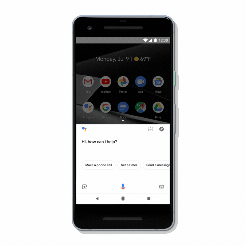
Below, though, you’ll see that new swipe-up gesture in the Assistant that gets you an overview of your day. Prior to this update, you would view this screen by opening Assistant and then tapping the little box icon with the 3 marks above it. Now, you no longer have to hunt for that button and can seamlessly swipe up to see if your flights are on time, what reminders are upcoming, how long your commute is, the weather, and what your daily schedule looks like.
There’s a chance that a number of you already have this new UI. If you don’t, expect it to rollout shortly.