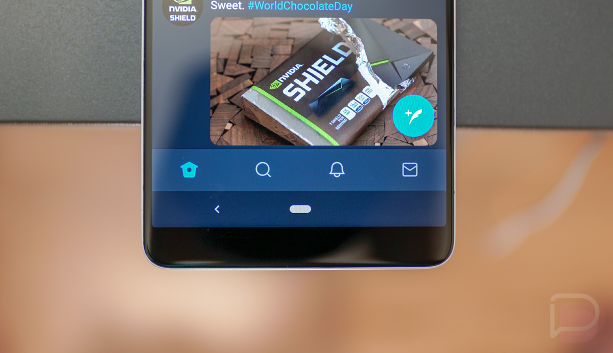
Twitter has been testing a bottom navigation bar in its beta track for some time now, but they started rolling it out to everyone this morning. People are a bit pissed off at the moment. Trust me, though, you’ll grow to love it, especially if you have a bigger phone.
The wave of reviews that hit the Twitter Google Play listing this morning are almost all 1-star reviews and every single one mentions the new bottom bar. People are mad because they are opposed to change, even if the change will be better. People are mad because a bottom bar is in the way when scrolling, or something. People are mad because people like being mad.
The thing is, a bottom bar actually makes a lot of sense. You no longer have to reach waaaaaaay up to the top of your giant ass screen in order to switch tabs or get back to the top of your feed. Instead, you just barely lift a thumb and the buttons are all right there. As someone who used the bottom bar in beta for a long time and have had to switch off it when using other test phones, I can tell you that the top bar drives me nuts now. Give it a run and I bet you’ll like it.
If you were looking for something to complain about, one could argue that removing the swipe-between-tabs gesture is annoying. I’d agree there. You used to be able to swipe left or right to jump into search or your mentions or DMs, but Twitter has killed that. That seems dumb. Why does a bottom bar mean a need to kill a gesture?
The update should be live for all. Grab it below!
