Ignore that top photo.
Google frequently likes to test things that involve the Google app, which means everything from search bar launcher locations and stupid text within them to the Feed and the never-ending-suckification of it. Today, Pixel owners are noticing another adjustment to the awfulness that is the Google Feed in what might be the biggest laugher tweak yet.
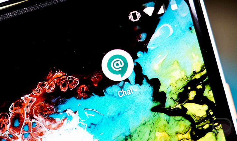
Look at this thing that was posted by a user at reddit.

What in the…
It’s like a mash-up of all of the worst parts that Google has introduced to the Feed in recent months. You’ve got a touch of transparency and bubble effect going on, as well as separated topic sections (with big category pill identifiers), a whole bunch of unnecessary padding surrounding each bubble, and a pretty worthless utilization of space in general.
This particular screenshot appears to show the Google app confused by the user’s wallpaper color, so it’s showing white bars across category subsections, rather than transparency. And I say that because the folks at Android Police have similar shots from another user who had this new Feed with a dark background that was rendered properly with transparency around category pills. This one looks especially f*cking ridiculous, though, because of those white bars.
I don’t even know what else to say. Google destroyed what was once Google Now because it thought we all wanted a glorified news reader curated by our Search habits instead, only it hasn’t ever turned this Feed product into a good product that anyone wants to use.
Hopefully, none of you ever have to deal with this. My god, Google.
// reddit | Android Police