Over the last couple of years, if you asked me which navigation button setup I preferred on a phone – on-screen or physical/capacitive – I wouldn’t have hesitated to say “on-screen for life, my brothers and sisters.” Google has fully convinced me that navigation buttons should be a part of the phone’s software, not hardware. At least, I thought they had fully convinced me. After having spent the past few months caressing a Galaxy S6, calling it the best phone you can buy, and poo-pooing most of the others, I’m now having this awkward internal debate with myself. Which setup do I actually prefer at this point?
I don’t know.
After Google introduced us to on-screen buttons for phones with the release of Ice Cream Sandwich (don’t you dare bring up Honeycomb), I was instantly hooked. They gave you this immersive experience while using your phone that we didn’t have prior, but they also made navigating a phone so quick, because you didn’t have to physically press a button or leave your display as you reached for the bottom chin of your phone. And you could swipe up for Google Now! Damn, do I love that gesture.
But then Samsung went ahead this year and added in the best mobile fingerprint scanner and the quickest camera launching shortcut known to man in their physical home button. I now can’t put down the stupid Galaxy S6. It’s so pretty. And good. And shiny. I don’t even mind the button setup that I swore off so long ago. What is happening.
Of course, on-screen buttons have their issues, as do physical/capacitive setups. I know, because I see them listed out in the comments through never ending debates like the one I’m having right now with myself. So let’s do this – how about I list out the good and bad for each and then we try to settle this together? (Good luck.)
On-screen Buttons
- Good: They give you an immersive experience, especially now that the navigation area can be fully transparent or take on the colors of the apps you have open. Software tricks like these, when implemented correctly, really add a level of polish to a phone.
- Good: Buttonless is prettier. Without buttons jutting out from the front of your phone’s surface, you get a clean glass experience that to me, looks so good.
- Good: Gestures! That gesture to swipe up into Google now is the best, especially for those of us who use 3rd party launchers and can’t just swipe-over like you can in the Google Now Launcher. It also makes accessing ol’ Google easier than ever.
- Good: Flexibility on a number of levels. For one, Google is showing us with Google Now on Tap that they can enable things like long-presses in on-screen buttons that add functionality. But not only that, companies like LG have given users the opportunity to customize the arrangement and number of buttons that appear in the navigation area. While I prefer the standard Back-Home-App Switcher, I can see why someone might add a menu button or notification pulldown shortcut.
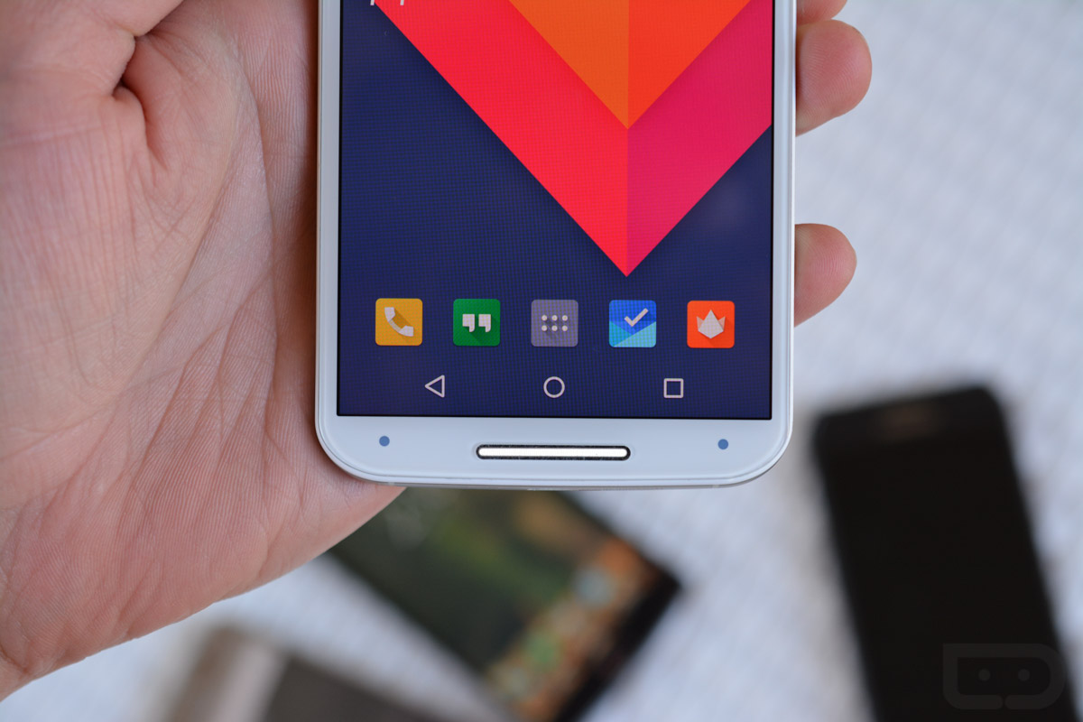
- Good: On-screen buttons are essentially future proof. What I mean is that as Google continues to change the look of their on-screen buttons, phones with on-screen buttons have a better chance at being current. Take the DROID Turbo as an example of why you wouldn’t want to use capacitive buttons. It was released with KitKat a few weeks before Google released Lollipop. With Lollipop, Google changed the theme of the buttons to the Playstation-ish theme you are seeing on the Moto X above. The DROID Turbo, assuming it gets Lollipop some day, will forever have pre-Lollipop buttons. And what if Google decides that Android doesn’t need an app switcher and needs a dedicated search button or something? Sorry, DROID Turbo users, you get to keep your app switcher.
- Good: On-screen buttons leave manufacturers the opportunity to trim up a phone’s chin or add additional features to it. Forget the LG G4 and its massive chin and instead consider that I’m referring to the Nexus 6, HTC One series, and Moto X. With the Moto X, Motorola created a chin area that is absolutely tiny, which means the overall phone size is reduced. With the Nexus 6 and One series, Motorola and HTC were able to add in secondary speakers that give you a stereo experience. If you have physical or capacitive buttons, it becomes tough to shrink the size of an area or add in extra functionality outside of a fingerprint sensor.
- Good: You don’t have to physically press down a button.
- Bad: They take up precious pixels. Your Quad HD display with on-screen buttons has less usable resolution almost all of the time than the Quad HD display on the phone with physical/capacitive buttons. That on-screen bar that houses your buttons is a part of the screen, so it’s stealing pixels. Sure, you can hide them and get all the pixels during movie or game playback, but not necessarily during your Gmail or Hangouts sessions.
- Bad: Few things bug me more than when I’m looking at a picture in the gallery and the on-screen buttons think they are doing me a favor by hiding. That drives me nuts because in order to leave that screen (go back or home) I have to tap the damn screen again to make the buttons appear. Ugh, extra steps.
Physical/Capacitive Buttons
- Good: With the Galaxy S6, you get that amazing quick launch camera double-tap magic. It’s the fastest way to launch a smartphone camera that we have come across and appreciate every ounce of brain-sweat that went into the idea. But physical buttons in general give you opportunities like that to customize actions that on-screen buttons may never have.
- Good: A physical button, at least in the case of the S6 (and iPhone), can be used as a fingerprint sensor that really adds a level of security to your phone that doesn’t impact experience. If Google wants to implement fingerprint scanning into a stock Android phone that has on-screen buttons, it’s going to have to do it somewhere else in the hardware of a phone that may not be as convenient.
- Good: You get all the pixels! Since your buttons aren’t on-screen, you never have to worry about them needing to hide – you always get to put to use every single pixel on that big, beautiful QHD display of yours.
- Good: Your buttons are always there. I mentioned how much I hate having to tap the screen in the gallery or YouTube or other areas with on-screen buttons in order to show buttons that have been hidden temporarily for a full-screen experience. With physical or capacitive buttons, your buttons are always there for the pressing.
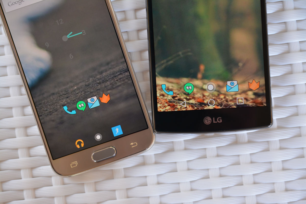
- Good: With separated button and screen areas, there won’t ever be much confusion when you try to operate your phone. Look at the picture at the top of this post to understand what I mean. With the LG G4, you actually have two sets of software-powered navigation areas sitting on top of each other. The app dock there has swiping gestures built into it, just like the home button, so I often find times where I swipe one and mean to swipe the other. With the Galaxy S6’s setup, that never happens because of that hardware separation. With hardware buttons, you also should experience far fewer accidental presses.
- Bad: Physical buttons tend to provide a slower experience than those that are on-screen. With capacitive, the experience is largely the same, but it’s almost always easier to slide your finger over a button and have it sense a touch rather than you having to physically compress it.
- Bad: As I mentioned above, your physical and capacitive buttons are there for life. If Google changes the look of buttons in the next version of Android or swaps one out for something new, you don’t get to participate in the fun when we geek out about it. Related, but if companies like Samsung do this insanely stupid thing where they swap the Back and App Switcher button, you just have to deal with it.
- Bad: This is obviously a personal taste thing, but a physical button on the front of a phone just doesn’t let it look as clean as a phone that is buttonless. I don’t care how fancy and gold that button may be, Samsung.
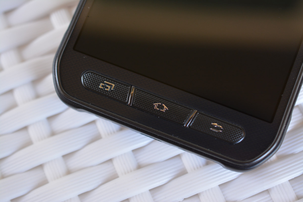
- Bad: Look at the picture of the Galaxy S6 Active above – holy disaster.
Wow. Look at that list.
So what’s the conclusion? Well, I think I still mostly prefer on-screen buttons because of their flexibility, aesthetic they give to a phone, and their ease of use. They are also the standard that Google has tried to set for how they envision Android working, which is always something we strongly take into consideration. Not that Google is always right (Hello, Lollipop volume controls!), but this is one of those areas they seem to have gotten right.
That doesn’t mean I don’t see all sorts of value in having the button setup of a phone like the Galaxy S6. I love this phone’s camera quick launch shortcut and fingerprint sensor. I also love the dedicated area for operating my phone that often hides when I’d rather it be present on phones with on-screen buttons. I have easily been able to adapt to this phone’s button setup and don’t regret for a second calling it the best phone you can by right now.
In the end, it’s on-screen buttons for me 99 times out of 100. But should a phone like the Galaxy S6 come along with a physical/capacitive button setup done correctly, I won’t have a problem giving it some run.