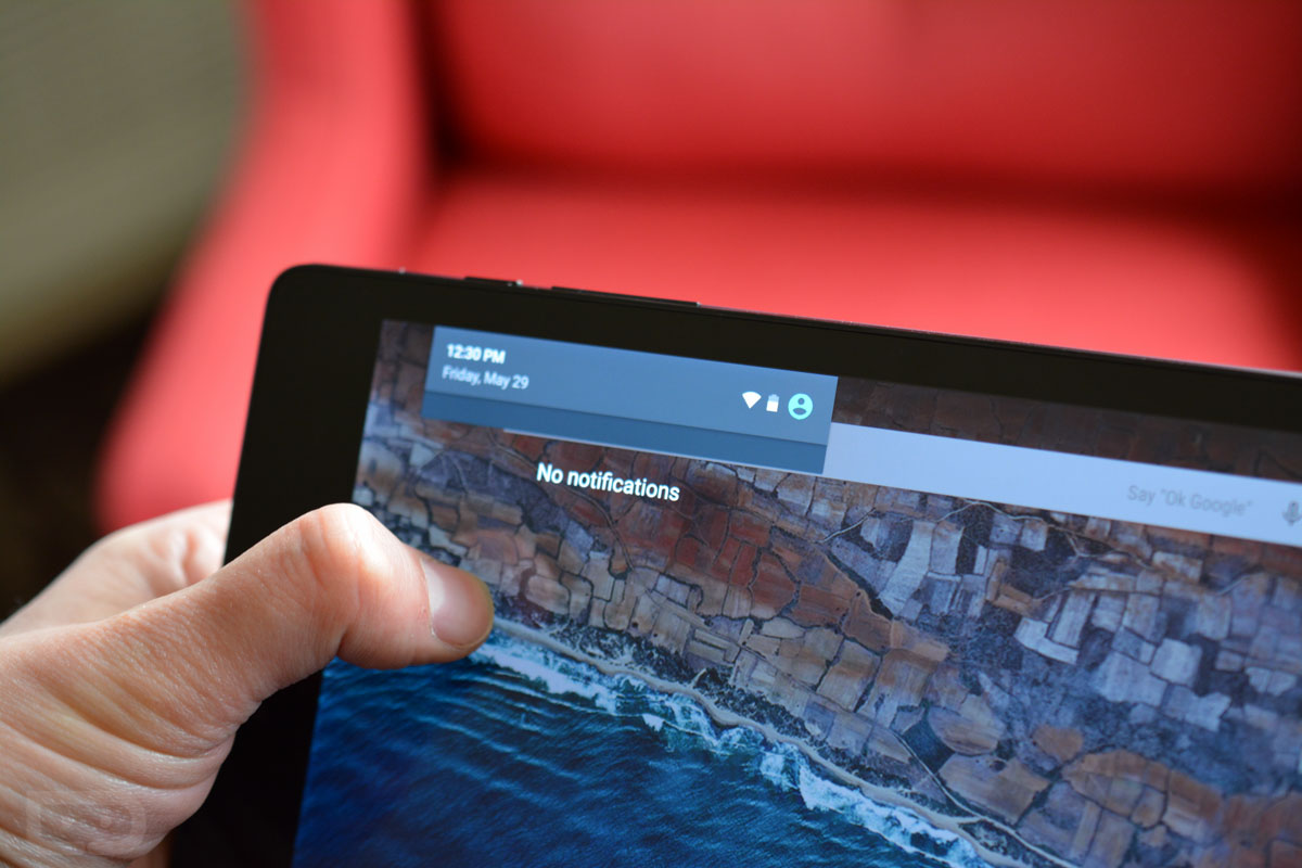
If you have used a tablet running stock Lollipop, then you probably know that the notification shade situation isn’t exactly ideal. Before Lollipop, Google was using two separate pulldowns for the notification shade on tablets, one that would show notifications and another that gave you access to quick toggles. Since those were combined into a multi-layered single notification shade in Android 5.0+, they decided to center it on tablets, no matter where you swiped from.
That can be semi-annoying in instances where you may swipe down from say, the right corner of your tablet. It would make sense for the notification shade to pull down where your finger is to give you quick access, but it doesn’t on Lollipop – you would have to move your hand over to the center of the screen to access notifications or quick toggles.
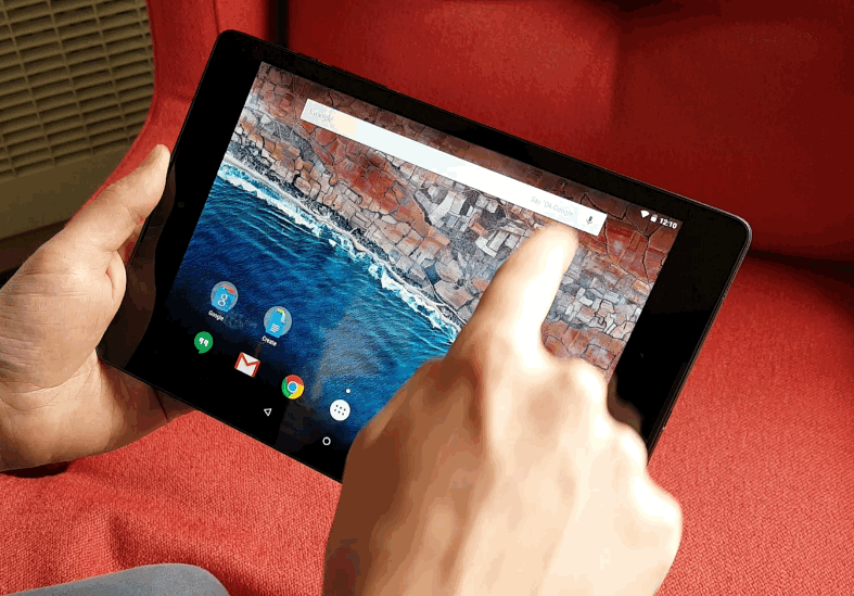
That is changing in Android M. As you can see from the GIF below, the notification shade now follows your finger swipes, so as you move from one side to the other and swipe down, the notification shade is there for quick actions.
It might be a small change, but these are some times the most important when you are talking about fine-tuning a user experience.
Be sure to checkout all of our Android M feature highlights!