Custom ROMs have always been a thing, whether you love them or hate them, and CyanogenMod has always been the most popular one. If you can remember, they incorporated a few months ago, and are now working with OnePlus on their One smartphone (set to launch soon), so they’ve made some ground from early last year. Today, they’re looking to take this further by unveiling new branding and a retouched logo.
Abhisek Devkota attempts to explain every bit of the new look, including the logo’s minute details. He also states that freedom to modify devices as the user wishes is still at the core of CyanogenMod, and is the focus of Cyanogen going forward.
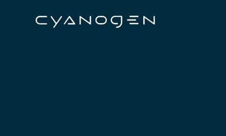
![]()
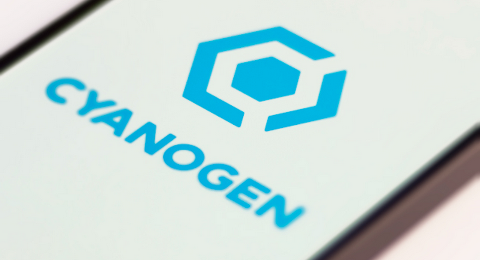
With the picture above, Devkota goes on to explain the intricacies of the logo. At the heart of everything, as mentioned before, is customization. The “C” is to “bring together the users and the community,” as it represents the security of the ROM. And finally, now the smallest part of everything, is remaining open source.
It is also noted that the arrow for open source points forward, and that the whole “screw” design is meant to show that this is a project in motion still. Interesting stuff, folks.
If you were wondering about Cid, the old CyanogenMod mascot, he lives on as part of the community. In the words of Devkota, “Cid belongs to the community, he is yours, not the company’s”. Oh, and the recklessness isn’t quite yet gone. One of the images still shows “Void your warranty,” so we know we’re still dealing with the same ol’ folks.

The blog post is ended with Cyanogen telling users that they will “build something unique” — that’s what we like to see. Thoughts on the new look?