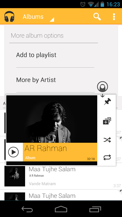
Since the launch of Google Now, Google has been moving towards a certain design language with Android and it’s been well received by many people. The core Google apps have been slowly moving away from the Honeycomb look and more towards the Jelly Bean “Holo” feel. One app that still feels lacking, however, is Google Music, the dark backgrounds and highlights just don’t mesh with Jelly Bean well.
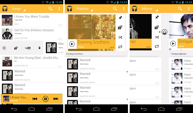
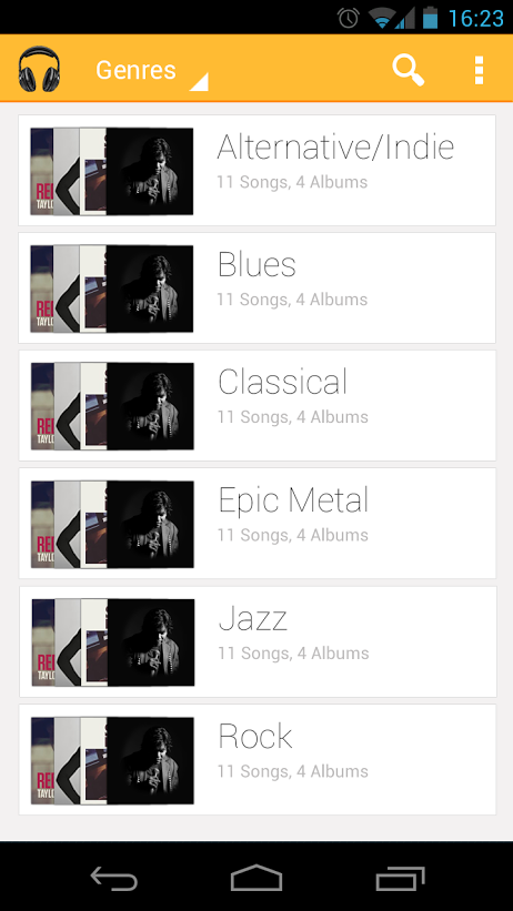
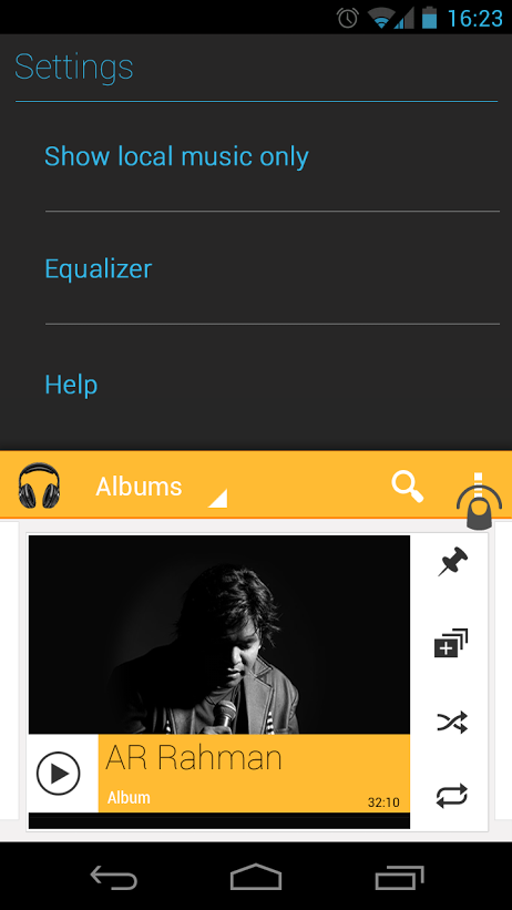
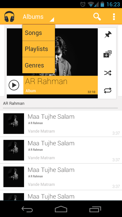
One designer put together a great looking mock-up for what the new app could be. Rajesh Handa uploaded an album of screenshots to his Google+ page showing what Google could do with the app as far as swiping and color schemes go, and it looks great. Everything about this app screams Android 4.2 and Google might do well to take some cues from this.
What do you think about this suggested redesign? Head over to Handa’s Google+ page to see the rest of his design mock-up.
Via: Google+