![]()
If you haven’t cruised over to the Android Developers site in a while, I recommend that you do, as it has been completely overhauled and includes all sorts of fun information. The site is much more beautifully designed now, easy to navigate, and should help all developers create more fantastic Android apps going forward. But even if you aren’t a developer, you are bound to learn something about Android that you didn’t previously know.
With that said, we couldn’t help but get a laugh out of the “Pure Android” page at the bottom of the “Patterns” column in the “Design” section of the site. The focus is on making Android apps look nothing like their cross-platform counterparts. It’s an entire section dedicated to helping developers create apps that fit the Android platform, rather than being exact copies of their versions for iOS or Windows Phone.
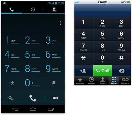
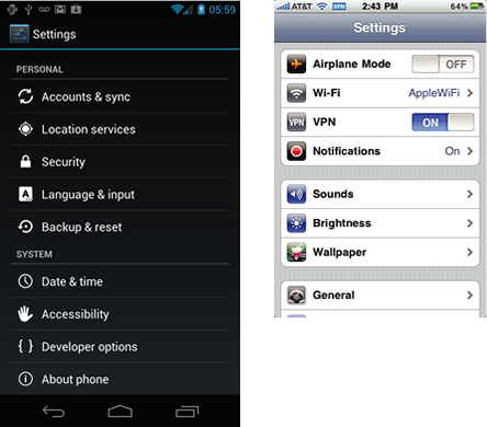
It’s funny because many of these design tips have been brought up in the ongoing battle between Samsung and Apple. Take the icon sets for example. Google is reminding developers that there is a specific set of icons that they should be using when developing apps for Android. While it may be easier to create one app design for all platforms, it can lead to an inconsistent experience as each OS behaves differently.
Now, that doesn’t mean that they want apps that look absolutely nothing like an app from another OS. In fact, they still want your branding to be front a center, however, they don’t want you to carry over rounded buttons, bottom fixed action bars, labeled back buttons, etc.
All jokes aside, if developers do follow these guidelines, it will lead to a much more consistent experience on Android, something we have begged for.
Via: Android Developers
Cheers E!

