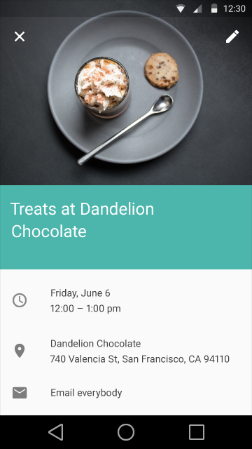
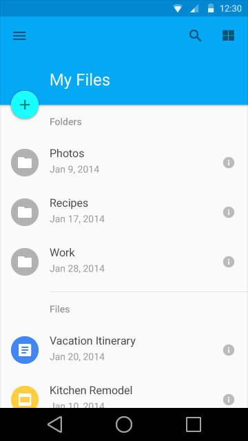
Everyone is waiting patiently for Google to release the Android L preview build tomorrow, but hopefully these screenshots can help ease the impatience.
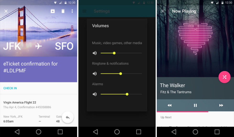
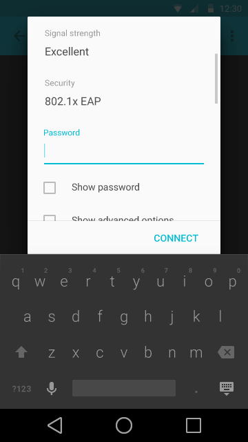
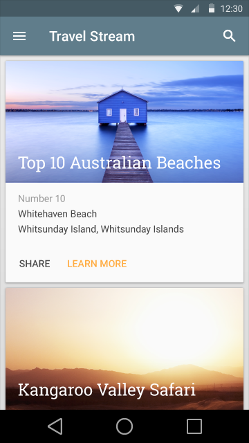
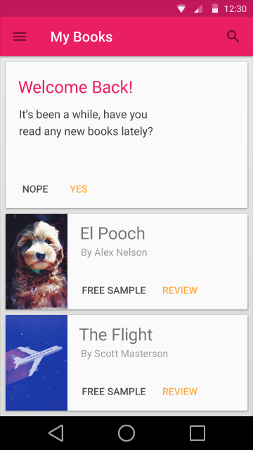
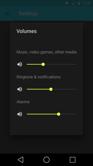
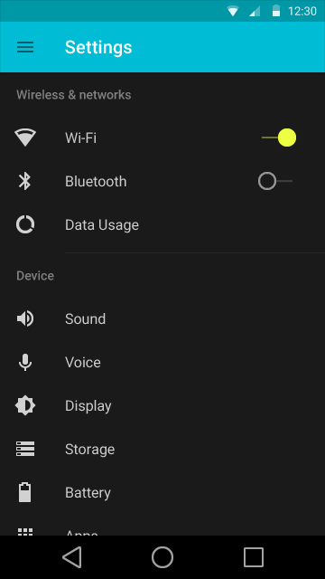
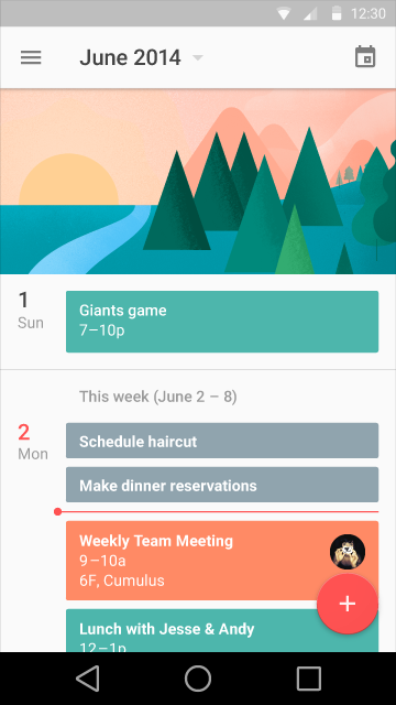
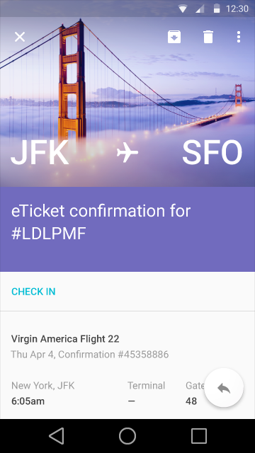
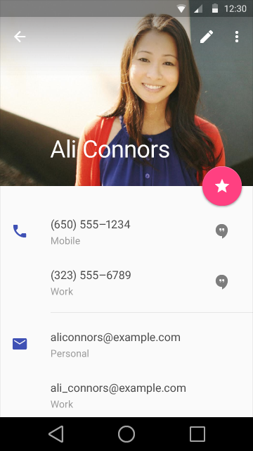
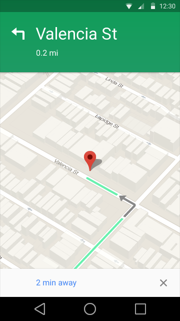
Android L, from what we can see so far, is a major redesign for the OS. App color schemes and various layouts are changing considerably inside of system applications, which might have Android L as one of the most distinguishable updates the OS has ever received. For example, colors for system volumes are now going to be a bright yellow instead of Holo Blue, and many other apps and lists seem to be much more vibrant.
Google Keyboard will also see a nice update at some point, more than likely through Google Play, which looks to bring a very minimal and flat appearance.
Google has posted an entire walkthrough of their new design language, so take a peek if you want to dive deeper into Android L.
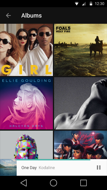
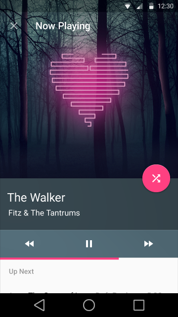
Below, we have posted a few of the big UI update screenshots we have seen on the site.
Share your thoughts below.
Gallery


Collapse Show Comments187 Comments