You should have had a solid month to take in the latest changes to Google Play. You’ve opened the page to manage your apps and most definitely said, “Whoa, what the hell is this?” From there, I want to know if you followed that surprise up with nods and thumbs up or headshakes and tears.
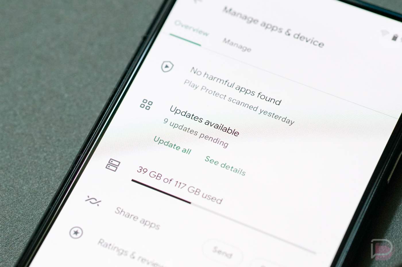
In early June, Google started fully rolling out their big overhaul to the “Manage apps & device” section on Google Play. It took away the familiar layout that showed when you first entered, with all apps who had updates available at the top, and replaced it with an overview page. This page, as far as I can tell, is not loved by many.
Currently, when checking for app updates, you get to squint your eyes and find a tiny section in the middle of the page that tells you if you have updates available and how many. You can update them without ever looking at the list from there or you can enter a “See details” page that at least shows you the apps. You can also “Manage” all apps, sort them in weird ways, see how much storage your apps are taking up, check on your own reviews and ratings, etc.
This change really is a weird one that is going to take a long time to get used to. For me, during the past month, I still can’t quite wrap my head around the reason for this setup. It takes extra steps to see the apps that need updates because of an “Overview” page that forces me to do more than I’ve had to for years. While I like the idea of an overview, maybe Google could have put all of this info at the top of a single page that let us scroll to see our apps, you know, sort of like we used to have?
Anyways, I’m curious if you have adapted to the new Google Play, if you like or hate it, or if you’ve found yourself avoiding Google Play and updates as much as I have?