
OnePlus detailed a new direction for its “visual identity” this week, going over what all is changing with concern to its logo, typeface, and overall brand image. They’re no wily little startup anymore, so I believe these changes are supposed to reflect the company’s growth and continued passion in delivering premium flagship phone experiences at affordable prices. I don’t know, I just made that up. Hire me, OnePlus.
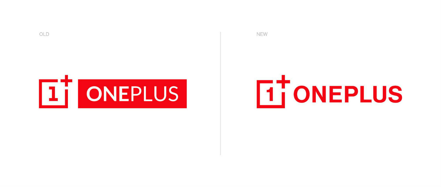
Anyway, the big change is the company’s logo. Even noted by OnePlus, your typical consumer isn’t going to notice any changes, but diehard fans certainly will. There’s apparently a whole thread of OnePlus fans irked by this new logo’s existence. Waaaah!
I think it looks fine.
New Logo
OnePlus gave the following information with regard to the change.
The changes you see here have two purposes – Create a clearer association between the logo and the brand while improving legibility and visibility. To achieve this, we increased the logo’s thickness, gave the number 1 some curve so it’s more immediately recognizable and slightly increased the plus sign to make it a more relevant part of the logo in homage to our community, which we view as an extension of the OnePlus family. We also removed the solid box behind the word “OnePlus” and made the weight of the entire logo consistent to improve the overall balance.
And it wasn’t just the logo to see change. As you may have noticed on your OnePlus phone, the company has been toying with its own font for a bit, so you’ll be seeing it basically everywhere OnePlus has imagery.
New Typeface

If you’re big in design or want to share your thoughts with OnePlus, check out the complete forum post. It’s rather fascinating.
// OnePlus