Google announced some big changes to Android today in branding and naming. Gone are the fun dessert names and in are simple numbers, as well as a tweaked logo. Why? Because the name and design of Android actually had some issues.
Android Q is Android 10
First up, though, let’s talk about naming. I actually called this on last week’s episode of the DL Show, but Android Q will not get a dessert name. Instead, it will just be called Android Q and Android 10. Well, officially and publicly, Google will call it Android 10. We’ll probably all still think of it as Android Q, because we’re weird, but just know that going forward, Google plans to use numbers to identify versions of Android, even if internally they might be referred to as Android R or Android S.
The change comes for a couple of reasons, but a lot has to do with dessert names not meaning the same thing across the globe. Android is a global operating system with billions of users and a 10 makes a lot more sense everywhere than a KitKat. Additionally, a naming scheme based off of desserts might not make it clear to everyone which version of Android they have, while numbers are pretty straight forward.
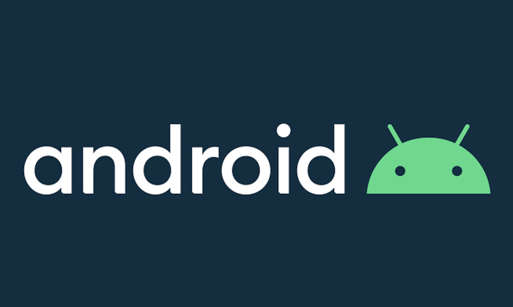
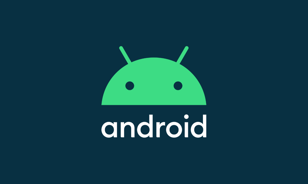
Logo refresh
As for the logo stuff, you can see the refresh above and in the video below. Google has tweaked the Android logo to now be black (because green can’t be seen by everyone), with an attached bugdroid logo on the top or side that is a new shade of green.
The logo is officially this, with the robot along for the ride at all times:
Cool or nah?