My Google Voice app just updated and I have been blessed with the newest “Material” update. That means almost nothing in terms of functionality, of course. The thing is hella white now with a different font or something, but I’ve got other beef here. What the hell is Google doing with its in-app account management these days?
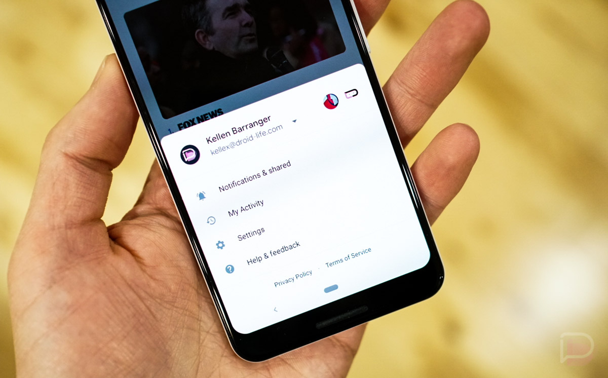
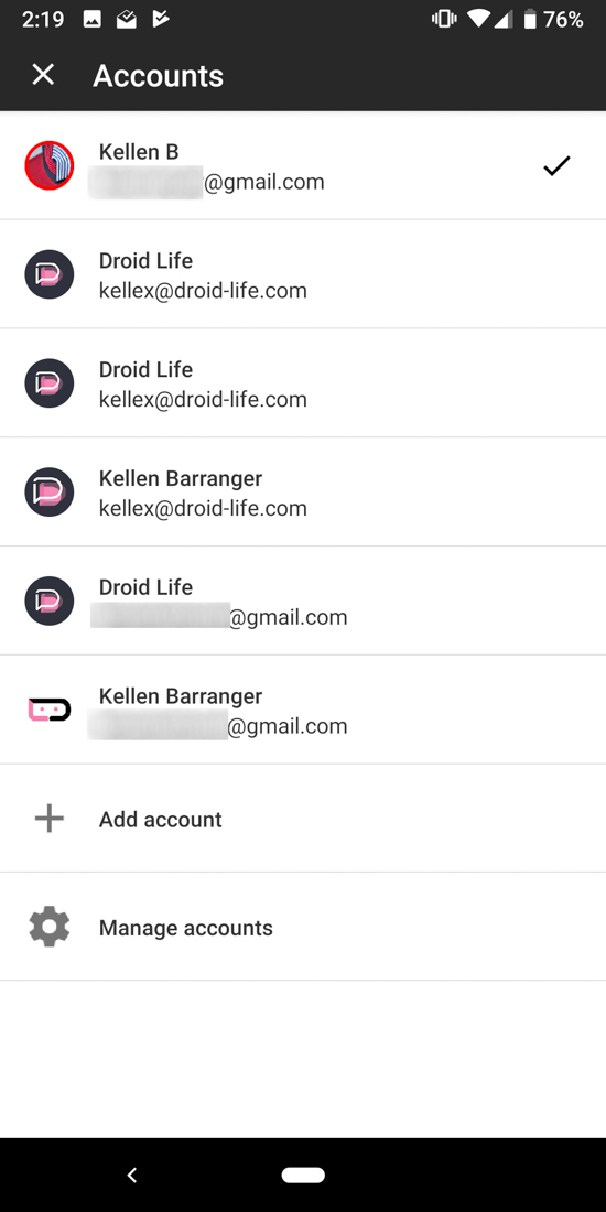
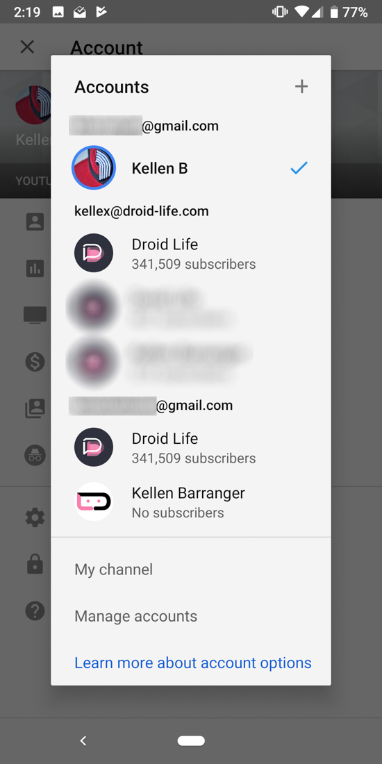
I’m referring to the system within Google apps that lets you toggle between different accounts. For years, it has been buried within a side slidout menu that often has icons for each of your accounts, along with a dropdown menu that lets you choose one. You know this menu, it’s still in the Google Play store, Google Maps, Google Play Movies, Google Express, etc. You can see it below.
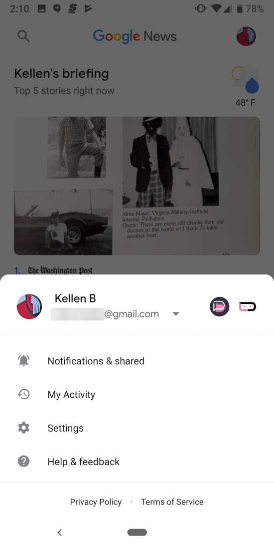
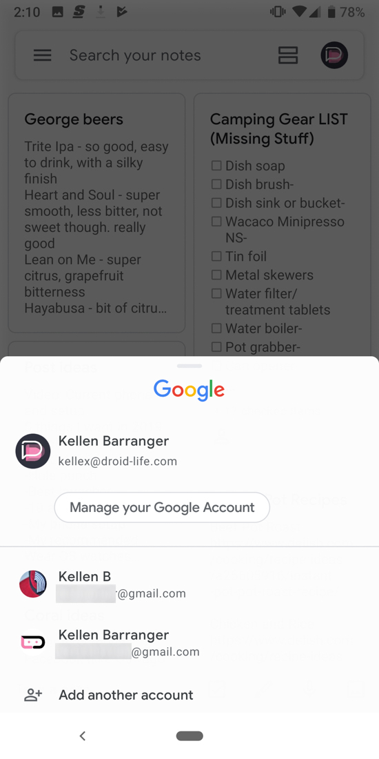
Looks familiar, right? OK, so that’s apparently the old stuff and some freshness is coming to replace it. The future more than likely looks like what we find in the Google News app and Google Keep. In this setup, you get an account icon in the top right corner that when tapped, gives you a bottom rising menu with access to the rest of them. You might find settings in there too. It looks slick and feels like a much more modern and efficient design for such an action . It’s pretty great! However…
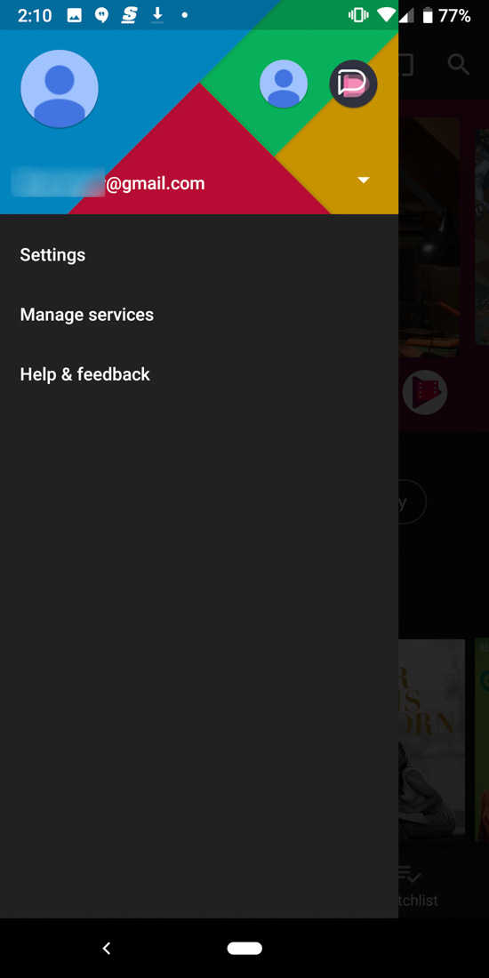
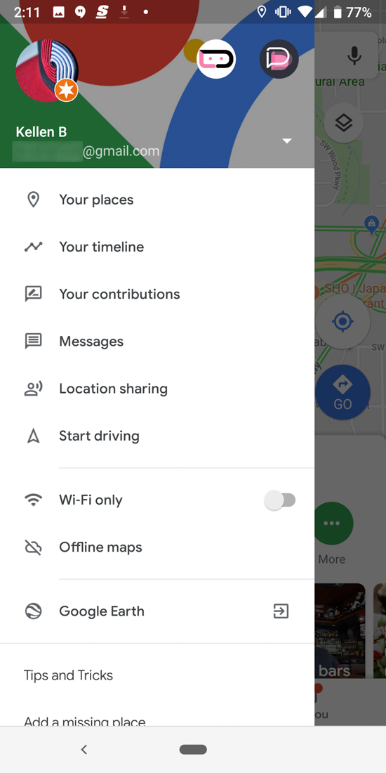
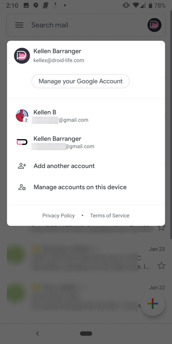
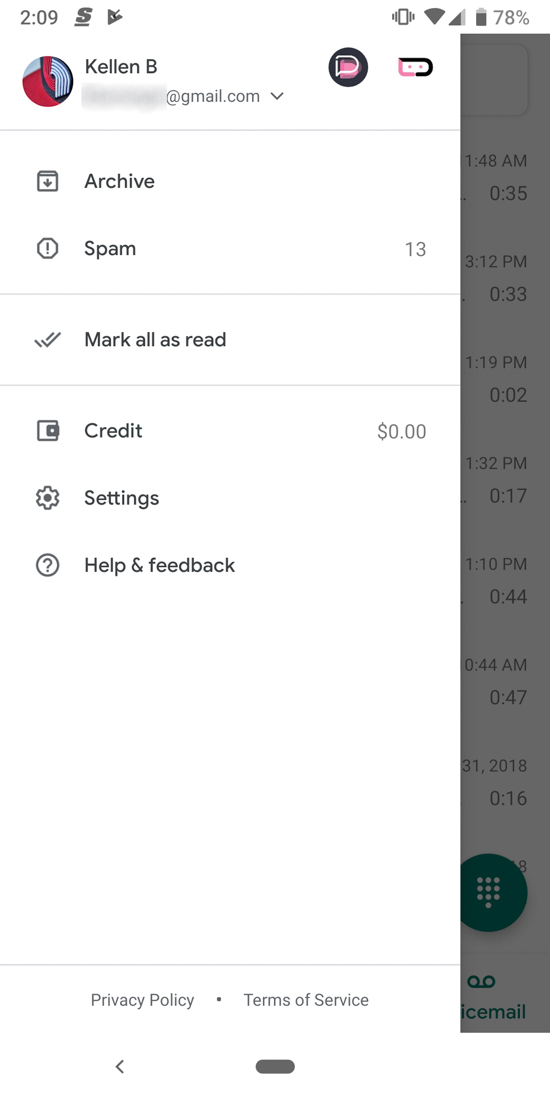
Below is the newly refreshed Gmail that just came this week. What the hell, man? This isn’t like what I just showed you above that I assumed was the new new. Instead, it’s a damn pop-up, although it’s accessed with that same top-right account icon. It’s kind of like the new new, yet not it. It’s new-er than the new.
It gets weirder, though. Anyone been in the YouTube or YouTube Music apps, or the new Google One app, lately? They also feature account icons in the top-right, but touching them brings up no such new school menu. Instead, you get everything from pop-ups to full-screen pages that might ask you to tap another area before you can “Switch account” and activate another pop-up. We’re talking 2-3 extra steps over the new account menu in Gmail or News. It’s not good!
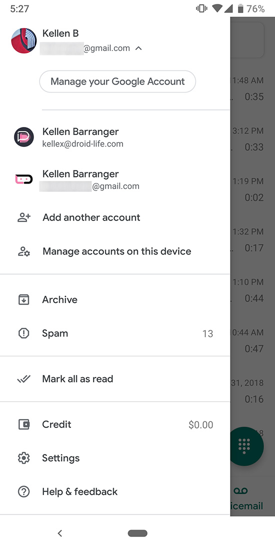
And again, I bring all of this up because Google Voice was updated with what I assumed was the new school styling with all the whiteness. But it has certainly not adopted the new account switching design. No sir, instead you’ll find a weird mash-up between that old Google Play account switch and the stuff seen in newer apps. We have the slideout menu and dropdown, but now the top account area has been shrunken down to smaller icons. When you drop it down, it then looks like that menu from Google News or Gmail! What…is…this?
Am I complaining just to complain? Yes and no. Mostly it’s because the lack of consistency here is something on another level I’m not sure I understand. When I open numerous Google apps in a day, I actually have to stop and think about where things are. And that’s because they keep changing it! I just showed you screenshots from 8 different apps, all of which receive regular updates, yet few of them offer a similar experience for something as simple as switching between two Google accounts.
If this stuff is throwing me off, I can’t imagine what it might do for the not-so-techie friend or family member or co-worker. Why can’t we get a familiar approach from one app to the next? And we don’t need every single app to look the same with different accent colors. But if I want to switch accounts, I shouldn’t have to stop and wonder where that setting might be.
Oh, and yes, I get that different Google teams are building these apps. I am fully aware that Google is the worst at consistency from one group or service to the next. I don’t care! This is a simple piece of their Android ecosystem and it should be better!