According to at least one person on reddit, Netflix is testing a redesign of its Android app. While we don’t have a ton of screenshots to share, user MyFishDrownedItself at least shared a few details about what the redesign offers.
From what we can see with the single screenshot, all of the buttons have been moved to the bottom, including the buttons for Home, Search, Downloads, and My Profile. Currently, the Netflix UI consists of a hamburger pullout shelf, housing all of the app’s features and settings.
While a button move isn’t necessarily revolutionary, the reddit user says that the app now features a “Skip Intro” and “Skip Recap” option, thicker timestamps, a central hub for notifications, as well as a dedicated section for My List.
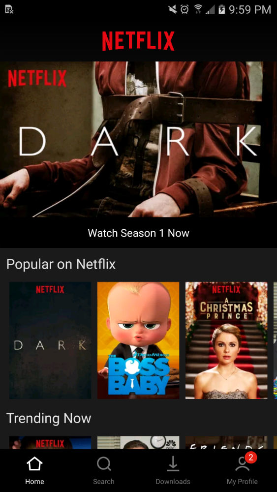
I recently updated my Netflix app and am not seeing this UI, but I’ll keep my eye on it. You should do the same. The user says the version number listed is 5.10.1 (code 25262), which is odd, because I’m sitting at 5.11 (code 25402).
Does your Netflix UI look like this?