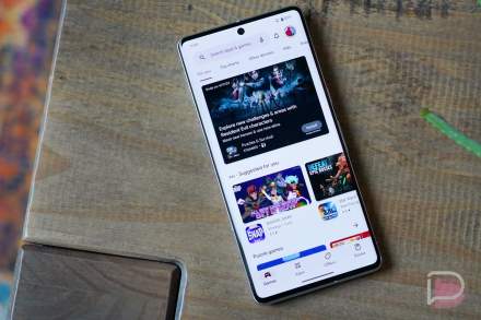
Google seems to always be A/B testing various versions of Google Play. The changes can be somewhat minimal, with not many people noticing them, while others are quite a breakaway from what we have publicly. The latest test, spotted by a user on reddit, brings a card UI to the app section, allowing a user to swipe through the various charts of Google Play.
As you can see in the GIF below, the landing looks rather normal, but once you dive into “Top Charts,” the UI morphs into cards, with the interface powered by a user swiping through the various apps. The UI’s backdrop is the primary color of the app’s icon and header image, proving to be a very immersive look.
I checked on a couple phones and I don’t have this UI, and your phone probably won’t have it either. These tests are typically quite limited, and as I mentioned, unless you’re actively looking for this stuff, you may never see it.
Personally, I quite like this UI – It’s colorful and the idea of swiping through the Top Apps could be cool. However, just seeing a big list for easy skimming seems more efficient.
Thoughts?
