Chrome Beta 51 just showed up on Android and it killed off that never-quite-implemented-correctly “Merge Tabs” feature that was introduced back with the launch of Lollipop. The death of tab merging first showed up in Chrome Dev a few weeks back, but now that it has made its way through to Beta, I think it’s safe to say that it is probably on the way out for good.
For those not familiar with “Merge Tabs,” we have to take you back a couple of years, to a time where Google thought that you wanted every single open tab in Chrome merged into your recent apps screen. That meant that if you had 5 or 8 or 15 tabs open, they were all intertwined with your apps, making a disaster of your app switcher screen and also making it insanely more difficult than it needed to be to switch between tabs. If you had “Merge Tabs” turned on, it also killed off the tab count button and ability to swipe across the action bar in Chrome to switch between tabs.
It was awful, for the most part. But really, all Google needed to do was let your tabs merge, while keeping the swiping and tab count button in the action bar and it wouldn’t have been that bad. But they never did that for some reason and now appear to be ready to abandon the idea.
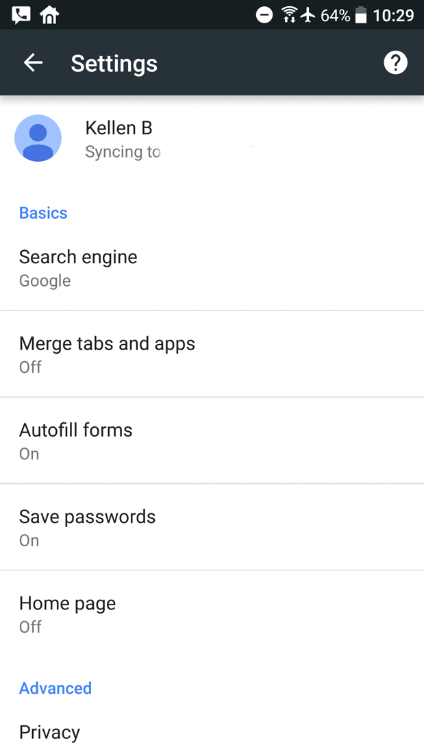
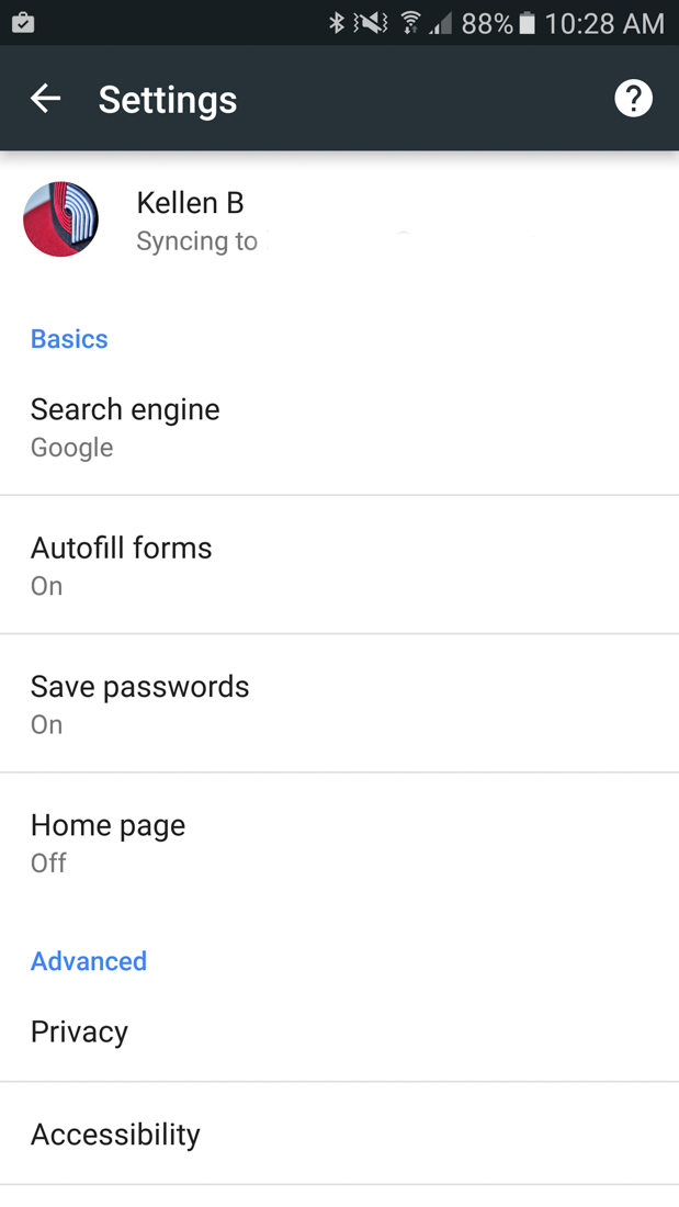
Chrome Beta 50 vs. 51
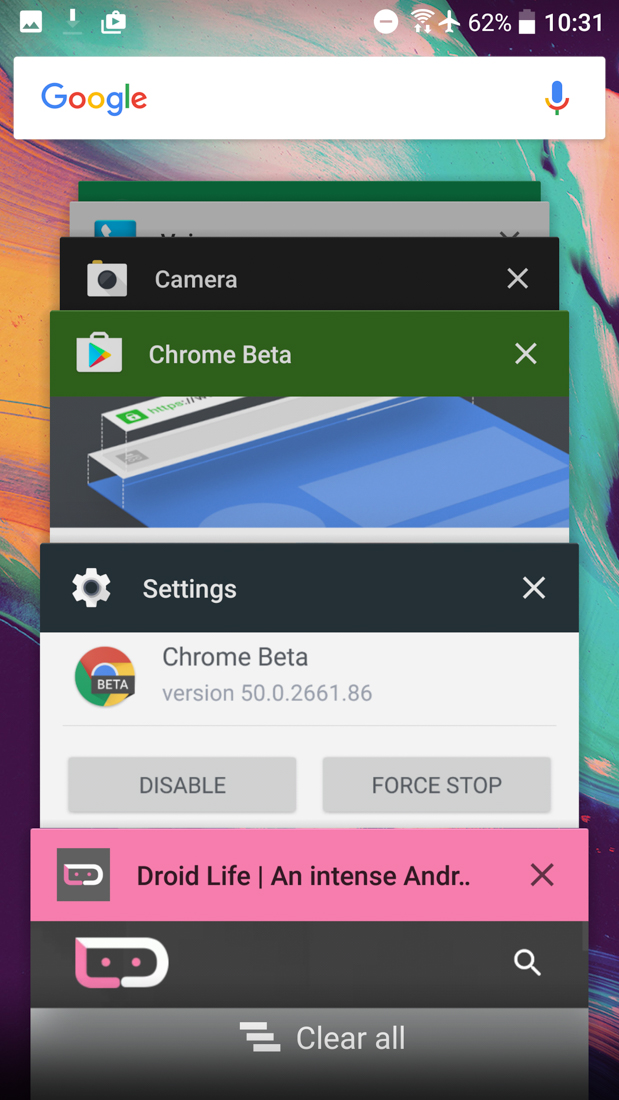
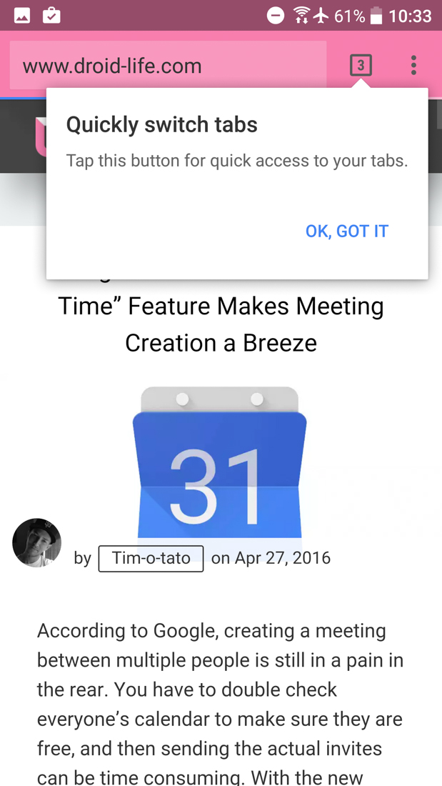
And to show you that merging of the tabs is now 100% gone, here is my HTC 10 before updating to v51. You can see I had it merged with three tabs open, all of which were showing in my app switcher. Then, post update, Google took those tabs out of the app switcher and stuck them back in Chrome, plus it then told me where I could find the tabs because merging is gone. Sad face?
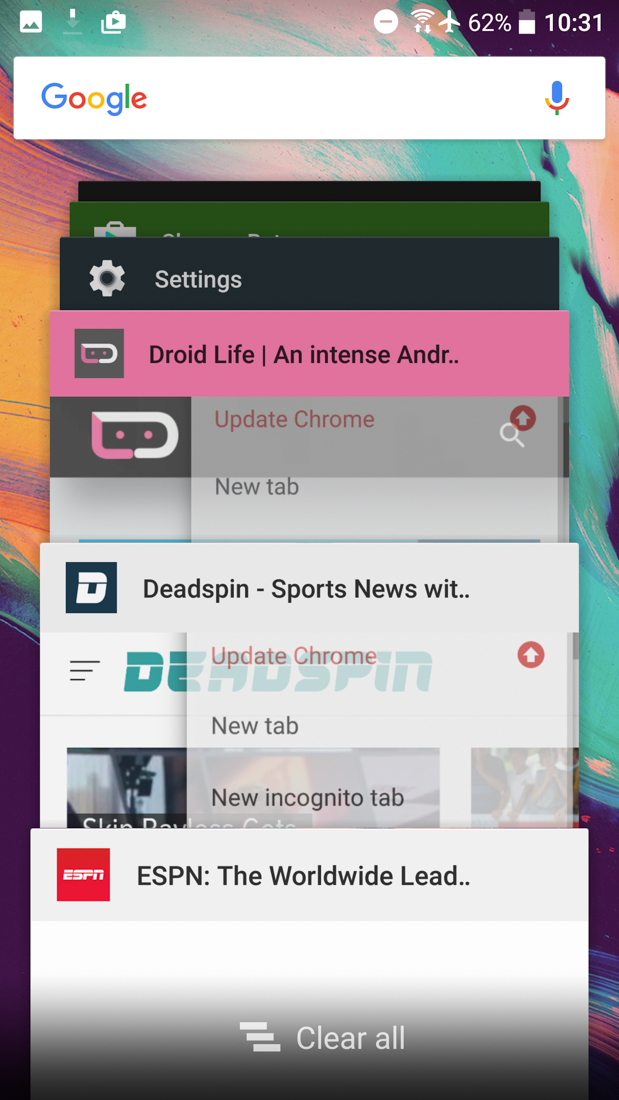
RIP, “merge tabs.” You were unused by many and likely won’t be missed.


This is an idiotic change, and now it is in the release version. I have to reteach myself how to use my goddamn phone! Using the task switch button is much easier than using the tiny, top of screen tabs button in Chrome on any large screen, AND it allows you to jump to specific Chrome tabs from anywhere in the UI. I looked at my phone this morning and felt like I dove back in time to 2012. What is this, an HTC Verve??
Dick move, Google. I kind of hate my phone this morning for frustrating me. Thanks for that.
I hated merged tabs. It was a complete abomination.
It seems like I’ve used merge tabs forever now. I really liked the feature. I woke up this morning and went to check a few webpages while waiting for my toast and was confused. It’s going to take a while to train my brain how to switch tabs again.
And now that Android N has split screen multitasking, this is exactly the functionality needed to view two Chrome tabs side by side. If only the app tabs were just bundled together like a tab group in the app switcher.
I miss it….
A week later? I hate this more than ever. I need merged tabs back. Time to root.
They should introduce the ability to choose which tabs to merge. That sounds like a huge pain in the ass though. Even as a former programmer it doesn’t sound with the trouble. But I would definitely love to be able to decide to turn 1 tab into “app window” whenever i
Mr. Kellex, you have been proven wrong. Judging from the comments, many people liked this feature and will be missing it.
You should see the reviews in Google Play.
NOOOOOOOOOOOOOO I love using merge tabs :'(
This is a bad move. Merged Tabs is great on bigger devices. Why reach up to Chrome’s specific switcher when the System switcher is right there at the bottom where my fingers already are?
Now if they can just move the “+” to create a new tab from the upper left where it is unreachable to the lower right (or left) where it belongs. Seriously Google, WTF?
I turned it off almost immediately anyway, and since Google gets anonymous usage data, I’m guessing others did the same. Enough of us that they removed the feature altogether.
Ugh, it was such a clusterf*ck in recent apps. If they implemented the tabs side-by-side in a horizontal scrolling fashion in recent apps (like pages of a book), at least it’d be less cluttered; meaning if you were in another app, you’d hit recent apps, scroll up to Chrome, then scroll horizontally for tabs. The way it was implemented was totally inefficient.
I loved merged tabs, I like to keep my recent apps clean and the feature worked well for me. However, I have to say that I like that horizontal list idea. However, it would take more than a Chrome update. Maybe in Android O?
I really didn’t get all the hate for this. I’ve used this since they first implemented it and actually preferred it. Also, does no one know that you can swipe on the app switcher button to switch back and forth between open Chrome tabs, not unlike swiping on the navigation bar? Obviously this requires on screen buttons.
What phone do you have? I don’t think swiping on the app switcher button is a standard Android thing, although it sounds really useful.
Yes, what is this feature? Pretty sure I would’ve heard about it if it was in stock Android.
I liked having tabs merged with apps, they should at least bring back the option. When it first happened I was wary of merging tabs. I lived with it just to see what it was like then never turned it off. Leave it off by default if it’s not very popular.
I really disliked it at first, but with a huge phone screen it was easier to hit the multitasking button with my thumb then reaching up to the top to hit the tab button in chrome so I kept it and got used to it. I’ll be semi-sad to see it go, although it definitely is confusing to new users.
It’s easier on any phone. Reaching the tab button on my little moto x1 is a headache.
That’s good, it’s the first thing I changed every time.
Very bummed they disabled this. I love the current “Merge tabs and apps” functionality. Just make it not the default option if people have a problem with it. I know I would opt in and leave it on for good.
I hate it, glad it’s being removed. That way whenever I get a new device or FDR my current one, I won’t have to go in and turn it off… lol
It would be fine by default if they turned this feature off and give the merge tabs feature as an option for those that want it. I hate the fact they removed it entirely. But I an see why you hate it at the same time though and respect it.
Looks like it’s going to be replaced by allowing you to open new windows. It was live in Dev channel for a little bit.
The idea of opening a new window is nothing new. This would be a good compromise. If you want separate chrome instances, each web page can be opened in windows instead of tabs.
I really wish they would give us a way to kill the colored address bars on websites, I can’t stand that it drives me nuts!
I’m actually really going to miss this feature.
The fact that I couldn’t switch tabs by swiping the action bar kept me from using this feature. Now I’m glad I never got used to it, so I’m not upset that it’s going away.
If you have on screen buttons, you can swipe left and right on the app switcher button to switch tabs.
I don’t, but I didn’t know that. Cool.
No you can’t
I’ve been using it this whole time and really never bothered me, going to interesting switching back to the old style. i actually missed it when i was using my nexus 7 that doesn’t have it turned on.
Good. It sucked and it was annoying.
Yeah it was so irritating and annoying since you didn’t have to use it. But, I guess someone from the Chrome team came to your house and held a gun to your head, right?
Is the Samsung that great? I have the note 5 and thought about using it but I was so use to using chrome
Funny I turned that off today. I’ve used it since I got my Nexus 6P and really think that it had a rather bad implementation. I never knew how many windows I had open, I couldn’t use gestures to switch between tabs. I’m actually glad they got rid of it
I thought it was obnoxious.. especially if I had more than 5-7 tabs open in Chrome, which is usually the case. So I never used it.
Don’t understand ANYONE can could find any efficiency in how that worked. It didn’t make much sense.
Exactly, why did through tons of recent apps to find the tab?
Not everyone leaves tons of recent apps open. I rarely leave more than than 3 tabs open. I use to be able to tap recent tabs and tap. Now I’ll have to open Chrome, reach CLEAR to the top of the screen, and tap. For those that never close tabs and probably have a few thousand unread emails, this wouldn’t be efficient (but if you have that many recent tabs open your already inefficient). I dare you to enable merged tabs and swipe everything you don’t use, at least for a week or so. I didn’t like merged tabs at first but it grew on me. It’s all about preference.
“reach CLEAR to the top of the screen”
1st world problems….
Actually, my phone is the first gen Moto X; Only 4.7 in. Got it refurbished for 60 bucks. 😀 I may be ‘Murican but I’m not made of money.
I have a handful of tabs open at a time ever, so it made multitasking a lot easier for me. Now I may as well go back to BlackBerry 10 because their browser is better than Chrome now.
Never used it, but found it useful in N. Oh well…
I remember when they first started doing this, it was the only way you could get the colored action bar. Turning off Merge Tabs gave you the older, grey look. It was pretty much the only reason I left it on. But I see now turning it off keeps the colored action bar.
Yay for color, and no, I won’t miss Merge Tabs.
i turned that crap immediately after hearing about it. such a poor implementation. good riddance.
I liked merged tabs. It felt better to me to just close a tab like I would any other app from the recents.
Turned that bad boy off a while ago.
Maybe I was one of the only ones that really liked this feature, but gonna be sad this is gone. Before it was added, I would end up with a bunch of unwanted tabs open (I like closing down tabs when I’m done with them, and it’s clunky to do so in this….in desktop Chrome, do people leave 15, 20, 40 tabs up? I think not). With this feature I would just use the “close all” in the app switcher to close all tabs along with other stuff.
I too liked it. That way I didn’t have a ton of tabs open. I never look at the tab counter in the top corner.
I’m with you
I too like the feature. It is great for using web sites like an app. Specifically, using the web version of Facebook feels more like it is an app. It does kind of make general web usage a little more awkward, but that’s not really how I use the web browser on my phone.
It worked so great in tandem with the add to home screen option too. Blurring the line between apps and the web was a good thing.
Thankfully if you have a web site added to your home screen it will still keep that in a separate window even if you have merge tabs and apps turned off.
More info please? I just tested with for websites added to my home screen (my chrome is actually a shutter. Swiping onbit opens all the shortcuts) (the pages were Shoes for Crews, Droid Life, Android Authority, and N4G) and they all opened into the chrome tab. No separate tabs in the carousel for them.
Same here. I’ll miss this feature.
I think the reason it wasn’t as popular was you had this feature when you weren’t using this feature in the app itself when you click on the box with the number it would perform the same duty and had less confusion and clutter when you went into the recent apps.
I personally like closing everything once I’m done with it. With this feature off, I have to close the tab, then hit the recents and close Chrome. With it on, I just swipe the tab away in recents. It closes both the tab and Chrome at the same time. I know people like to leave stuff open though
You still had the option to not use this feature though. Now we won’t have the option to use this feature if we want to.
That’s what I’m not going to like. The missing option. I don’t see why they can’t leave it and let the user choose.
I think they’re not interested in maintaining the code for this in upcoming revisions.
True
I want the option to. I understand people not liking it, but I don’t understand taking it away from the people that do when the people that didn’t like it didn’t have to “suffer” through it.
I also don’t like Droid Life pretending like they didn’t think this was the Holy Grail of awesome when it was first announced. What’s with them pretending like they always hated it.
Yeah, I liked it too. It made everything more unified and made webpages work a little like apps. I agree the implementation was a little clunky, though.
I like that it was clean but was VERY useless in actual use IMO. It was the first thing turned off on every new phone.
“my room mate Mary Is getting paid on the internet 98$/hr”..,……..!wc260ctwo days ago grey MacLaren P1 I bought after earning 18,512 DoIIars..it was my previous month’s payout..just a little over.17k DoIIars Last month..3-5 hours job a day…with weekly payouts..it’s realy the simplest. job I have ever Do.. I Joined This 7 months. ago. and now making over. hourly 87 DoIIars…Learn. More right Here !wc260:➽:➽:➽➽➽➽ http://GlobalSuperJobsReportsEmploymentsSuperGetPayHourly$98…. .❖❖:❦❦:❖❖:❦❦:❖❖:❦❦:❖❖:❦❦:❖❖:❦❦:❖❖:❦❦:❖❖:❦❦:❖❖:❦❦:❖❖:❦❦:❖❖:❦❦:❖❖:❦❦::::::!wc260…….
i still have it on my latest version of chrome dev… oh wait im rooted and i installed an Xposed module to allow it… root your phones 🙂
You werent alone. I liked it and will miss it.
The same people who have 35,000 unread emails, lol
I liked it. It made the mobile experience a little less horrible. The removal makes me want to go back to blackberry 10, to be honest. At least BlackBerry 10 isn’t removing good features every 2 versions of their apps.
I hated that feature anyway