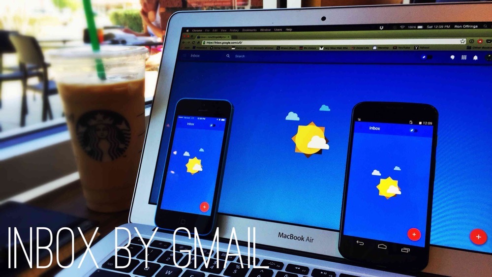
Gmail has looked like Gmail for a very, very long time. It looks stark and minimalist to a flaw. With the onslaught of third party Gmail apps like Sparrow, Mailbox, Acompli, and Boxer it seemed like Google was going to become a dumb pipe for these smarter Gmail apps. Then came Inbox.
Inspired by Mailbox
Inbox isn’t so much a reimagining of email as it is a copy of Mailbox with a few added features and a (much needed) coat of paint. Like Mailbox, Inbox is centered on the idea that your emails should be treated like a to-do list. When a bill comes in you can open it and pay for it, or snooze it until your next pay check, or archive it because you’re pretty sure Time Warner Cable finally figured out how auto-pay works.
Inbox also requires an invitation, much like Google+ and, you guessed it, Mailbox. It’s not clear why Inbox requires invitations since the product is very polished and Google has no lack of servers. You can request an invitation by emailing inbox@google.com or have a friend send an invitation your way. Once you receive an invitation, your access is granted by signing into the mobile app. Right now Inbox only supports normal Gmail accounts, but Google Apps account support should be coming in the future.
Unlike Mailbox, Inbox launched with apps for iOS (iPhone only), Android, and Chrome (that’s right, Inbox will not work in Safari, Firefox, or Internet Explorer – maybe that’s the reason for Blink). The apps all feature the same overall design with a few idiosyncrasies.
On All Apps
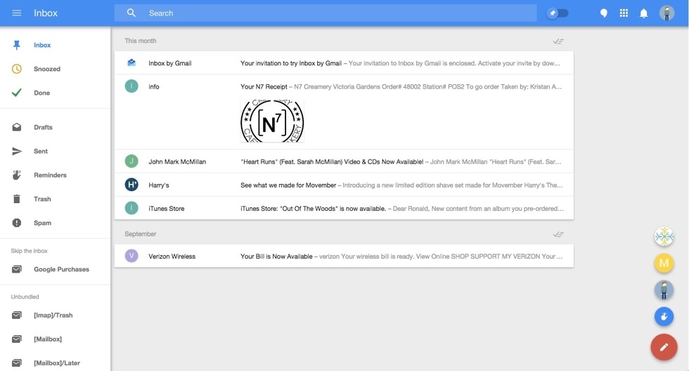
Inbox’s main innovation in your inbox is that it surfaces content to your inbox. So, if Kellen emails me a picture of him and Tim enjoying a beer together, Inbox will show me the title of the email and a preview of its text, but right below that it will show a thumbnail of the image. Tapping or clicking on that image opens the image directly so that you can access content right away. The same applies for any kind of attachment, which is a huge help for quickly getting to the content you want, not the email and then the content.
Inbox also allows you to pin messages to your inbox. With pinned messages you can mark all others as done or just filter your view to only your pinned items in order to focus in on things that are more immediately important. Inbox also features filtering options, now called bundles, that Gmail introduced last year (yes, you need to turn them off again if you don’t want to use them). All of the apps feature the ability to turn emails into reminders which sync with Google Now (but oddly not with Keep, almost certainly because Google Now is available on iOS and Keep is not).
Chrome
Inbox is a bit more powerful in Chrome than on mobile because it supports Gmail’s keyboard shortcuts (J and K to move through messages, O to open, E to archive, F to forward, / to search, . to move a message to a folder, and C to compose). Unfortunately, there are not shortcuts to open the side menu or to snooze, but Google may add some soon. Inbox in Chrome also has built in Hangouts integration (similar to that found in Google+), which will launch the app if it’s installed or open the chat window in that tab if not.
Android and iOS
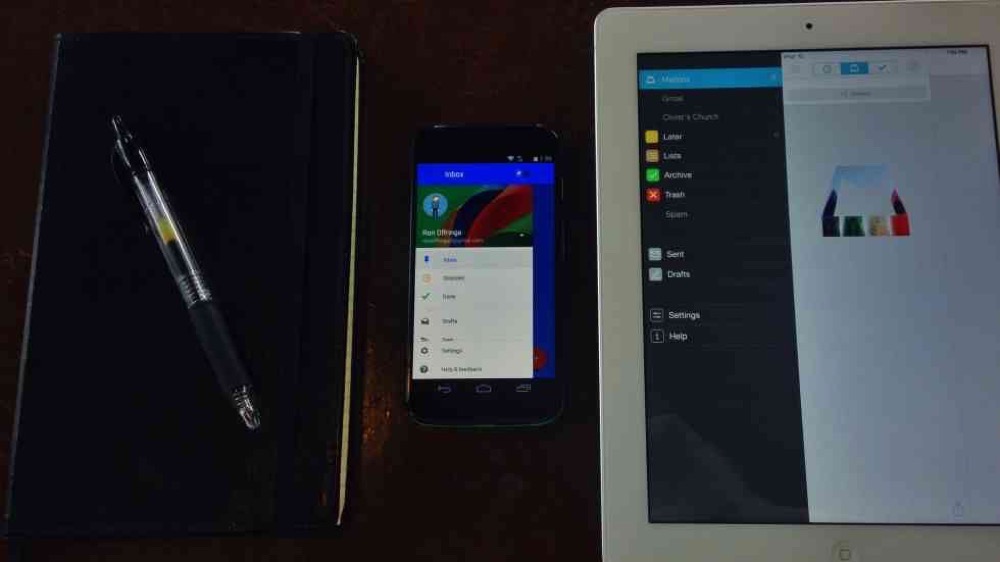
The app is almost identical on Android and iOS, with the major difference being that the iOS app is slower and slightly more difficult to navigate. Both feature the same Material design with a hamburger menu, location label, and search button adorning the top navigation bar. Tapping compose brings up the options to compose an email, create a reminder, or email your most popular correspondents (on Android your current location in the app fades out in the background except for the top nav bar, on iOS everything grays out including the nav bar). Opening the side menu reveals your Inbox, Sent, Done (archived), bundles, and other folders (on iOS the Settings and Help & Feedback buttons are at the very bottom while on Android those buttons are pinned to always show).
Both apps feature pull to refresh, with the iOS app lowering your content to reveal the animation and the Android app lowering the animation on top of your content, each iteration representing design standard on their respective platform. The iPhone 5c, Moto X (2013), and Note 4 all show the same amount of information (5 normal emails) while some larger screened devices are able to fit in more (for example, the iPhone 6 is able to display 6 emails and Android tablets are able to display upwards of 8 messages).
Once messages have been archived the only way to move them back into your inbox is to open the message and tap the check mark or tap and hold to select the message and then select the check mark. Compared to Mailbox, which displays a physical hierarchy that is maintained throughout the app with snooze on the left, inbox in the middle, and archived on the right, this process of organizing emails between locations feels tedious. A simple swipe from right to left to return a message to the inbox is far faster, but Inbox still gets the job done.
There are three major differences between the iOS and Android apps that make the Android app better and faster to use. The first is selecting multiple messages. You can tap and hold to select multiple messages from any view. For whatever reason the iOS app takes about 2.5 seconds to select your first message while the Android app is consistenly under a second (I tested this on my iPhone 5c and my wife’s iPhone 6). That alone makes the iOS app feel annoyingly slow when you have to select multiple messages (which is admittedly rare). The second is accessing the side menu. On the Android app you can slide the side menu out by dragging from the left edge of the screen to the right, even if there’s a message below your finger (just like in every other modern Android app). On iOS a swipe from the edge will initiate the archive gesture (unless you’re in Done or Snooze, then the message will wiggle as a reminder that Mailbox’s gestures are better).The only way to access the side menu on iOS is by swiping on top of the navigation bar or tapping the hamburger button. The third difference is that the iOS app does not support the swipe from the left edge of the display to go back, meaning you have to tap the X to close an open message; on Android the back button is the fastest way to return to the last location.
Inbox or Mailbox
After spending a lot of time playing with Inbox and using it as my full time Gmail app I have to say that I still prefer Mailbox, especially if your workflow includes OS X. Mailbox for OS X is so much faster to use than Inbox in Chrome. Emails can be archived or snoozed by swiping over them with the mouse or with the arrow keys. You don’t ever have to leave the keyboard when using Mailbox, which also makes it much faster to use. ⌘N creates a new message, / starts a search, ⌘Number gets you into Snooze (2), Lists (3), Archive (4), etc. If Inbox had the ability to archive and snooze messages that easily then I would call it a draw, but with Mailbox’s native OS X support it’s the clear winner. If you’re on a PC then I would probably use Inbox simply because it’s prettier than Gmail with the same functionality. If you never use a computer to use your email then it comes down your personal preferences for the apps. I think Inbox is prettier than Mailbox, and if you’re on Android then it will feel far more native than Mailbox does. If you’re on iOS or need a unified inbox, however, I would stick with Mailbox.
While Gmail promises that Inbox is just a side project, I really hope that Inbox becomes Gmail. It’s prettier, better designed, and fun to use. It may be a pretty heavy rip off of Mailbox (what modern Gmail app isn’t?), but it works well and the added features of pins and reminders set Inbox apart as potentially more helpful for organizing your emails as a to-do list than Mailbox.