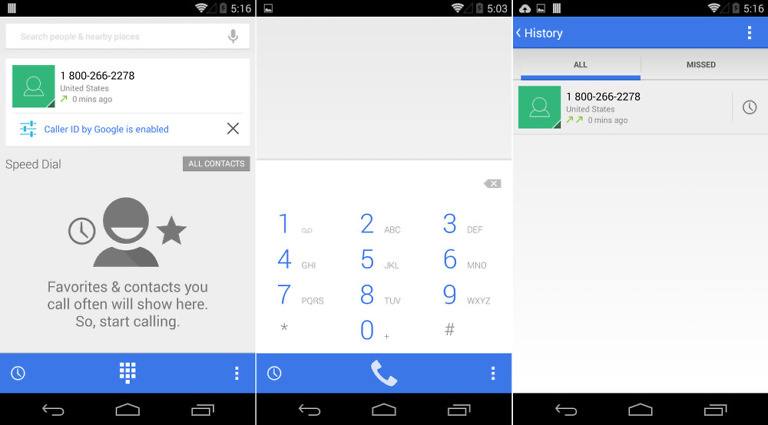
We are still digging through Android 4.4.3, looking for major changes to talk about, like the newly re-skinned dialer that we already showed you. Unfortunately, the update is starting to look as minor as expected, so we aren’t finding much much else in terms of up-front overhauls to give you a look at. The People app did receive some much-needed love, though, making it look a lot more like Gmail and a lot less drab.
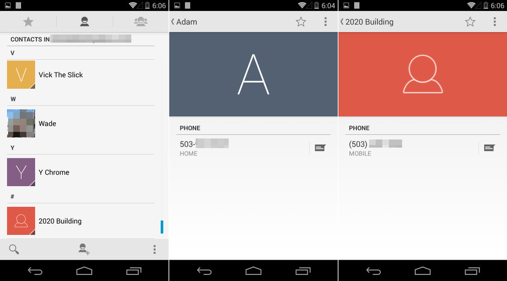
As you can see from the images above, your contacts without contact images are now a lot more colorful. In place of the greyed-out icon for contacts that you will find in Android 4.4.2 and below, we now have colored boxes with letters to represent the first letter of the name of the contact. If you are a Gmail user, then this will look very familiar. In individual contact pages without contact images, we are also seeing that letter and color from the “All Contacts” page carry through. It certainly brightens up the People app.
And that’s about it. A little polish that goes a long way, in this case.
Noticing anything else in 4.4.3 that we are missing?