One of the fun things about having such a talented Android community is that we can imagine what future versions of Android will look and feel like, way before it hits the streets. Sure, it may end up looking nothing like it, but it’s a great way to hear ideas of what people might like to see inside the OS. The most recent idea to hit the web is an Android 5.0 concept video, created by designer Craig Tuttle.
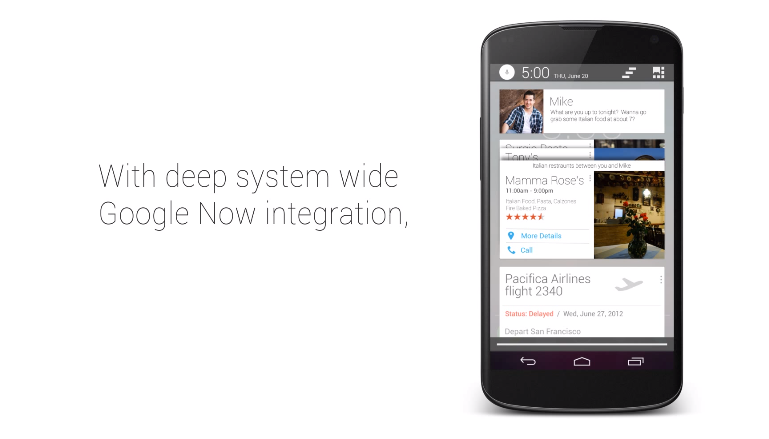
In Craig’s mind, the next version of Android following 4.4 “Kit Kat,” will feature extremely deep system wide integration with Google Now. Instead of a regular notification pulldown, you will be greeted by things that would usually be seen inside the Google Now app, but only at times when you need them. This is already the idea behind Google Now, so it isn’t the furthest stretch of the imagination to assume this could even happen.
In addition, Craig changed up the color scheme of Android a bit, going for a more whited out look, instead of the now well-known Android blue that first stuck in our minds with Ice Cream Sandwich. Some would argue that the blue color came with Honeycomb, but does that really count?
Take a look at the video and let us know what you think of the concept. We think it’s pretty slick, especially the new multitasking windows. Those are hot.
[youtube]http://youtu.be/HBL43tr8Gt0[/youtube]


Apple just showed all their employees this
love it!
Oh great. Now rumors will start and people will complain when it doesn’t look exactly like this.
Fluff article is fluff.
“In Craig’s mind” – all that needs to be said. I see no note that he works for Google, or that there’s anything to make this news at all.
I really enjoy this site –but really? This is like the World’s Fair “House Of Tomorrow” or other such exhibits. A lot of imagination, without much perspective to put it in reality.
Get over yourself. this was just a fun video about what could possibly happen in the future.
seriously, get off your high horse. this site doesn’t need readers like you.
Read article before posting, kthx.
If only I knew more than 2 people besides me that use Hangouts and Google+, then this might work…
I like the lock screen live animations, the new Multi-tasking set up would be cool but for closing the apps you would want a slight swipe away. Like chrome. I also say No go on the Now style notification bar, it’s too cluttered and too much white. That can be a battery killer. More OK Google actions would be cool.
Don’t like that everything is white. Yes its just a concept made by some ramdom guy but still.
I like this concept especially the multitasking card view but what I want to see Google now do is always be in the know. Check my messages and if someone messages me regarding directions to a certain venue I want Google now already searching directions for it before I even read the message. Just one idea of many that I have.
It would be cool, but I personally don’t know THAT many people that use Hangouts as a messaging app.
Looks nice…
What do I want to see most in 4.4?
Google Now hooks. Meaning Pandora for example could have “[Pandora] play ____ radio” to fire up a specific station.
Quick settings hooks. Meaning Tesla LED could add a flashlight toggle into the quick settings drawer. This could have design guidelines like notifications.
I can see the next major overhaul having Google Now deeply rooted in everything you do on your phone: calls, photos, social media etc. I am wondering if it is being designed to be the next “launcher” for your phone.
While I think your on the right track, I think this would be something we might see over a year from now
Which is what phones like the moto x need.
looks cool. Of course that’s on stock. When it’s on Samsung HTC LG Sony is going to be a bit different.
i would love to see Android come out with a small update liek 4.4 or whatever and include some of the more polished custom rom features from roms liek PA, AOKP, or CM. For instance a battery percentage icon choice, clock options, lock screen options (which did grow with widgets and such). Maybe some more customization on certain UI tweeks. Again it would be optional but it would be nice
Esta muy asombroso, debería ser asi
thats pretty awesome
I would love to see a ROM based on this mockup… It looks very slick and I’d like to see stock be integrated further with Now, especially since that’s what Google seems to want to focus on for the future (based on Moto X’s features and how much they are working on increasing usability with Now).
Things I like:
The multitasking concept (YES PLEASE!)
The shift to white (it’s a more neutral color)
That lockscreen animation
Transparency and the notification bar coloring (Though I don’t see this being easy to implement, unless they let app devs tell it what color to use)
Things I don’t like:
Google Now Notification panel (far too cluttered)
Removal of the ‘ICS’ status icons (they’re much more… awesome)
Regarding the color: It can be auto-updating depending on the most common colors int he app, perhaps? (…or it could base it off of the app icon so that it wouldn’t change while the movie played)
The problem of course being that a lot of apps don’t have a dominant color – like Chrome. What color should that be?
I am certain the fine minds at GoogleHQ could come up with something. 🙂
Really only 2 options (assuming the app doesn’t tell it a color): either it chooses the most common color (Yellow in Chrome, which would fail miserably), or default to black.
Wondering how Chrome is yellow…looks to me like the red, green, and blue are all the same.
Regardless, I am sure they’d have some logic in there saying “These colors are a no-no”.
Yellow occupies more pixels.
And lots of apps use yellow (again I’m just using one specific example out of thousands of potential complications) as their color (Plex, for example), so you couldn’t make hard rules about that either.
So to circle around, basically they have 2 options: Most dominant color (pixel count wise), or black.
No.
They have an infinite amount of choices…we just haven’t thought of them all.
One example would be an amalgamation fo teh primary colors represented in the icon, app, etc.
Another would simply be to have the dev specify and failing any specification, dropping back to another default or amalgamation, etc…
I’m sure there are many more options. I am sure the folks at Google can probably come up with a few you and I cannot.
I think the word you’re looking for is ‘algorithm’.
Which is kinda what I’m saying – when an algorithm looks at the colors, assuming it can check vibrancy and such, it’s going to see 4 highly saturated tones in the Chrome logo. As such it would count the number of pixels in each, and select the one with the most pixels. In 80% of situations this is going to work fine. In situations like Chrome, it’s going to look really strange. Alternatively the algorithm could blend everything together and use that, but that’s going to look terrible in 99% of situations.
I already mentioned devs specifying colors, the ‘fall back’ is what I’m saying they have 2 options for.
And Google is good. They cannot break current technical limitations, however. To make something like this work without specification requires the human touch (at the moment… give it 5-10 years and that will probably be changed).
*sigh*
I’ll just leave it at:
Here’s hoping they surprise you. Cheers.
I hope so too, unfortunately I do actually know what I’m talking about.
But hey, if they do manage to break the ‘thought’ barrier on computers, I will totally come back and give you $5.
No, I think he was looking for the word amalgamation. IE: the process of combining or uniting multiple entities into one form.
It looks like the notification bar might not be changing color per se, but instead just allowing the app to designate a color to place behind the default transparency. Much more doable I would imagine, and the effect of having the notification bar always be slightly darker is very nice imo.
The blue of ICS/JB looks dated to me. I jumped on the GNex bandwagon from day 1 maybe that’s why. White is much better for stock. Let the tweakers come up with custom colors. White = classy imo
Sounds like you need an iPhone. I think white=boring.
Please don’t say that! :p I couldn’t imagine ever going to an iAnything. I’ve always been with Android. I think Apple makes legit nice products, but they do not appeal to me in any shape or form. Having said that, white status bar/notification icons and UI color scheme would liven and “classy up” Android imo. We’ve got all the killer developers to throw cool colors our way
White eats up battery faster
In the status bar?….. c’mon
Looked kind of cluttered to me.
This mockup gave me a windows phone feeling, but brighter with all the rectangles in google now.
Not bad! I really don’t think we’re going to see that much of a stylistic change. I think we’re still talking Jelly Bean-esque levels of improvements here. But if the next next version of Android is Google Now centered, this would be a decent “missing link” between the two styles.
Great job to the creator of the video!! It is definitely based in reality and wouldn’t be too surprised if Kit Kat (or later) is similar.
Seems sweet, but I really have to ask; would Google provide that much integration with stock android? For one, they’ve been pushing a separation of Google services from android through the play store, plus it seems like that might piss off manufacturers. I think a Google phone like this would be awesome, but I could see that being separate from stock android. The only thing that really suggests they might provide this much integration is the swipe up for Google Now feature they currently have. Thoughts?
Believe me, they’d find a way to integrate it somehow.
Whomever made this, leave the music crap to apple
I’d rather see Android hipsters than Apple ones. 😛
Hipsters dont use android…only apple…because it’s indie!
I’ve seen hipsters with ironically retro flip phones.
Flipsters?
Honeycomb was a legitimate Android version and I didn’t hate it.
*ducks and runs*
But how do you feel about bubbles?
I’m for ’em!
She’s the best powerpuff girl hands down.
I upvoted you but then I remembered that Bubbles is the cute-sy blue one… clearly, Buttercup over evry’thang.
Bubbles always had to like confront her fears to save her sisters though. And she was blue, which is the best color ever, so yeah.
The worst thing about HC was the stock browser, which FC’d constantly due to memory leaks. And the lack of tablet apps for several months after it debuted. Other than that it was great.
I used Dolphin and got the Xoom LTE like a year after it came out, so I didn’t experience any of those early release problems. Then again, I also mentally considered it the Windows Vista of Android. (The former being horrible enough to mask what minor quirks lied in Honeycomb)
That notification panel is way too busy.
I’m sure if they DID do that, you could customize what shows up and what doesn’t.
Make it JUUUST how you like it 🙂
And I’m not digging the white status bar
I think expanded vs expand-able is key with stuff like that.
Imagine if u get text asking what time is your flight, then scrolling down to flight card, then back up to reply. The situations are endless and useful.
….MUST……NOTIFY……YOU……
My
roomate’s mother makes $87 hourly on the laptop. She has been fired for 7
months but last month her pay was $21739 just working on the laptop for a few
hours. Read more here…www.Pro67.ℂom
Love the googlenow merge with notifications. That just seems so logical, I’d be disappointed now to NOT have it in 5.0
Like the task-management, too. Good use of space vs having to scroll endlessly.
stack em like chrome cards, and have the tilt to pan option. Why didn’t Jony Ive think of that?
Don’t worry, someone at Apple will see this and copy it and claim they made it. That’s pretty certain. The isheep will eat it up as a fact.
Yeah my imagination went wild and i’m getting kind of upset.
I would rather have them ‘expandable’ rather than all up in your face like that.
Please combine the notification panel with Google now .
I would like to see a flashlight built right into stock Android.
… along with Reboot, right into the power menu, the way most custom ROMs handle it.
I’m pretty sure he was making fun of iOS 7….
It would have been nice to ZING Apple, but I use a flash light all the time.
Then get one of the billion flashlight widgets? Or put it in your notification center? What more could you want?
I know I know. I am just so used to CM 10.2 having the Torch built right into the “Command Center.”
quick settings* please refrain from the apple like language.
Just playing @NexusPhan:disqus’s little game. No disrespect.
Yes. I knew I was forgetting something.
Stock or skinned? Because reboot is built in to the GS4 (TouchWiz) power menu.
Fleshlight Built?
lmao
“Tiny LED” has a small homescreen icon as a toggle switch, with no need to open a dedicated app. I use this almost daily, it’s on my main homescreen.
I sorta hope they stick with the blue overally, I really like the Honeycomb/ICS look, and no reason it can’t remain even if Google keeps going with more card-style stuff
I hope they go with pink.
….and Unicorns. Lots of unicorns.
T Mobile would sue. Now that I think of it, I’m surprised T Mobile hasn’t sued Droid Life for its use of pink.
Magenta =/= pink.
Also DL isn’t in the same field (not that it stopped them before)…
Should have added “/s”
Coming to your VZW Galaxy Nexus in 2015!
You’re being generous.
Was gonna throw some props his way for making the video with a Gnex. This thing may be hiccuping by then but I would bet it will run just fine.
I did not see a Gnex in that video. N4.
Yeah…that’s definitely a Nexus 4, not a Gnex.
While i subscribe to the idea of an infinite number of universes with an infinite number of Verizon’s, i assure you, in none of them are Verizon getting updates out that quick.