Before I get started, I want to point out that I have been a major fan and supporter of Sliding Messaging since early January. It was a major step in the right direction for text messaging on Android, bringing a great mix of looks and functionality to a somewhat bland stock experience Google gives us. Last night, Sliding Messaging received a major update, bringing a completely “re-imagined” look for the entire app.
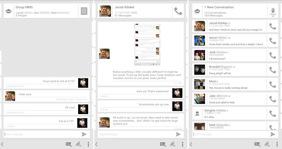
Inside the update is a new card-based UI. As one reader put it, think Google Now. On the first page, you are shown your entire list of conversations, allowing you to swipe through cards of all your ongoing texts. Depending on how many people you text, this could either be great or a nightmare. If you hit on a single conversation in the list of threads, you are skipped to it, then can hit back to be returned to your messages. It’s neat, but is quite slow depending on how many texts you have.
So far, I have tried the updated version on a Nexus 4 and a RAZR HD, with much more luck performance wise on the Nexus 4. The RAZR HD can hardly handle the new card system, so unfortunately I had to disable it. I simply had too many cards for this poor phone to handle. Performance optimizations are something the dev will hopefully look into as the update rolls out and bug fix requests pour in.
In the meantime, go check it out and let me know what you think of the update.
Play Link ($0.99)
Cheers Derrick!