
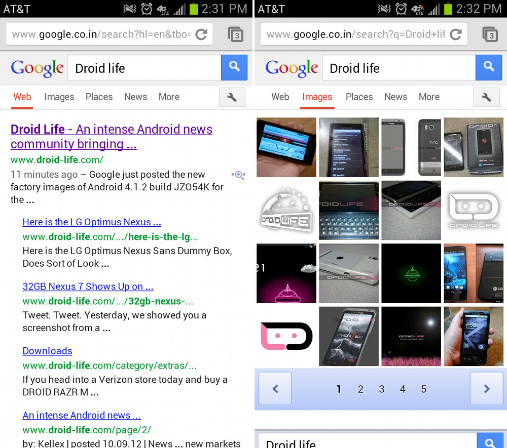
Google appears to be in the middle of a mobile site overhaul of google.com. As you can see in the pictures above and below, the tabs at the top for News, Images, Places, etc. have been replaced by a menu button. When tapped, you will see a sidebar slideout from the left edge, similarly to what we have seen in the YouTube and Google+ apps. Also, after searching for items, the top tab bar has been removed in favor of a scrolling options list directly below the search terms. It matches up quite nicely to the new desktop version of google.com that came earlier in the year, and is a massive improvement over the other dated mobile look.
We aren’t sure how quickly this new mobile version is becoming available. I was unable to see it by going to google.com, however, I can see it if I go to other versions of Google, such as google.co.in. Tim was able to see the new layout in the stock Android browser, but not in Chrome, without doing any secret India tricks.
Go check it out!
Via: Android Soul
