For the past week I’ve been reviewing the Samsung Focus S. I believe that competition drives innovation, so I love spending time with multiple devices and operating systems to see what works well and what doesn’t. I think most of us have spent some quality time with an iOS device and are aware of the competition it presents, but I’m guessing that most of us haven’t played with Windows Phone very much. So how does Windows Phone 7 stack up against Android?
Lock Screen
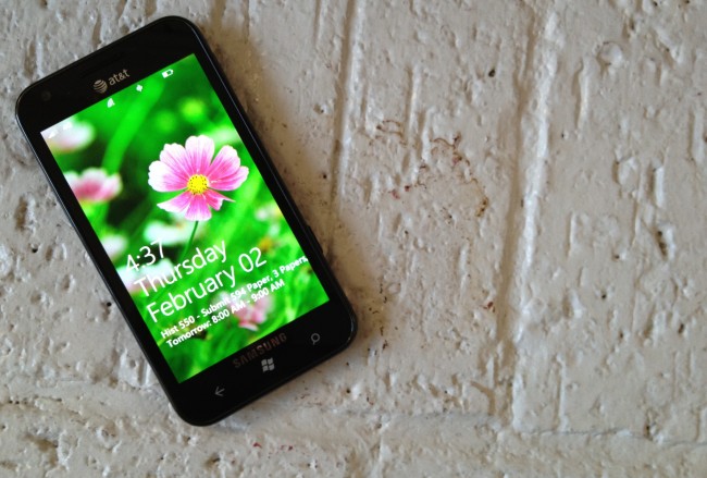
One of the most important things on a modern smartphone is the lock screen. I think this is one of the areas that Microsoft did really well. As you can see in the image above (the quality won’t be the best because WP7 doesn’t have an easy way to take screen shots), the lock screen gives the usual information at the top of the display (connectivity, battery), the time and date, and my next appointment. To unlock the device, you slide the lock screen upwards. The lock screen is simple, yet elegant.
Start Screen
The Start Screen is where the simplicity of Windows Phone really shines. If you use Launcher 7 then you should be fairly familiar with the appeal to Windows Phone’s Metro UI. Rather than have pages of widgets and app icons, Windows Phone highlights important applications and information through Live Tiles. The point of these Live Tiles is to give users quick information or to jump into an app’s feature or content more quickly. The calendar tile launches the app, shows me the date, and shows me an upcoming appointment. Another feature is pinning an album or a contact to Start for easy access. Sliding the start screen to the left reveals a list of all most of the apps installed on the device.
Multi-Tasking
Windows Phone 7.5 introduced multi-tasking to the platform, though the implementation of multi-tasking is one of the worst I’ve seen on a modern smartphone. To access multi-tasking, you hold down the back button. At first I thought this was a strange implementation, but holding back to return to an app makes sense. What doesn’t make sense, however, is the limit to only six applications being stored for multi-tasking. Perhaps the most frustrating part of this limitation is that often times applications are duplicated in the list, as can be seen in the photo above (Internet Explorer is the middle and left option). To make matters worse, the only way to jump back into an application from where you left off is to use the back button. Opening the app from its Start icon re-launches the app, even if it’s been cached in multi-tasking. This needs to be improved upon greatly if Microsoft wants to compete with Android and iOS.
Applications
The selection of applications available for Windows Phone 7 is sparse at best. Though the Marketplace has 50,000 applications, many big name developers and apps are missing. Even the apps that are present often lack major features that are present in their Android and iOS counterparts. Twitter, for example, lacks push notifications (and good luck finding a third party app that compares to third party apps for Android). The YouTube app is just a shortcut to Internet Explorer. Many major apps like Facebook and last.fm were developed by Microsoft, demonstrating a lack of developer support for the platform. If Microsoft wants to succeed, they need to start pushing more of their cash in front of developers.
Gaming
Gaming is even more of a joke. Light games like Angry Birds and Fruit Ninja are available for $2.99 and more graphically intense games like Assassin’s Creed ($4.99) Sonic the Hedgehog 4 Episode 1 ($6.99) are available. It’s a bit strange to me that these games are all more expensive than their Android and iOS counterparts. Perhaps the higher costs are developers’ way to make up for the low market share of Windows Phone. Another annoyance is how gaming is organized. Instead of listing your games along with other apps from the Start screen, games are collected in the Games hub. They can be pinned to the Start screen, but it’s still a sloppy implementation.
Productivity
Windows Phone comes with Microsoft Office built in. The Office apps work well for editing documents and spreadsheets and viewing documents, spreadsheets, and presentations. OneNote, Microsoft’s premier note taking application, is also built in. The editor is very basic and you’re limited to local storage, Office 365, SharePoint, or SkyDrive to store files.
Email offers a decent experience with support for Exchange (shocking!), IMAP, and POP accounts. Surprisingly, Gmail is well integrated. Unlike iOS devices, selecting Gmail when setting up email will set up sync with email, contacts, and calendars (this can be done with iOS, but only by setting up Gmail as an Exchange account). That said, the application uses especially large fonts when viewing messages, making the browsing experience sub par (the relatively low resolution of Windows Phone devices may be influential as well).
Other productivity apps like Calendar and Messaging continue the same Metro trends of clean text and hyper-simplistic graphics. The Calendar application is similar to the email application in terms of giant fonts and restrictive resolutions, but unless your calendar is especially crowded it’ll get the job done. The messaging app is extremely simplistic, with white text boxed off in solid hues. It certainly isn’t flashy, but it also doesn’t look like Microsoft spent much time on it.
Major and Minor Annoyances
Throughout the past week there have been a number of major and minor issues that have bothered me about Windows Phone. One of the more annoying issues is the volume level. Windows Phone has thirty (30!) different levels of volume. Try as I might, I had a hard time really telling the difference between 13 and 14. It’s a minor oversight, but it’s an annoying one.
Another minor issue is the inconsistency of the physical button’s functions. As I mentioned before, holding the back button to see your recently opened applications makes sense. Just hitting the back button functions almost identically to the Android back button. The Start button brings you back to the Start screen, but holding it launches voice command. Hitting the search button launches Bing. That’s it. Holding it does nothing. Hitting the search button in an app launches Bing. In other words, it’s a rarely used button. Hopefully in a future update Microsoft will allow the use of the search button for an in-app search.
A more critical issue is notifications. If you’re in the middle of an app, a bar with the notification will slide along the top of the screen and stay there for about ten seconds before going away forever. After the notification disappears, the lock screen will display a badge for the app and the app will have a numerical badge next to it if you’ve pinned it to the Start screen. There is no centralized place to see all of your notifications, which can be a bit maddening if you’re used to a modern operating system.
Conclusions
I honestly can’t imagine using a Windows Phone 7 device as my main phone for any extended period of time. The animations and scrolling are slick, the UI is cohesive, and the simplicity is attractive, but the overall experience is not on par with Android or iOS. Android offers a better experience in terms of apps (both availability and price), multi-tasking, notifications, service integration, gaming, and productivity. It doesn’t matter how fast your phone is if it’s lacking in so many areas. So many parts of the operating system feel unfinished or untouched that it’s honestly astounding to me that this is the second major release.
As I’ve said elsewhere, Windows Phone 7 feels like 21st MS-DOS. Microsoft says that the inspiration for Metro UI is “street and airport signage.” The signage inspiration is clear, but what isn’t clear is why Microsoft thought that reverting the majority of visual cues to text would provide a better experience to the overtly graphical interfaces found in Android and iOS. Even if the apps were there (and to be clear, there is a serious dearth of quality apps), there are so many part of Windows Phone 7 that still feel incomplete or not thought through. Why would you make the email text so big that you can only preview four to five messages on a screen without scrolling? Why limit multi-tasking to six applications? Why do applications relaunch if you slect them from the Start menu instead of the multi-tasking menu? Why doesn’t the email app replicate changes made on the server for IMAP connections? These are massive oversights that were possibly forgivable in the initial release, but to still have these issues in the second major version is incredible.
Tim Cook is right, Microsoft will keep trying. I’m glad they decided to start over with Windows Phone 7, but if they want to break into an already established industry, they need to offer a product that blows the competition out of the water. Microsoft does not have that product. For the foreseeable future the smartphone space is going to continue to be dominated by Apple and Google. That’s a disappointing sentence to write, but it’s the truth. I want more competition. More competition drives real innovation. Android would not be as polished as it is today if Apple hadn’t pushed the importance of design. iOS wouldn’t have the excellent notifications it has now if it weren’t for Android paving the way. I believe that Microsoft has some good ideas in Windows Phone 7, but if they really want to make an impact they need to do a lot better.
![Windows Phone 7.5 – How Does it Compare to Android? [Opinion]](https://www.droid-life.com/wp-content/uploads/2012/02/Samsung-Focus-S-1400x947.jpg)


