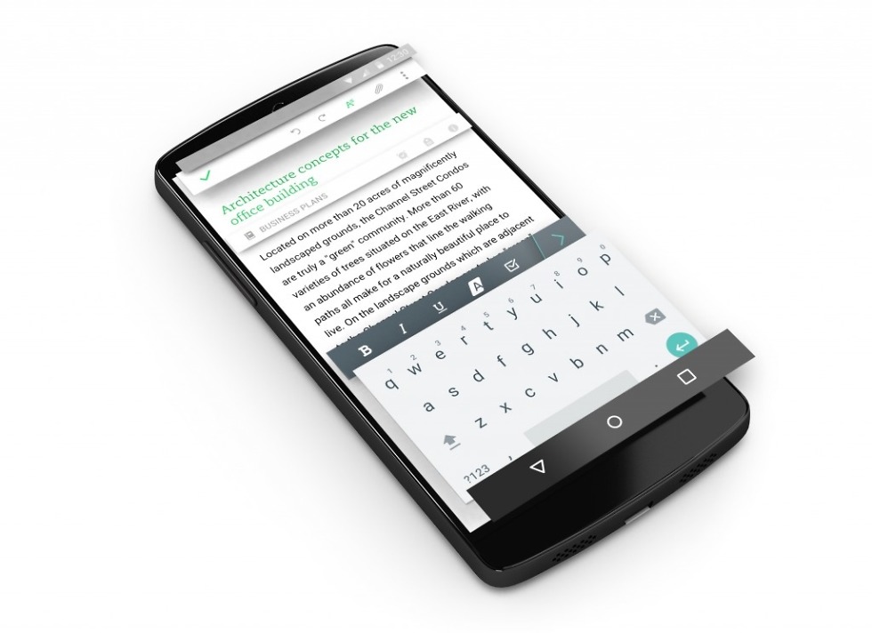
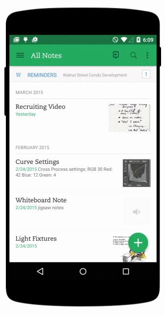
Evernote pushed an update to its Android app yesterday, an update that brought a Material Design flavor with it. The update isn’t necessarily an overhaul, by any stretch of the imagination, but it does bring added polish in areas like colors, typography and flatness, to give it that Material feel throughout. The Evernote designers focused on creating independent layers and subtle animations to give the impression of depth and a “sense of hierarchy.”
The update also adds things like customizable quick notes, long presses to add or remove quick note options, a revamped navigation, simpler navigation drawer, and more.
What’s New
- Visual refresh supporting Google’s Material Design principles, including a flatter look, bolder colors, and improved typography.
- Customizable quick notes
- Long press to add or remove quick note options
- Revamped navigation
- Simpler navigation drawer with direct access to shortcuts
- Improved note editor and note view
- Cleaner layout and control
- Editable tags
- Support for renaming and deleting tags
- Numerous bug fixes and enhancements
Collapse Show Comments9 Comments